

Social Media Marketing for Educational Institute in India
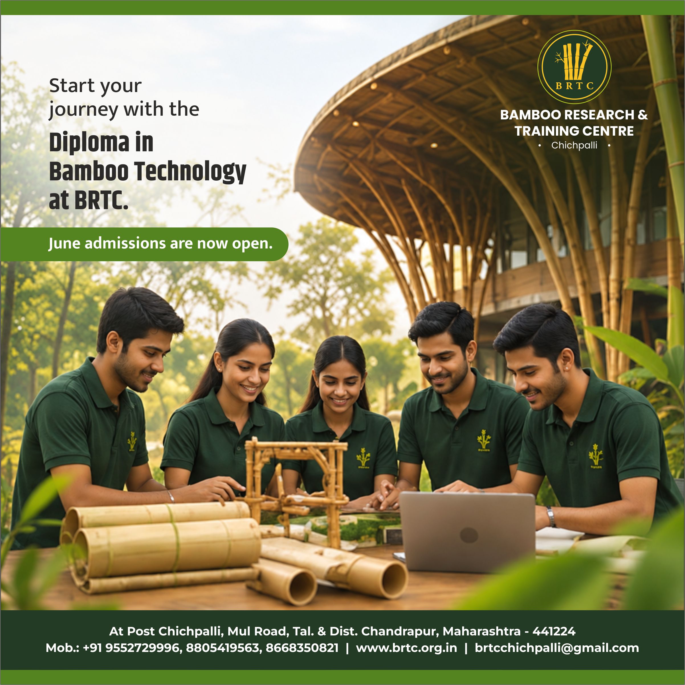
Angle partnered with India’s renowned educational and research institute – Bamboo Research & Training Centre (BRTC), Chichpalli, to run their Diploma in Bamboo Technology admissions campaign. The institution needed a targeted social media marketing strategy to generate leads for its technical diploma course. Being the top digital marketing company in India, we were tasked with generating high-value leads for the educational institute.
Angle Advt chalked out a detailed social media marketing campaign strategy for the educational institute, digital identity creation, and paid media execution to drive enrollment. The creative team designed a unified media framework that successfully elevated the educational institute’s profile, generated high social media engagement, and captured verified applications across the region during the active student intake timeline.
Project details
Client:
Bamboo Research & Training Centre (BRTC)
Location :
Chichpalli, Chandrapur, Maharashtra
Industry :
Green Education & Vocational Skill Development
Service :
Performance Marketing & Content Strategy
Project Type :
Admissions & Enrollment Lead Campaign
Completion :
2026
Verticals :
Digital Campaign Design, Social Media Identity, Meta Ad Creatives, Conversion Optimization, Localized Copywriting
The challenge
The educational institute faced low awareness and an outdated public perception. People viewed bamboo as a basic handicraft material rather than a modern technical field. Supported by the National Bamboo Mission, the educational institute needed to fill a strict 30-seat diploma cohort. The social media target audience ranged from ages 15 to 35. The strategy had to reach two distinct groups: rural families looking for stable careers and urban individuals focused on sustainable business sectors. Gaps in their digital presence caused a lack of trust among potential applicants, making institutional authority a vital element to highlight in the new marketing framework. Prospective students and their parents required concrete validation regarding the authenticity of the degree, career placement security, and long-term financial independence before committing to a niche vocational path instead of traditional academic lines.

Moodboard
Brand moodboard and ecosystem
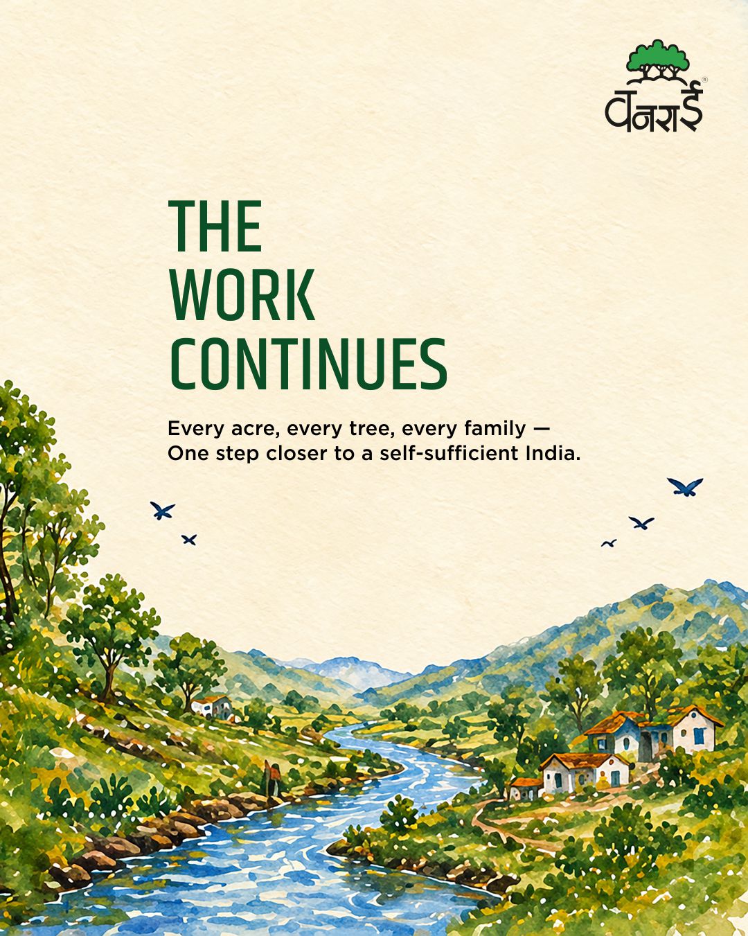
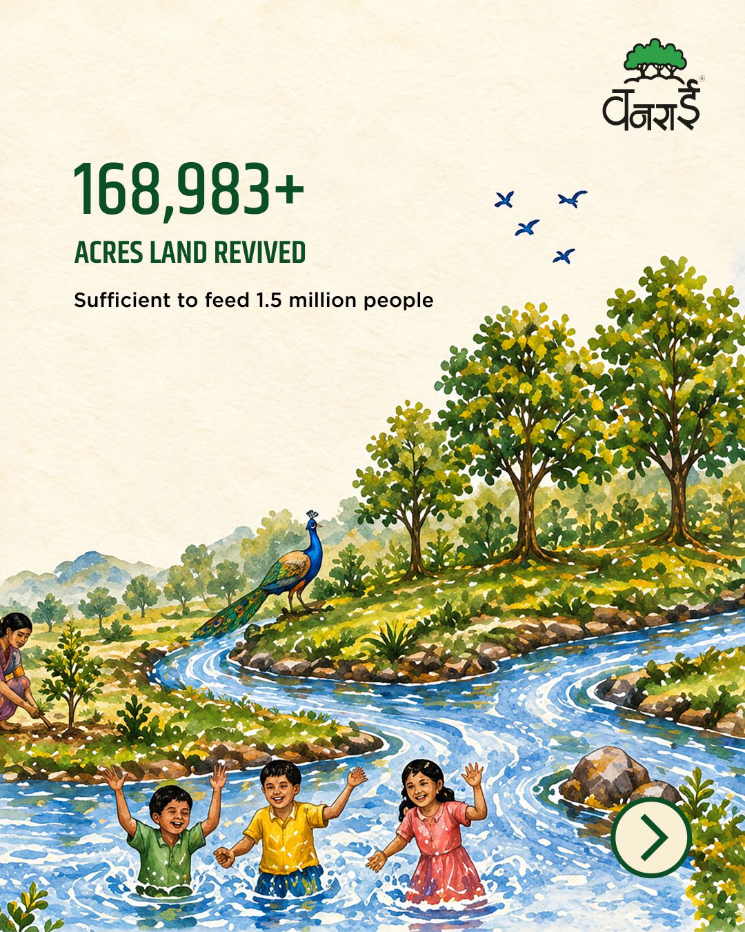
Angle Advt created a social media campaign framework titled “The Ground We Grow From’ for the educational institute. The visual direction combined natural tones with industrial design elements to show both research legacy and lab-based training. To drive niche “education-oriented” traffic and not generic impressions, the team initiated thorough audience research targeting students and their parents who had the intent of education in bamboo. Strict geographic targeting concentrated the paid ad spend within regional Maharashtra districts including Chandrapur, Nagpur, Gadchiroli, Yavatmal, Pune, Amravati, Wardha, and Miraj. The target audience framework was divided into clear segments:
- B2C Audience: 10th and 12th-pass students seeking diplomas, hostel housing, and financial scholarship support.
- B2C Audience: Urban individuals looking for technical training to enter the green economy.
- B2B Audience: Commercial wood and bamboo firms, farming groups, and factories looking to hire trained supervisors and laboratory technicians.
By tailoring specific sub-narratives for each profile, the educational social media creative messaging actively dismantled regional skepticism and directly highlighted the practical, commercial advantages of enrolling in this specialized technical program.
Identity design
Brand Identity Design
The creative team chose clean sans-serif typography for technical clarity and paired it with native Marathi text for local reach. Forest green established institutional authority, while construction orange highlighted industrial machinery work. For video channels, Angle Advt produced student-focused social media reels. These videos combined fast edits with real, unscripted sounds from the training floors. The footage focused on advanced tissue culture labs, chemical preservation areas, and automated processing tools to frame the program as a modern technical trade. This strategic choice of bold colours and rhythmic sound direct-linked institutional research to career viability.
Visualisation
Brand visualisations
The social media design system rolled out across digital and campus touchpoints. Angle Advt deployed targeted Facebook lead ads, multilingual Instagram video reels, and social media posts all in sync with the key concept.
Landing page optimization was applied directly to reduce user drop-offs and improve validation. Web landing pages and paid social media ads focused on direct conversion. They highlighted clear pricing details, direct government scholarship programs, and free residential hostel options. Mockups showed how social content transformed user engagement into institutional visits, matching real-world expectations with a polished, professional green corporate look across channels. This systematic integration ensured that every user click from the social media ad creative led to a cohesive, highly informative informational layout that emphasized the official state partnerships and extensive physical infrastructure of the campus.
Execution
Final execution
The finalized social media campaign ran direct paid ads and search engine updates across Meta and Google networks during the high-intent post-SSC results window. To filter high-intent traffic from broad searches, we executed thorough keyword research. Continuous campaign optimization with focus on reducing irrelevant traffic was achieved by aggressive negative keywords addition – excluding general hobbies, traditional wood crafts, and manual arts terms. This tactical shift directly reduced the overall Cost per Lead while refining applicant intent. All links and lead forms directed users straight to active admissions channels.
The numbers show the clear impact of the launch: the campaign generated over 1.38 million social media impressions, secured the #1 organic search spot for primary training keywords, and brought in 184+ high-intent leads to fill the 30-seat cohort. This allowed the academic board to select top applicants from a wide pool of qualified tech-focused leads. The optimization parameters cut through market noise, proving that high-density technical positioning can effectively solve enrollment challenges for highly specialized, public sector vocational educational tracks.
Our Approch
Brand Moodboard
And Ecosystem
Darjeeling Express speaks to three kinds of people. Those who are enthusiasts of Indian food and know exactly what they are looking for. Those who miss the feeling of a home cooked meal and come to the table looking for that comfort. And those with a curiosity for flavour, who seek out dining experiences that are layered, interesting, and genuinely different.
Every element on the moodboard had to work across all three. The terracottas, deep teals, and saffrons carried cultural warmth without alienating anyone. The serif typography felt inherited rather than designed. The imagery of women cooking, shared plates, and quiet rituals was chosen so that everyone who walked in, regardless of where they came from, found something that felt meant for them.
Restaurant Brand
Identity Design
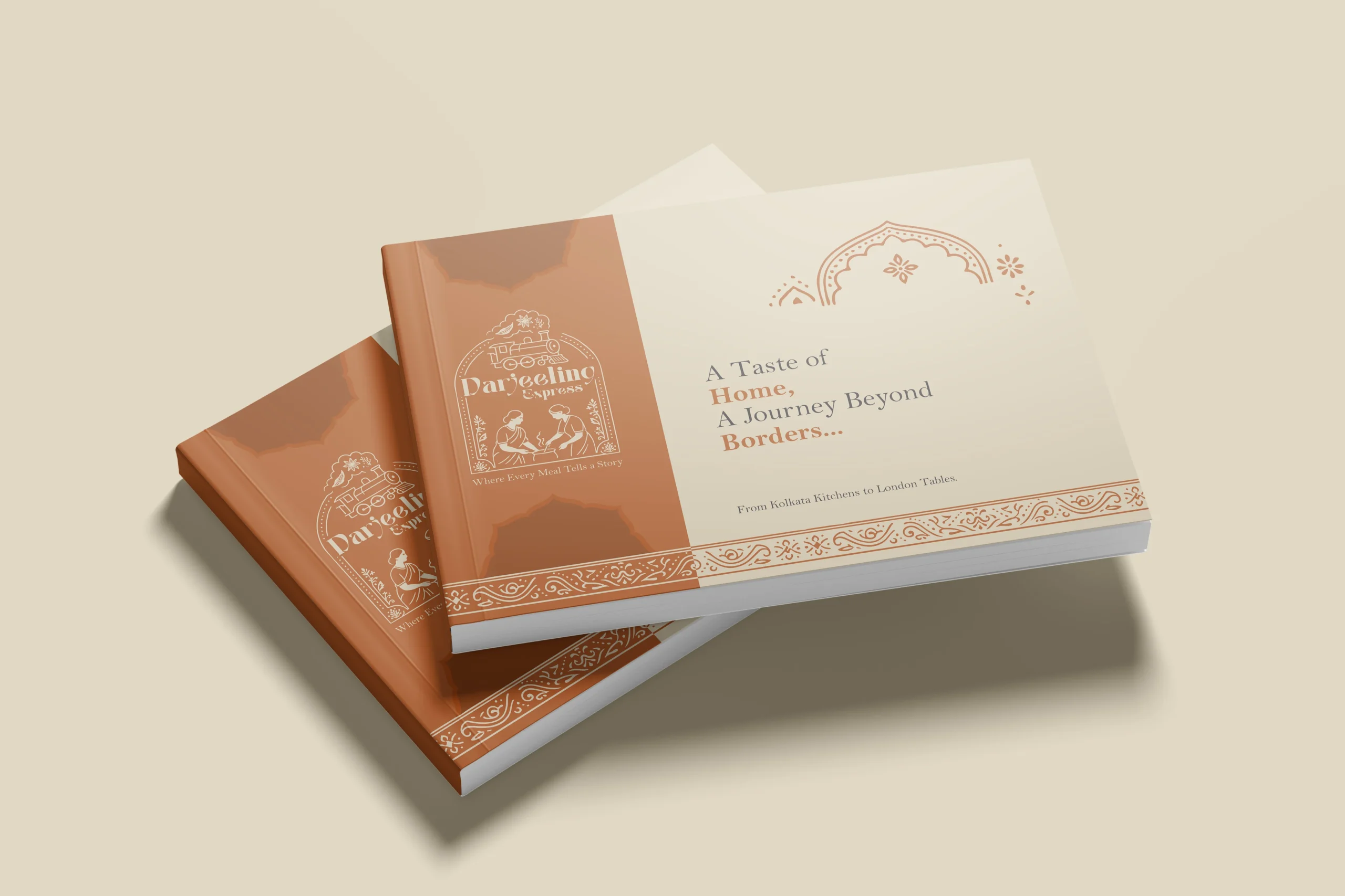
In a dining scene full of typographic marks and minimal identities, illustration was a strategic choice. We needed the restaurant brand to communicate what Darjeeling Express stands for before anyone reads a word. A clean logomark could never carry that weight. Only a fully realised illustrative mark could.
The mark brings together the Darjeeling train and the women who define the restaurant. Two things that are inseparable from the brand’s identity, and instantly recognisable as its own.
We developed two colour directions. Deep teal for quiet authority and cultural depth, a palette that signals credibility without loudness. Warm terracotta for familiarity and belonging, the colour equivalent of walking into somewhere that already feels like home. Both directions solve the same strategic problem differently: how do you make a brand impossible to confuse with anything else in the market.
Brand Visualisation
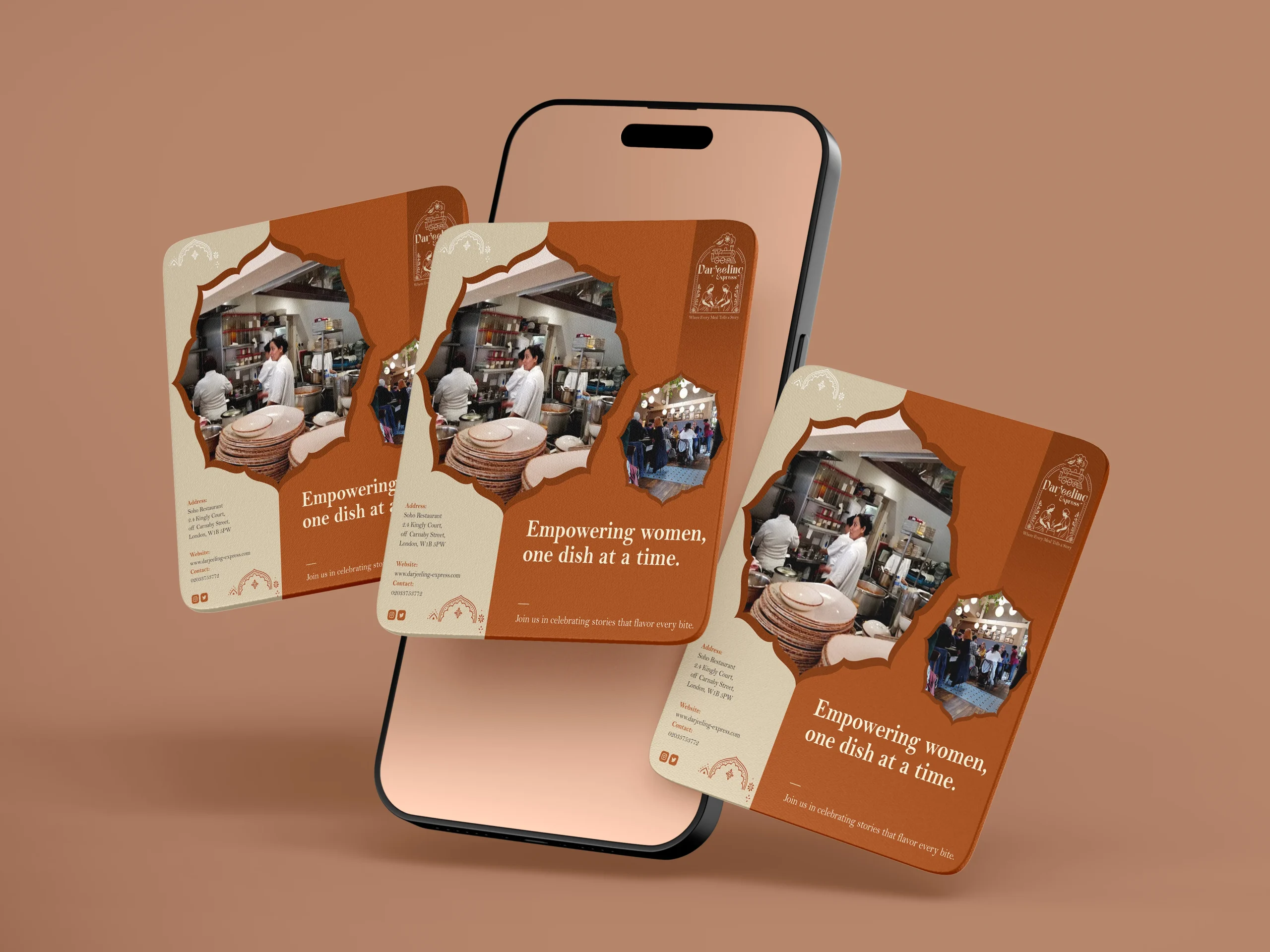
We designed our creatives similar to how we visualised it. And for the final visualisation, this was the part where everything came together. Seeing the identity move from a moodboard into real applications, menus, packaging, digital templates, and watching it hold up across all of them was genuinely satisfying. The palettes translated beautifully across print and screen, and the illustrated mark never lost its character no matter the scale. From a small stamp on a menu to a full printed board, it always looked like it belonged. That kind of consistency does not happen by accident. It comes from getting the foundations right.
Final Execution
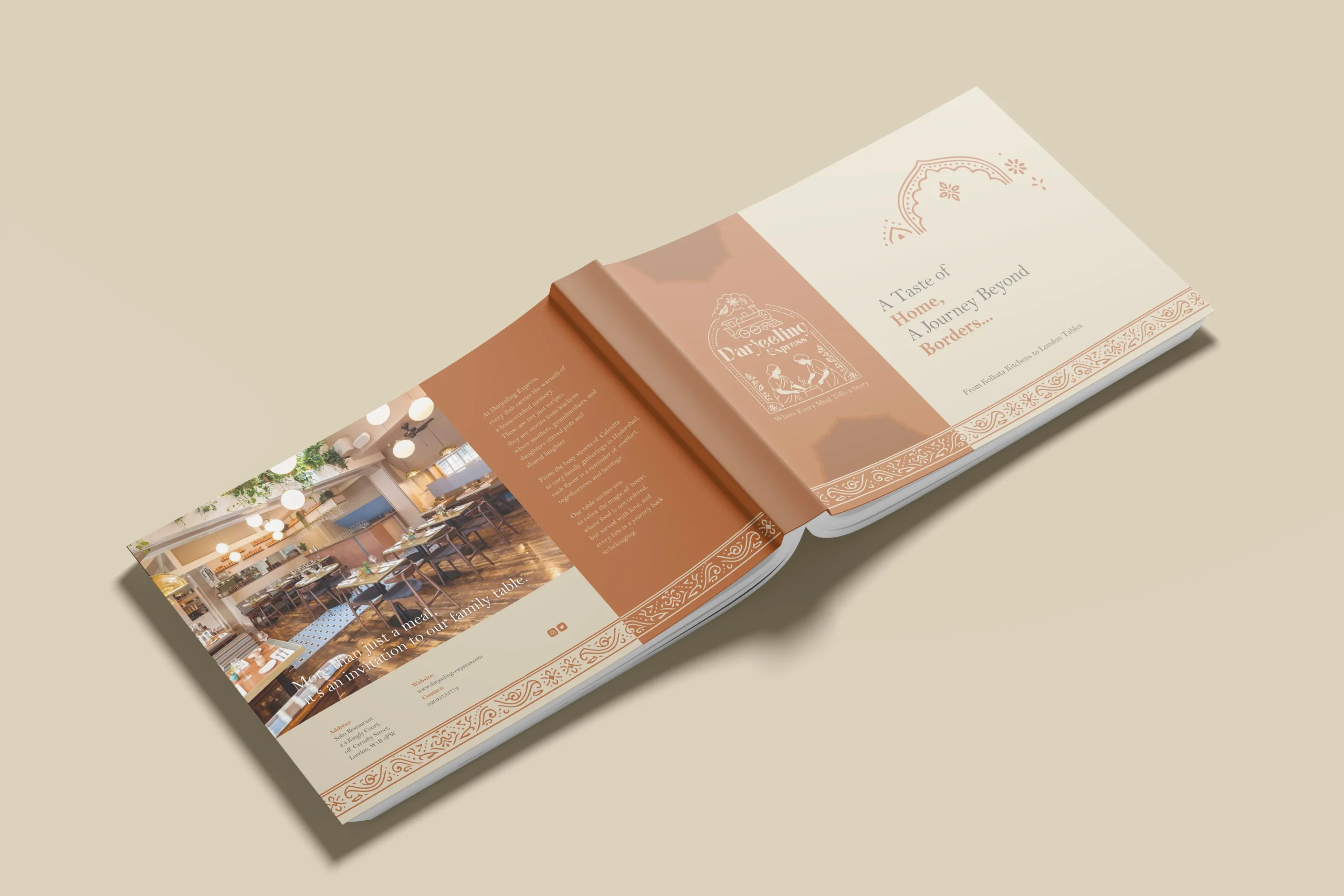
Handing over a project is always a mix of emotions, but mostly pride. With Darjeeling Express, it felt like sending something into the world that was genuinely ready. The full brand system, guidelines, print-ready files, and digital assets, all built to be used confidently without us in the room.
The value chain here is straightforward. We built Darjeeling Express a coherent, confident identity they could own completely. Darjeeling Express used that identity to show up consistently across every touchpoint, digital and physical. And their customers felt the difference, because the experience of the brand now began long before anyone walked through the door. What we create for our clients ultimately shapes what their clients feel. That is the point.
Project highlights
Technical Brand Shift
Repositioned bamboo training from traditional manual crafts to automated engineering using precise visual layouts and real lab footage.
High-Intent Lead Pool
Built an optimized lead funnel that secured 184+ direct applications, where over 80% of candidates chose business ownership as their primary goals.
Search Engine Rankings
Earned the top organic spot on Google for regional training phrases and gained a featured citation inside Google's AI Overview for the term "bamboo industry"
Packaging design
Being the leading packaging design agency in India, we approached Darjeeling Express packaging through a data driven lens, grounding every decision in consumer behavior. Studies show 68% of consumers associate premium packaging with higher food quality, while 45% are influenced by visual appeal alone, making first impressions critical. We translated this into sturdy, well-structured formats and a consistent visual system of color, typography, and brand elements to strengthen recall. Our analysis also highlighted that packaging ranks among the top drivers of repeat purchase in foodservice, often outperforming ads and reviews. Each design choice was made to signal professionalism, trigger emotional connection, and justify value. The result is packaging that not only delivers food but extends the brand experience, reinforcing identity with every interaction.