

Overseas Event Management for Maharashtra Government
Maharashtra contributes approximately Rs. 35 lakh crore to India’s economy, 14.2% of national GDP. Maharashtra Industrial Development Corporation wanted to turn that number into a conversation with Taiwanese industry. Given our experience as the top events management company in India, Angle Advt was brought in to build that conversation from the ground up: a 3-day investment roadshow event in Taiwan, designed to get the right people in the room, keep them engaged, and walk away with real investment intent.
Project details
Client:
MIDC, Government of Maharashtra
Location :
Taiwan
Industry :
Government and Economic Development
Service :
Event Strategy Event management Communications
Project Type :
International Investment Roadshow
Completion :
2024
Verticals :
Event Design, Mandarin Language Website Development, Social Media, Investor Outreach, PR, Collateral Design, Delegate Logistics
The challenge
Maharashtra has a strong economic story, but there was no existing global familiarity with the state’s industrial policies, no established trust, and no local presence to lean on.
The government’s authority behind this event project was specific: the state government wanted to position itself as the investment destination for Taiwanese businesses. That meant building credibility from scratch, in a foreign market, in their native language (Mandarin), across three sectors with distinct investor profiles: Electronics, Automotive, and Footwear. Multiple government departments also needed to speak in one consistent voice across the event.
The job was to build trust in a fairly new yet expanding market.
Moodboard
Brand moodboard and ecosystem
The creative direction for the event was shaped by one constraint: this audience makes decisions slowly and carefully. Taiwanese business culture places high value on precision, preparation, and respect.
For the B2B audience, senior executives and procurement heads, the visual language of the event was clean, data-led, and structured. We had to prioritise the showcase of credibility over fancy design elements.
For B2G interactions during the event, direct meetings between investors and state government officials, the design needed to signal institutional authority without feeling bureaucratic.
Identity design
Event identity design
Event typography was chosen for cross-cultural legibility. Clean, structured fonts that work in both English and Mandarin without visual conflict. It is often observed that decorative typefaces fall apart in translation.
The event colour palette signified institutional trust, ambition, and neutrality. The palette was intended to be read as sophisticated and serious across both Indian government contexts and Taiwanese corporate ones.
All communication assets, presentations, event collateral, and digital interfaces, were developed in Mandarin and English simultaneously, not translated after the fact. That distinction really mattered to the audience. A localised-first approach reads differently than a translated-second one. It signals that they were considered from the start.
Visualisation
Brand visualisations
Physical and digital touchpoints at the event were visualised before the team began work on the execution.
Event stage layouts, seminar room setups, registration flows, and branded environments were mapped to ensure consistency across all three days and multiple venues. Investor-facing materials used infographics and sector-specific data visuals to make the state’s economic numbers legible at a glance, because a foreign investor reading dense policy text disengages. The same information, displayed as a clear visual, keeps the conversation moving.
The Mandarin website and registration system were also prototyped and tested with local users before going live.
Our communication strategy maps out a clear digital and retail roadmap. For the immediate launch, the focus stays entirely on owned channels, showcasing the packaging across social media and the official website.
To support future growth, we designed the packaging layout to adapt as distribution expands. The bold, artistic styling ensures the products will stand out on cluttered screen interfaces when scaling to quick-commerce apps like Blinkit and Instamart down the line. Additionally, the wrapping botanical art easily transitions to physical retail shelves, keeping its premium positioning alongside imported goods in gourmet stores like Dorabjees and Nature’s Basket in the far future.
Execution
Final execution
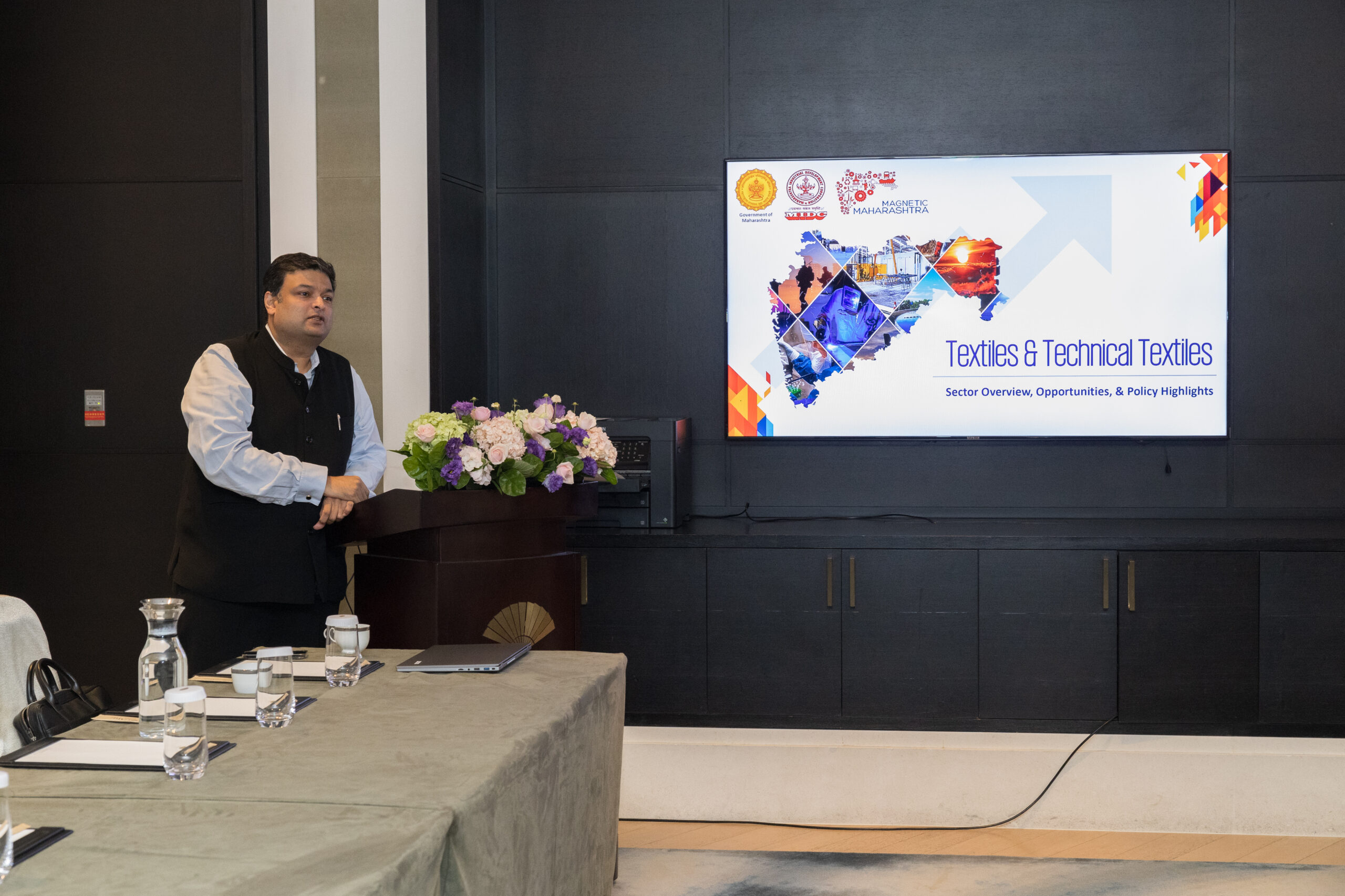
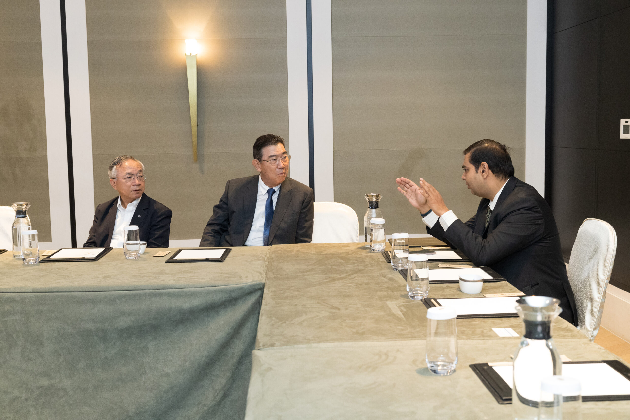
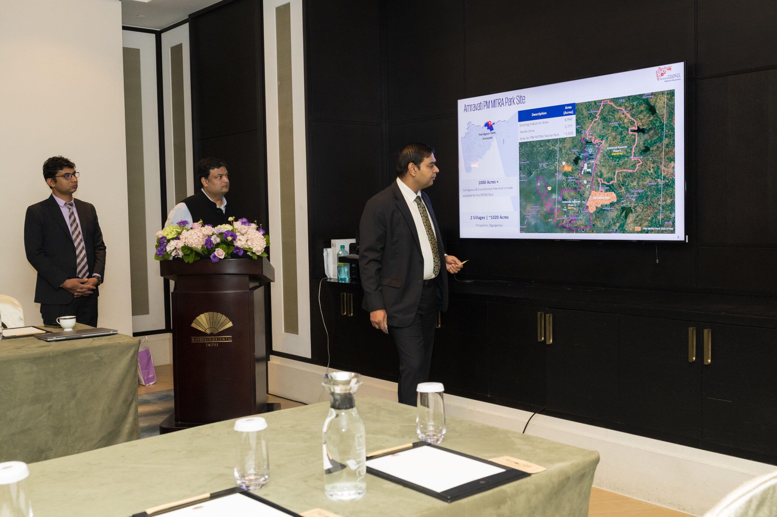
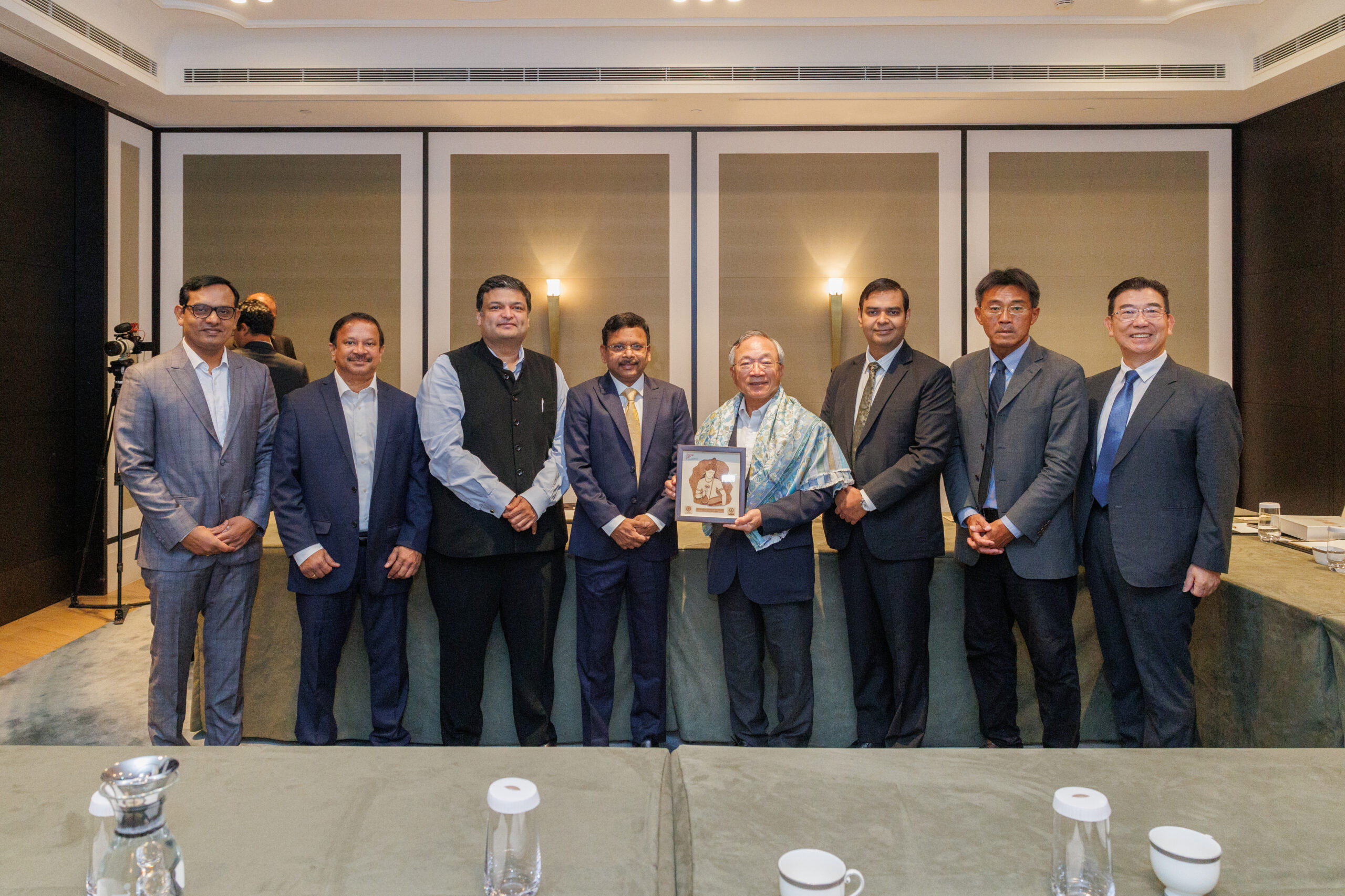
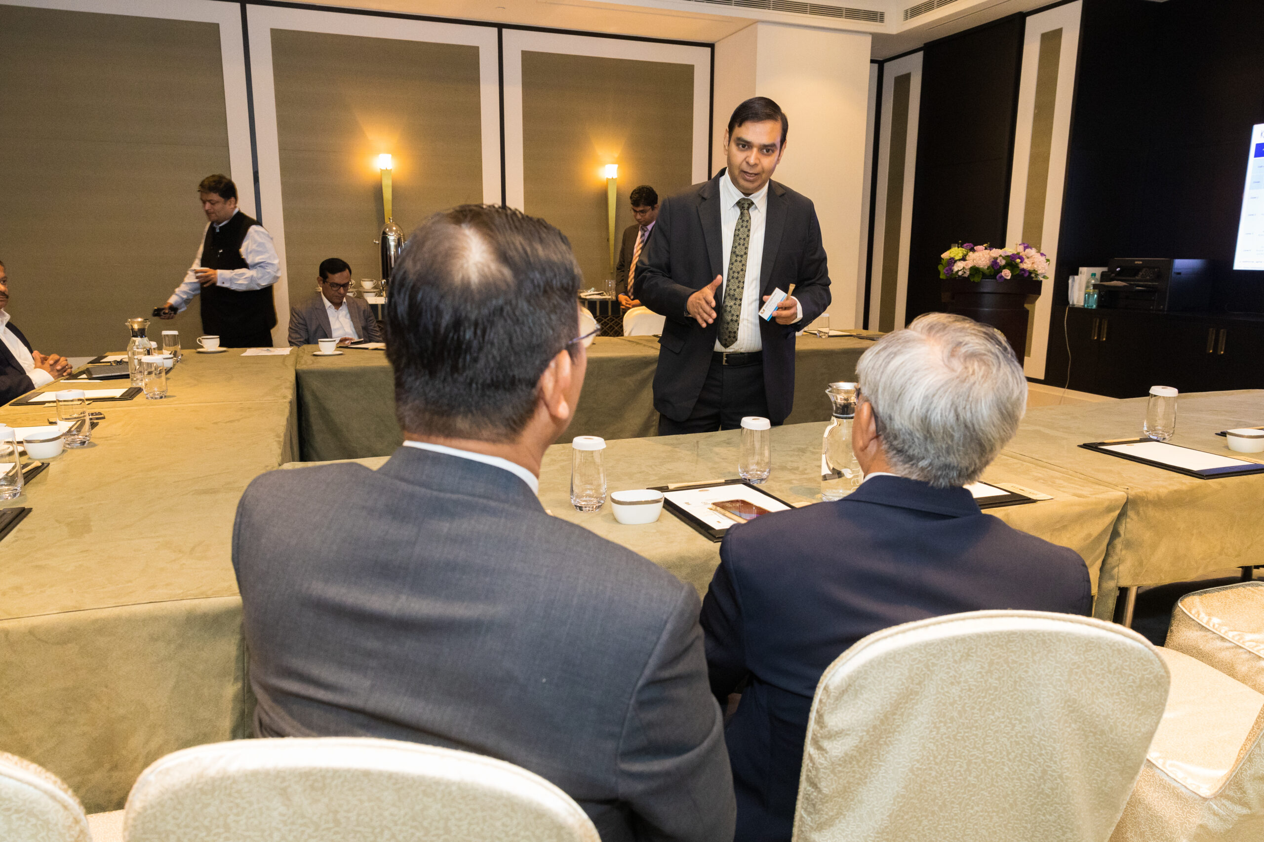
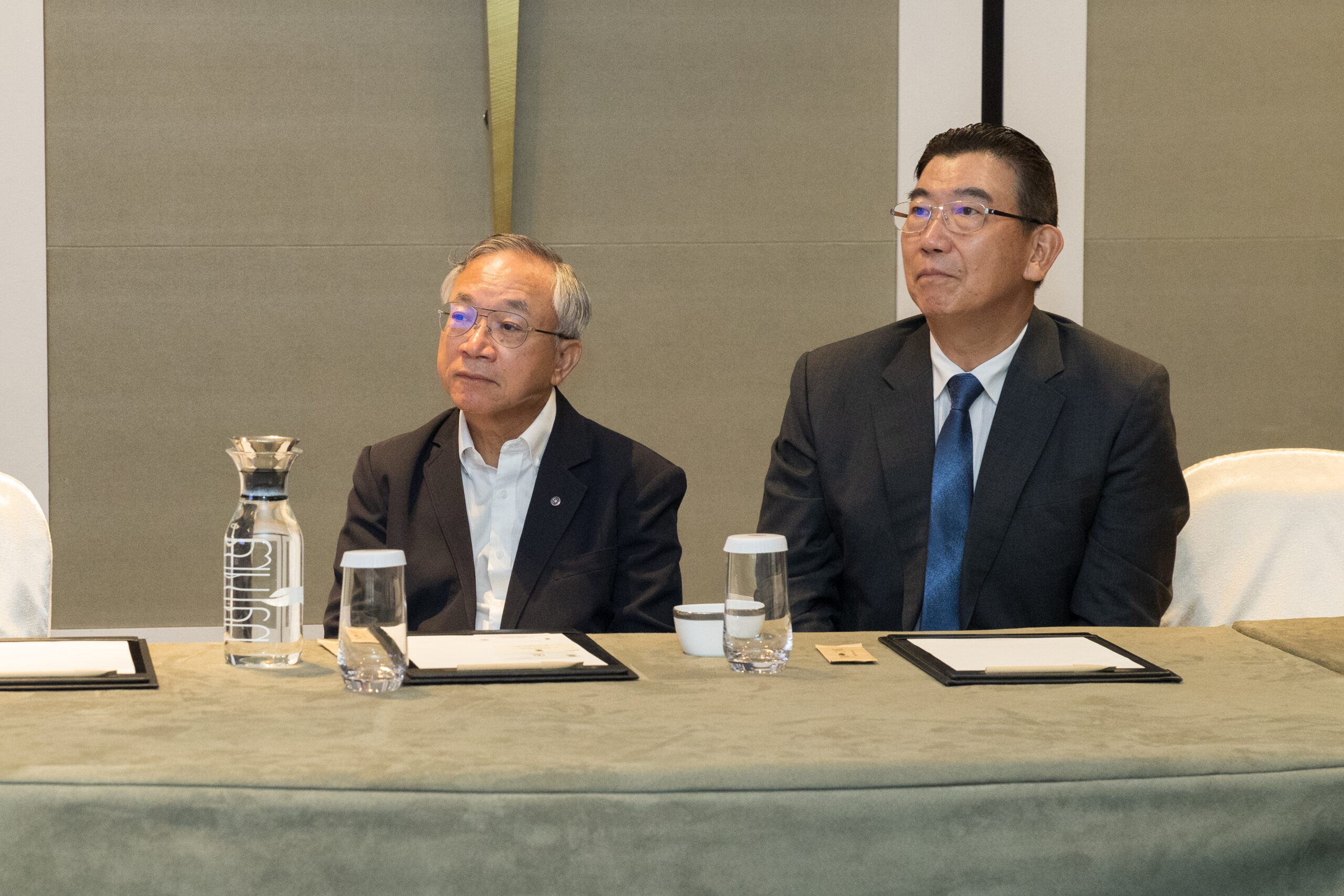
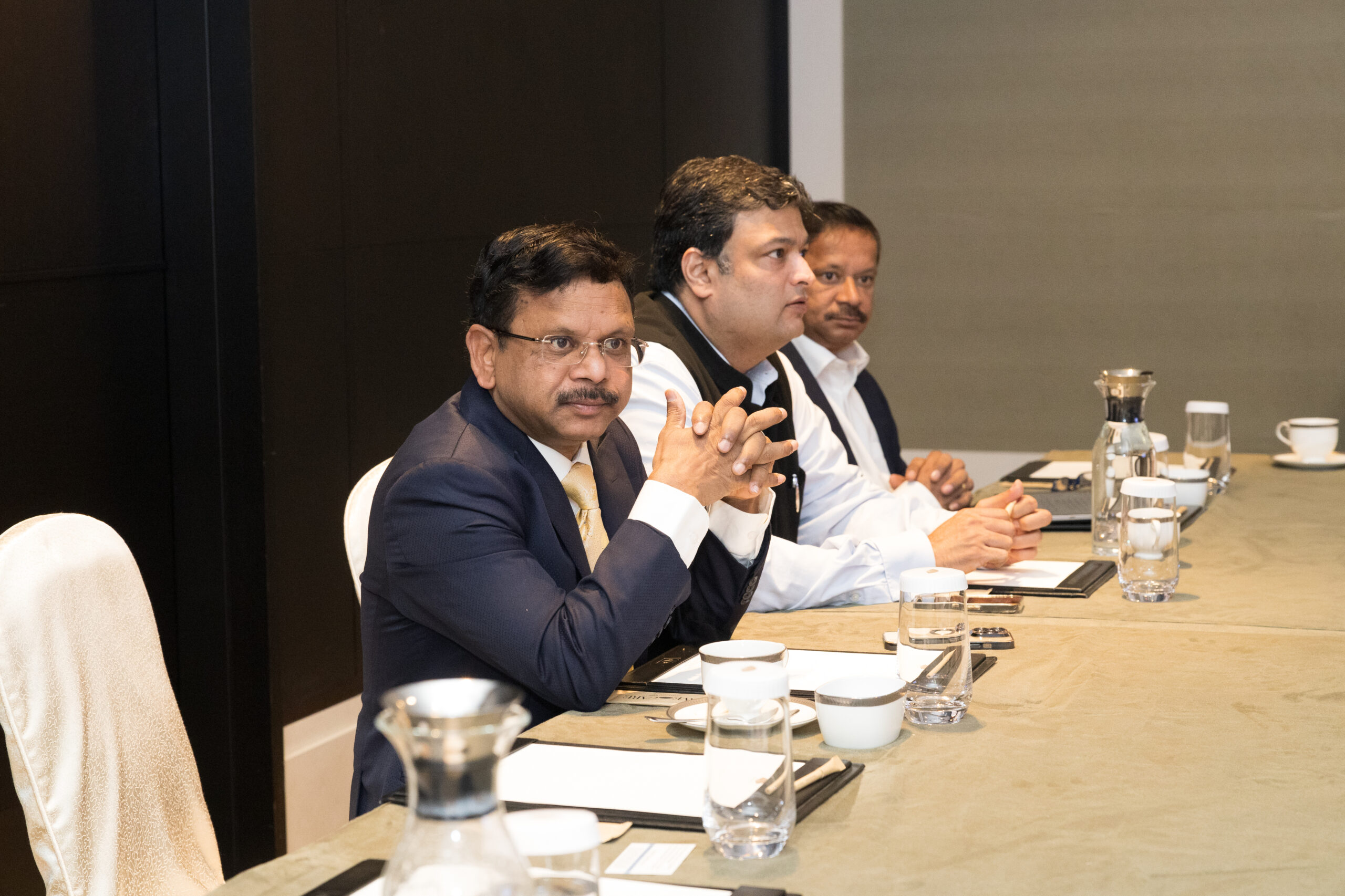
Over three days, the roadshow event engaged 100-plus investors per day from a targeted pool of 200 to 250 Taiwanese companies. Seminars, sector roundtables, and one-on-one B2G meetings ran in parallel, managed through a tightly coordinated scheduling system that kept the state government delegation on time and the investor experience smooth.
PR activity running alongside the event, press meets, published articles, and media coverage, extended reach beyond the room.
The Mandarin social media pages and website drove awareness in-market before, during, and after the event, creating touchpoints that outlasted the three days on the ground.
Our Approch
Brand Moodboard
And Ecosystem
Darjeeling Express speaks to three kinds of people. Those who are enthusiasts of Indian food and know exactly what they are looking for. Those who miss the feeling of a home cooked meal and come to the table looking for that comfort. And those with a curiosity for flavour, who seek out dining experiences that are layered, interesting, and genuinely different.
Every element on the moodboard had to work across all three. The terracottas, deep teals, and saffrons carried cultural warmth without alienating anyone. The serif typography felt inherited rather than designed. The imagery of women cooking, shared plates, and quiet rituals was chosen so that everyone who walked in, regardless of where they came from, found something that felt meant for them.
Restaurant Brand
Identity Design
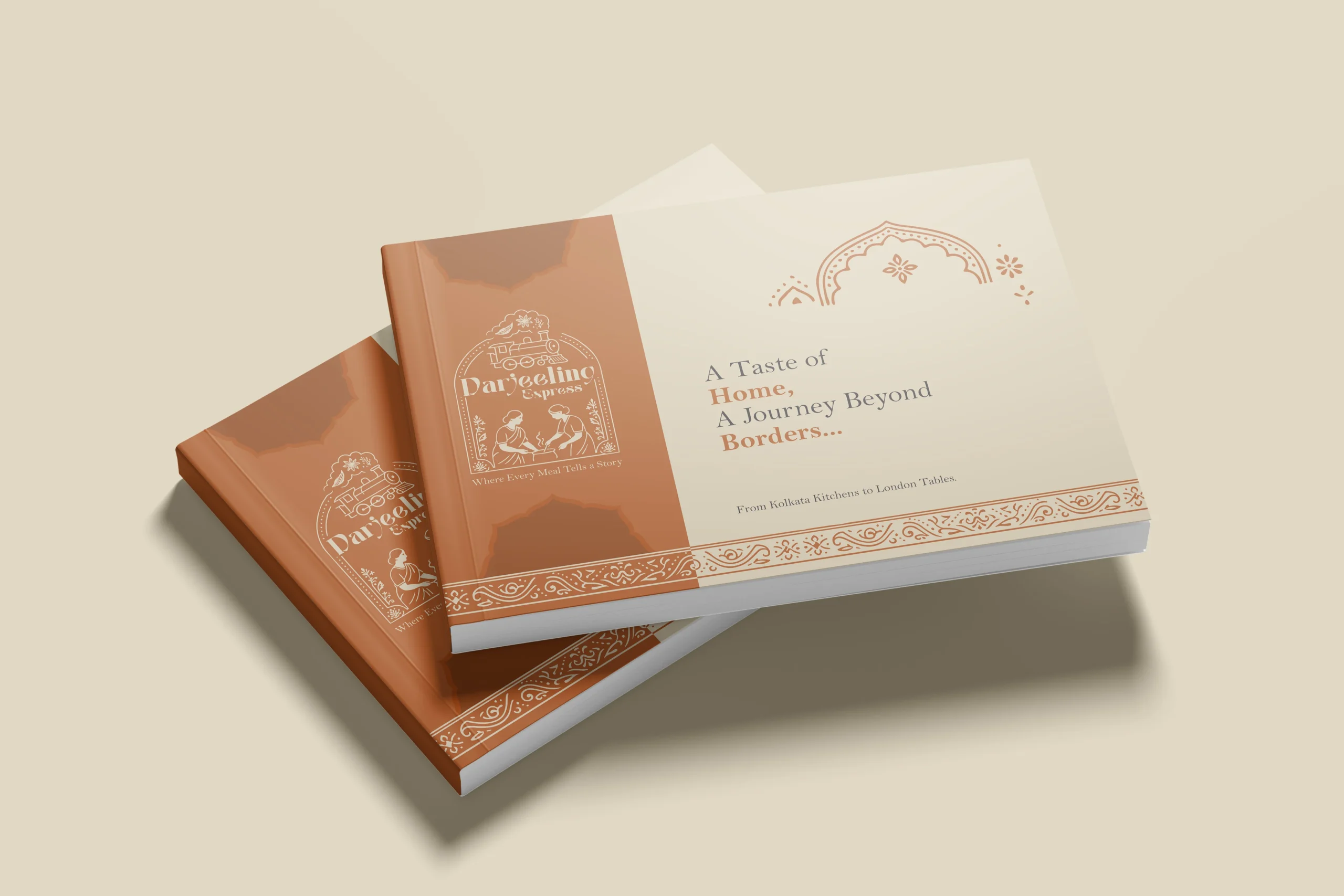
In a dining scene full of typographic marks and minimal identities, illustration was a strategic choice. We needed the restaurant brand to communicate what Darjeeling Express stands for before anyone reads a word. A clean logomark could never carry that weight. Only a fully realised illustrative mark could.
The mark brings together the Darjeeling train and the women who define the restaurant. Two things that are inseparable from the brand’s identity, and instantly recognisable as its own.
We developed two colour directions. Deep teal for quiet authority and cultural depth, a palette that signals credibility without loudness. Warm terracotta for familiarity and belonging, the colour equivalent of walking into somewhere that already feels like home. Both directions solve the same strategic problem differently: how do you make a brand impossible to confuse with anything else in the market.
Brand Visualisation
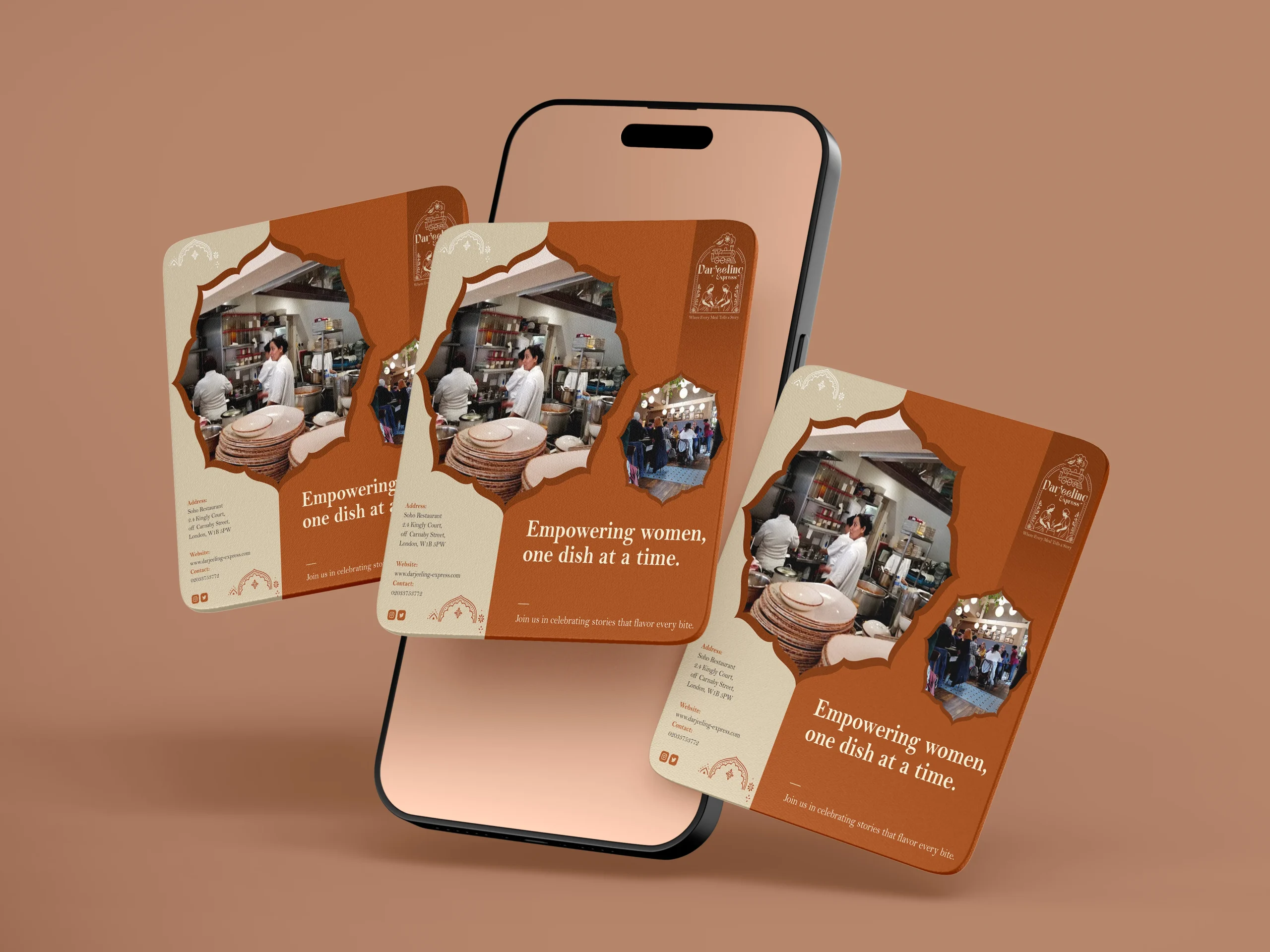
We designed our creatives similar to how we visualised it. And for the final visualisation, this was the part where everything came together. Seeing the identity move from a moodboard into real applications, menus, packaging, digital templates, and watching it hold up across all of them was genuinely satisfying. The palettes translated beautifully across print and screen, and the illustrated mark never lost its character no matter the scale. From a small stamp on a menu to a full printed board, it always looked like it belonged. That kind of consistency does not happen by accident. It comes from getting the foundations right.
Final Execution
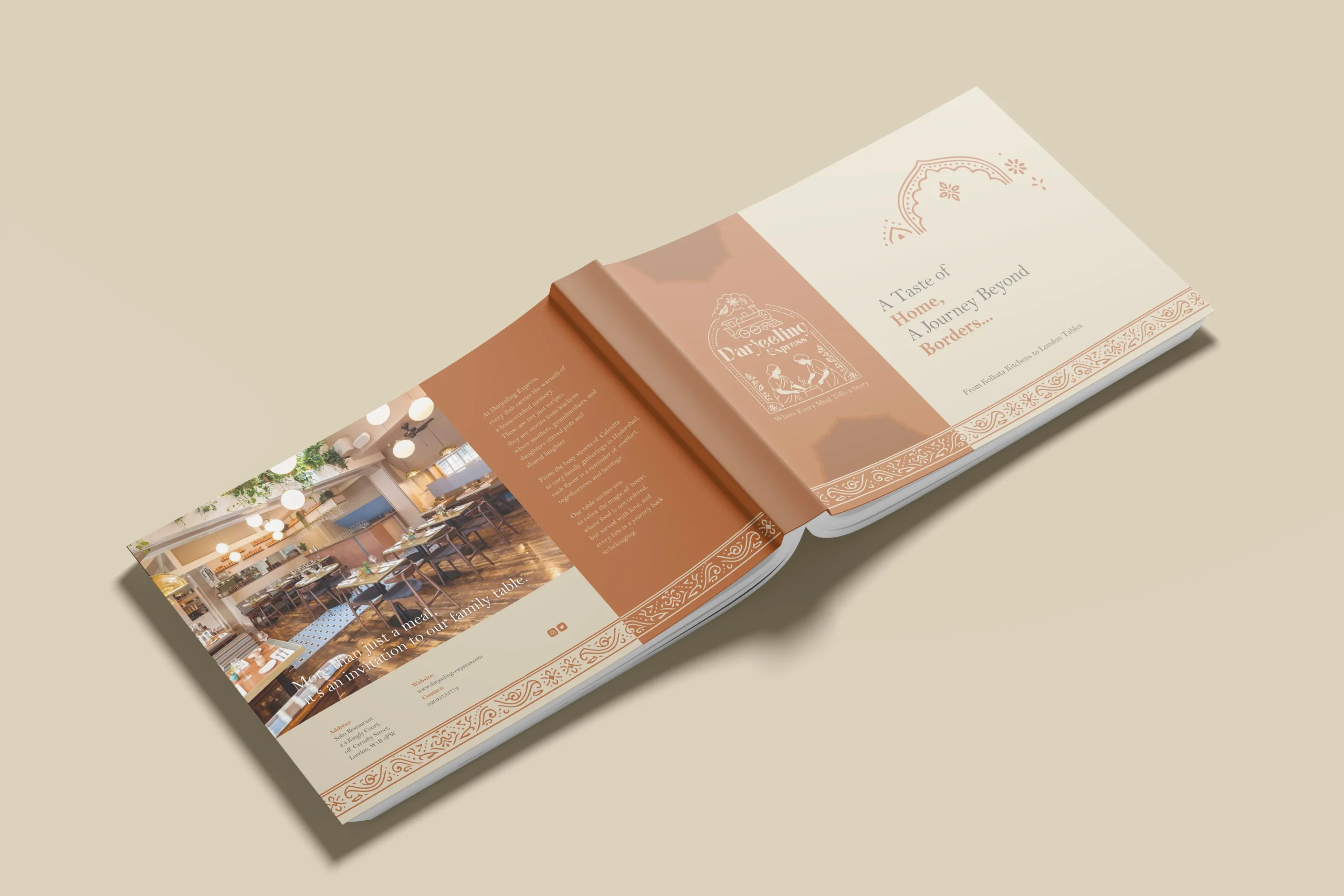
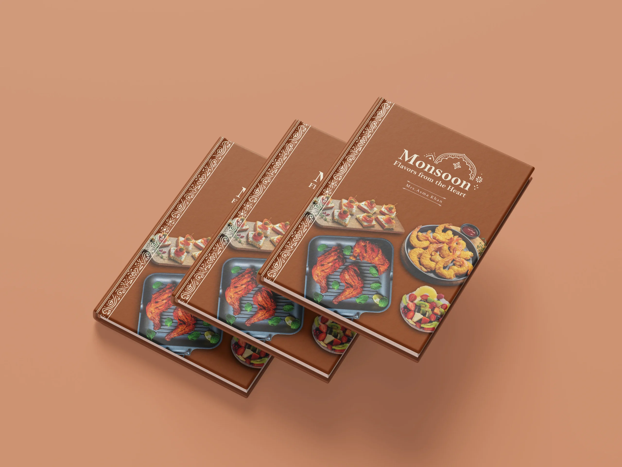
Handing over a project is always a mix of emotions, but mostly pride. With Darjeeling Express, it felt like sending something into the world that was genuinely ready. The full brand system, guidelines, print-ready files, and digital assets, all built to be used confidently without us in the room.
The value chain here is straightforward. We built Darjeeling Express a coherent, confident identity they could own completely. Darjeeling Express used that identity to show up consistently across every touchpoint, digital and physical. And their customers felt the difference, because the experience of the brand now began long before anyone walked through the door. What we create for our clients ultimately shapes what their clients feel. That is the point.
Project highlights
Trust building
Taiwanese investors had no prior relationship with the state's industrial landscape. The entire roadshow event was designed around closing that gap fast: direct access to government officials, sector-specific data, and a communications ecosystem built entirely in Mandarin. Each of those decisions addressed a specific psychological barrier to investment consideration.
Influencing strategic decision-making
Investment decisions at this level rarely happen in a single meeting. They happen across repeated touchpoints that build confidence over time. The roadshow was structured to create multiple moments of engagement across three days, each one reinforcing the last. Seminars set context. Roundtables built familiarity. One-on-one meetings created personal accountability.
The numbers
250+ companies targeted. 100+ investors engaged per day. Three days. One coordinated team managing logistics, communications, design, and government relations simultaneously.
Packaging design
Being the leading packaging design agency in India, we approached Darjeeling Express packaging through a data driven lens, grounding every decision in consumer behavior. Studies show 68% of consumers associate premium packaging with higher food quality, while 45% are influenced by visual appeal alone, making first impressions critical. We translated this into sturdy, well-structured formats and a consistent visual system of color, typography, and brand elements to strengthen recall. Our analysis also highlighted that packaging ranks among the top drivers of repeat purchase in foodservice, often outperforming ads and reviews. Each design choice was made to signal professionalism, trigger emotional connection, and justify value. The result is packaging that not only delivers food but extends the brand experience, reinforcing identity with every interaction.