


Defence expo event management
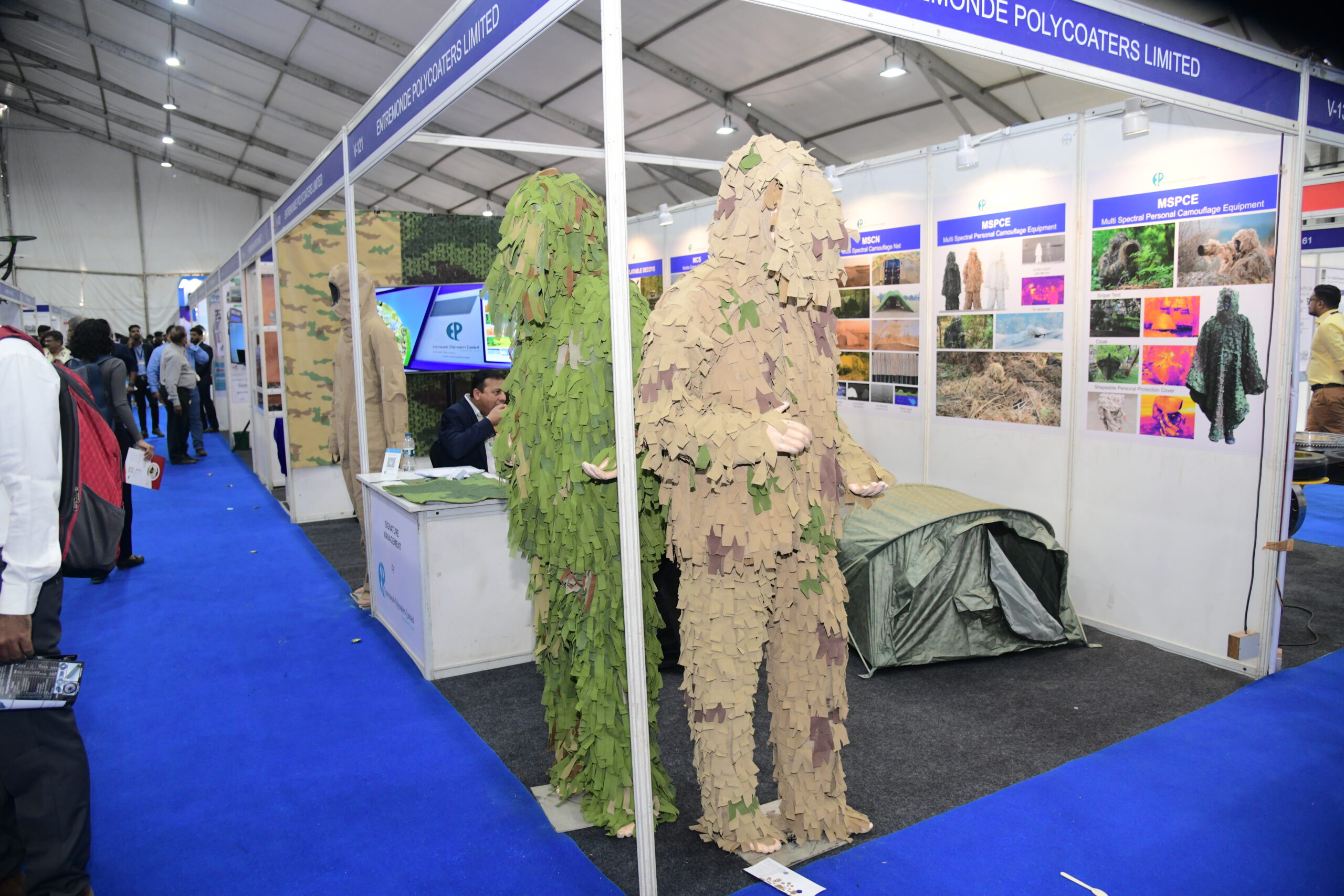
Defence Expo is India’s biennial defence exhibition, backed by the Ministry of Defence, and built around the government’s ‘Make in India’ agenda. Defence Expo is a BIG event and draws military officials, global defence manufacturers, and international delegations. As a leading event branding company in India, Angle Advt was brought in to handle the big event: physical infrastructure, spatial experience, branding, safety, documentation, and promotions. And, we built the event environment from scratch.
Project details
Client:
Defence Expo, Ministry of Defence, Government of India
Location :
Moshi, Pune
Industry :
Defence and Government
Service :
End-to-End Event Execution
Project Type :
Event branding & execution
Completion :
2024
Verticals :
Stall fabrication Spatial Design LED and Lighting Marketing and Promotions Photography Videography
The challenge
Defence Expo is a Government of India event representing domestic defence capabilities to an international audience, so every detail carries a reputational consequence. And it definitely couldn’t be treated as a standard event.
The physical challenge was real: We were building on a blank site, with imported aluminium hangars, full air-conditioning, and separate functional zones for VIPs, media, and general delegates, all within a fixed timeline and compliance requirements set by the government.
But the harder challenge was perception. People who attend this big event carry calibrated expectations shaped by international defence events. If the environment feels improvised or visually inconsistent, the credibility of the event suffers. The brief was to build an event that was delivered with confidence and maintained the credibility of the client.
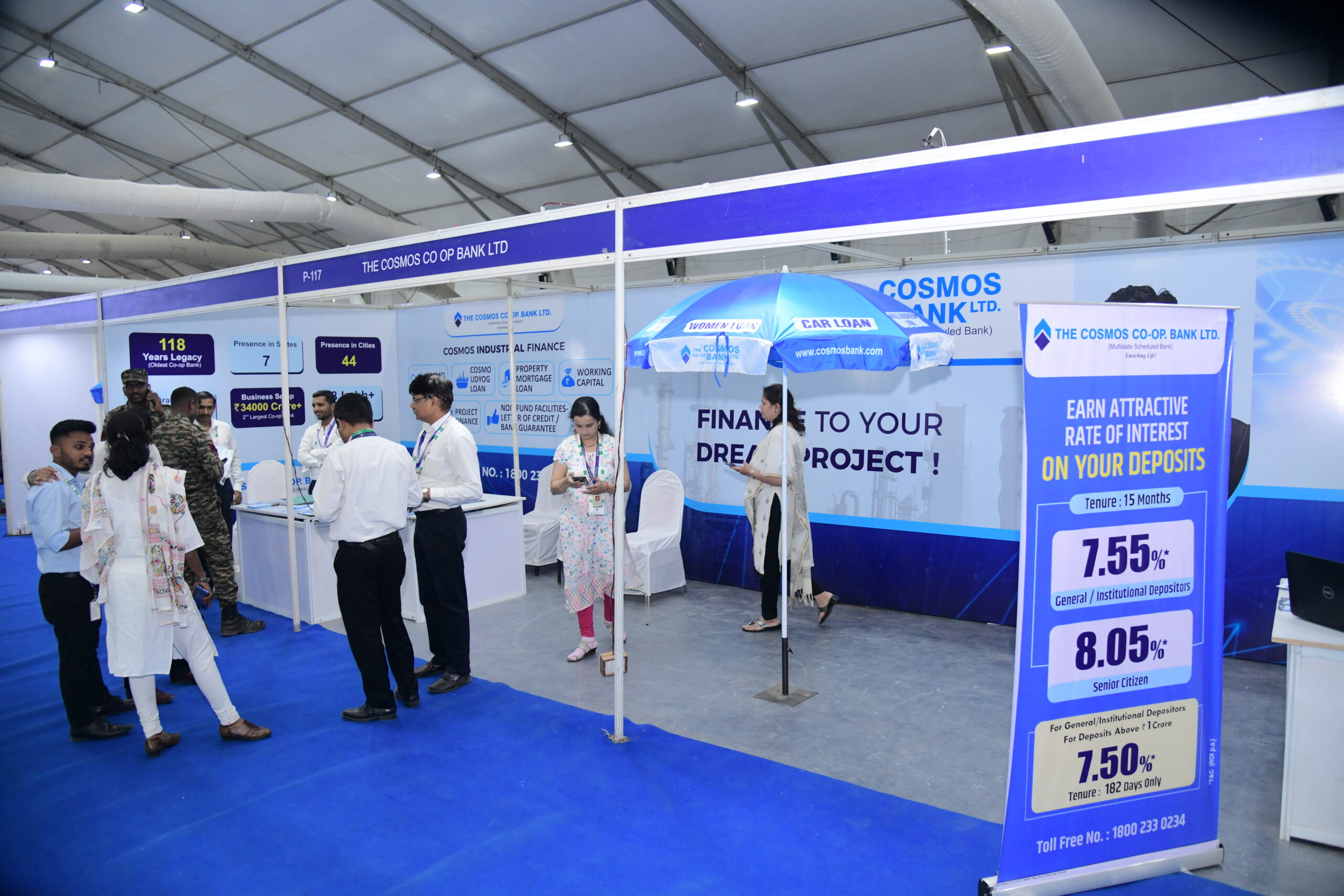
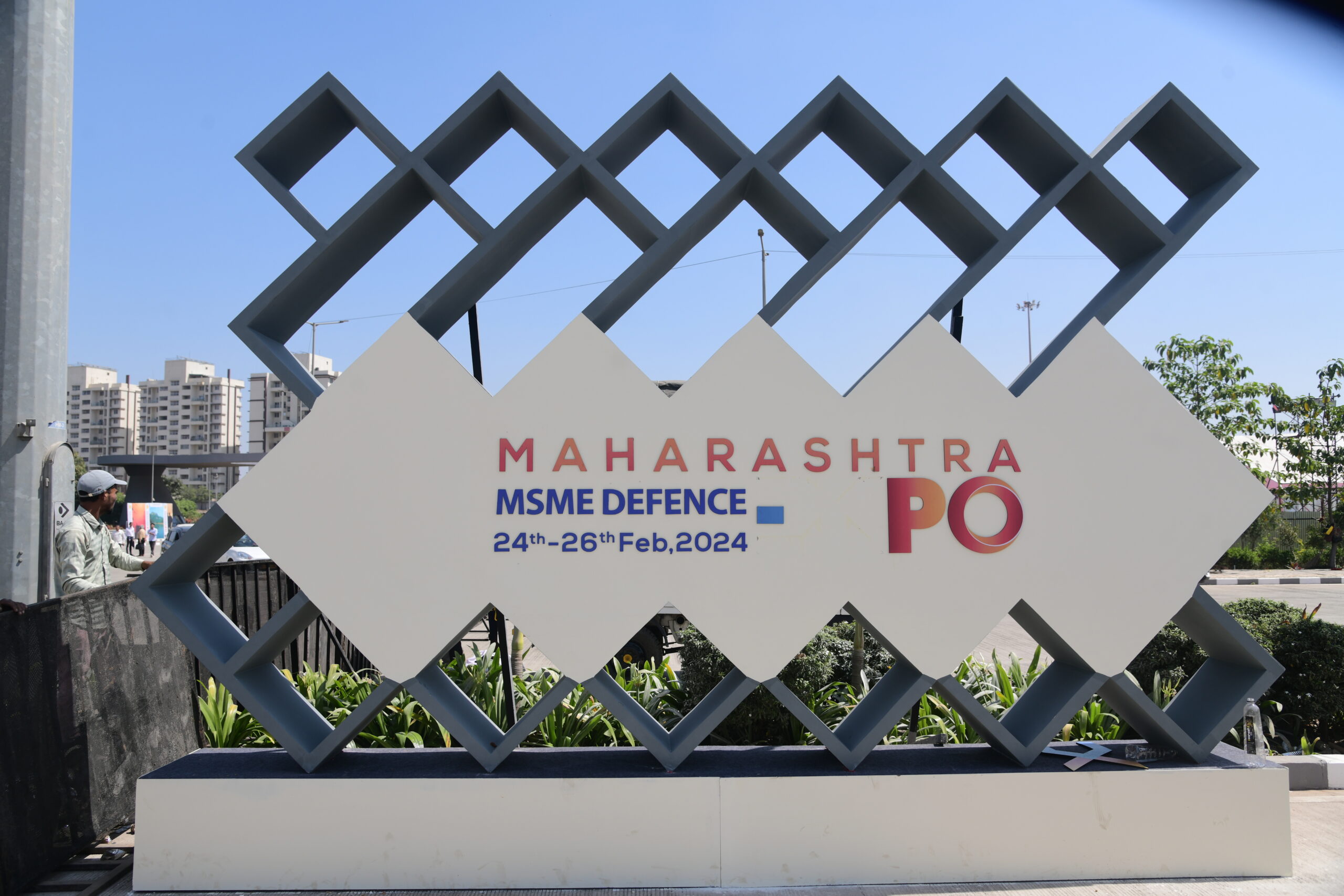
Moodboard
Brand moodboard and ecosystem
The B2B audience at this big event, government officials, procurement heads, and global defence manufacturers, reads environments the way they read proposals. Visual disorder signals operational disorder. So the spatial language was built on structure: industrial textures, metallic finishes, geometric precision, and a controlled colour palette. Nothing decorative for its own sake.
The B2C audience of this big event, visitors and general attendees, needed a different emotional trigger: scale, national pride, and awe. The same environment needed to deliver both. The event design had to work on two registers simultaneously.
Identity design
Brand identity design
Typography for the big event’s branding was chosen for readability at distance, across large-format signage and entry gates where a visitor processes information in under three seconds. We opted for bold, structured letterforms with tight tracking, instead of decorative fonts.
The colour palette was grounded, and proudly represented the defence and engineering sectors use restraint as a signal of reliability. Saffron because it roots the event in India without making that reference heavy-handed.
Wayfinding was designed around how people move in unfamiliar large venues: they look for landmarks before they look for signs. So each zone had a distinct visual anchor. It was designed to let visitors know where they were before they read anything.
Visualisation
Brand visualisations
The full venue was modelled in 3D before fabrication began.
This was not purely aesthetic. When you are managing multiple stakeholders at a big event, including government officials, security teams, and operations crews, a visual model is the most efficient shared reference point. Everyone is looking at the same thing. Strategic decisions were made about placement, flow, and proportion before we began with the installation.
Hangar structures, zone boundaries, branding placements, entry arches, and visitor pathways were all mapped. What was built on-site matched what was approved in the model. That alignment is what keeps a project at this big scale from unravelling.
Execution
Final execution
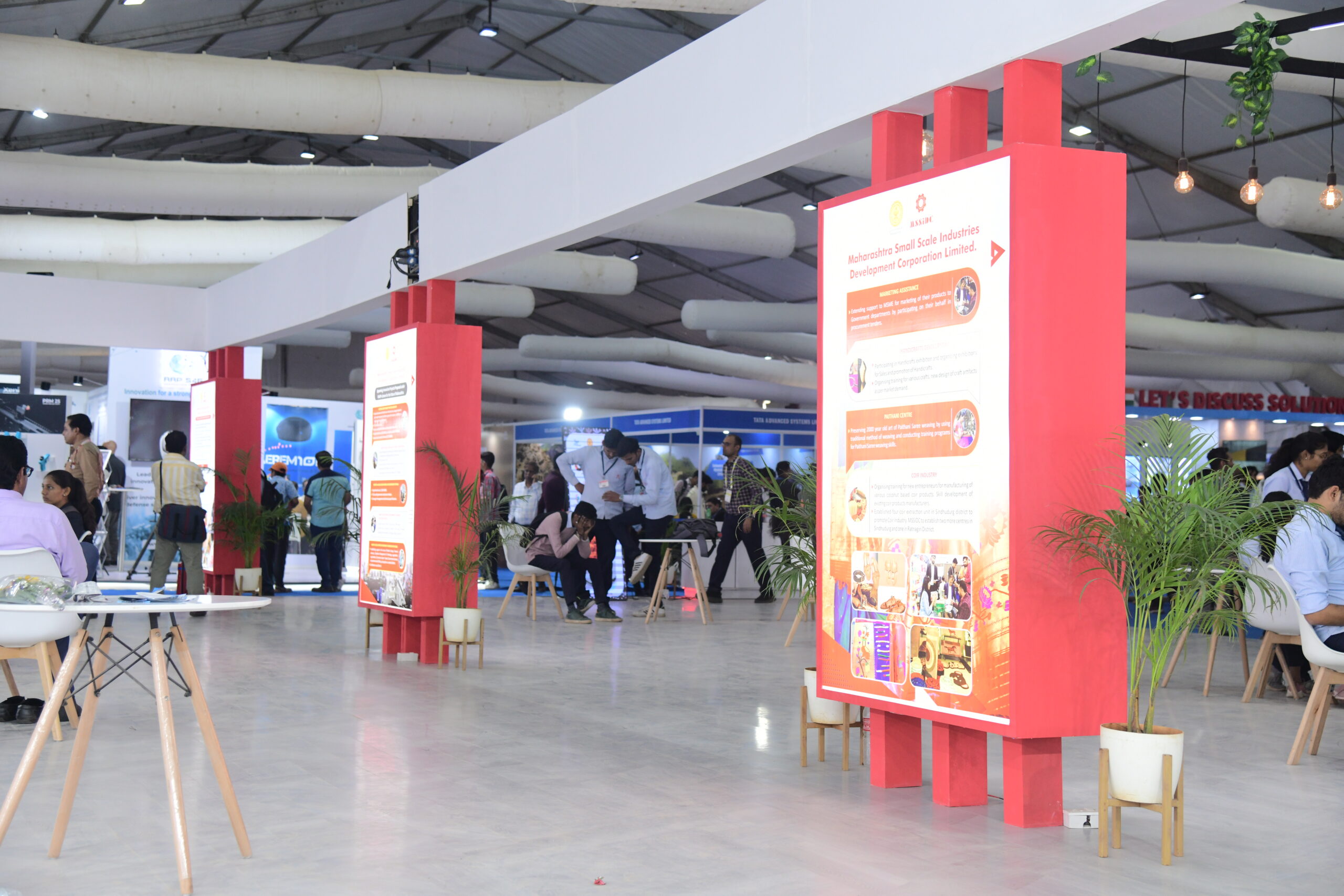
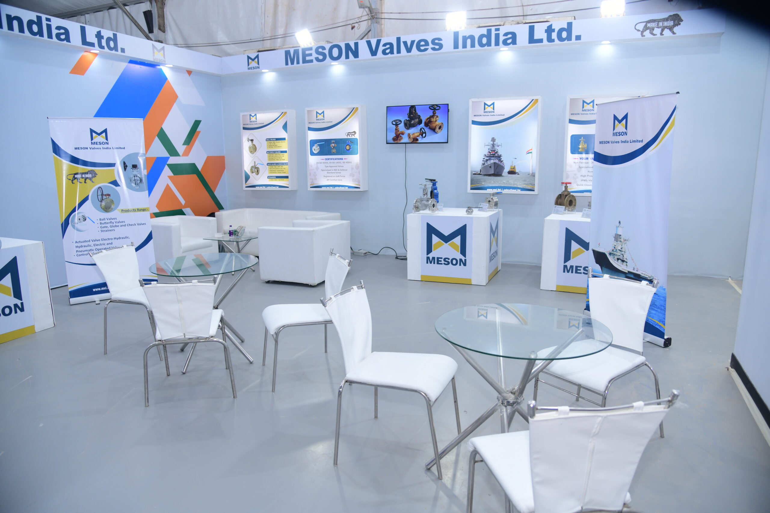
Imported aluminium hangars were installed for the big event, air-conditioned, and maintained across all three days. Each zone, VIP rooms, media lounge, kitchen, and service areas, was fully furnished and operational before the first delegate arrived.
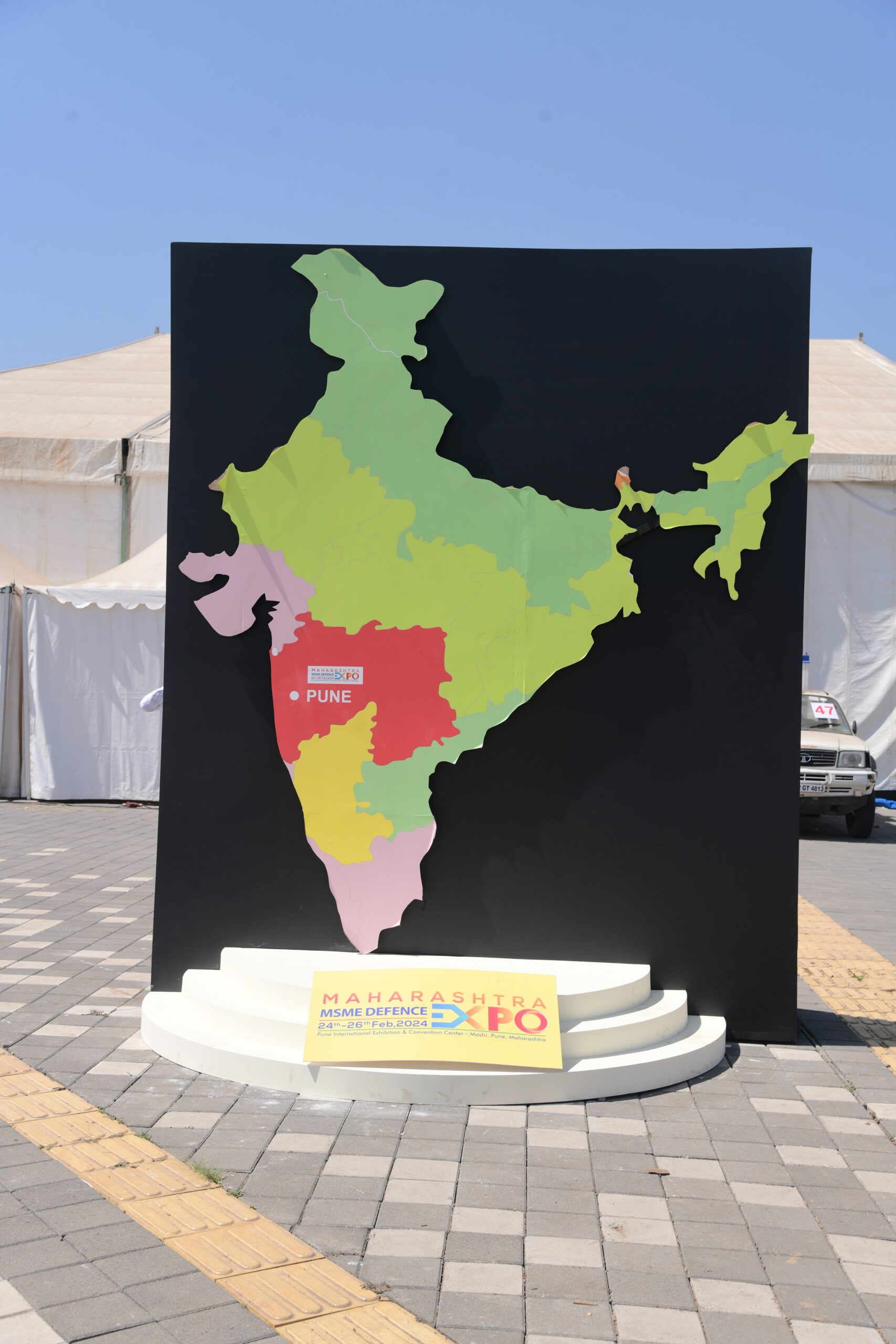
Entry gates, architectural lighting, and LED screen installations were set up to create a consistent spatial experience from arrival to exit.
A parallel campaign running across outdoor hoardings, social media, and newspaper placements drove pre-event visibility and footfall. The big event ran across three days without operational disruption. Every zone performed as designed, and the environment held up through full attendance.
Our Approch
Brand Moodboard
And Ecosystem
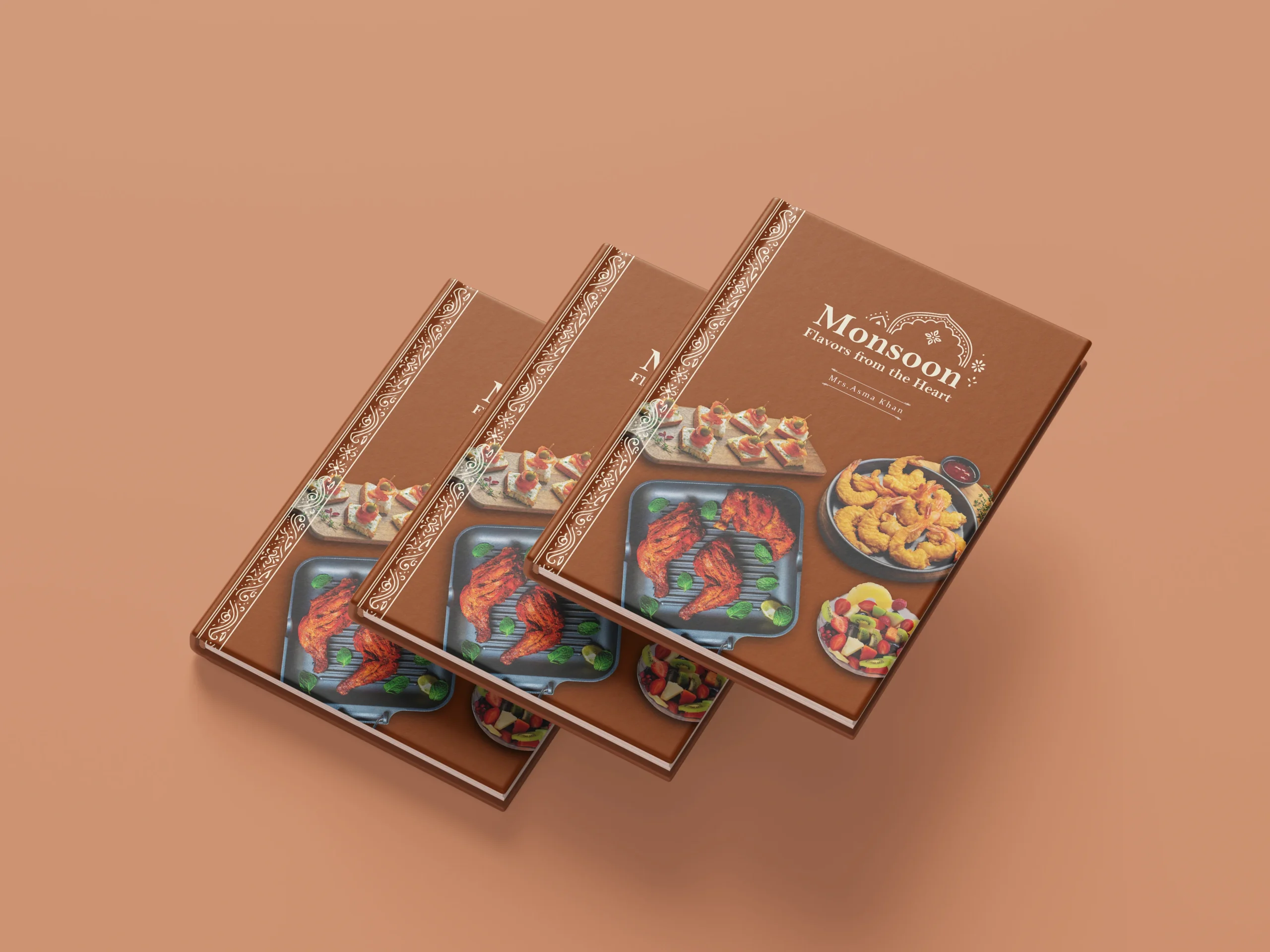
Darjeeling Express speaks to three kinds of people. Those who are enthusiasts of Indian food and know exactly what they are looking for. Those who miss the feeling of a home cooked meal and come to the table looking for that comfort. And those with a curiosity for flavour, who seek out dining experiences that are layered, interesting, and genuinely different.
Every element on the moodboard had to work across all three. The terracottas, deep teals, and saffrons carried cultural warmth without alienating anyone. The serif typography felt inherited rather than designed. The imagery of women cooking, shared plates, and quiet rituals was chosen so that everyone who walked in, regardless of where they came from, found something that felt meant for them.
Restaurant Brand
Identity Design
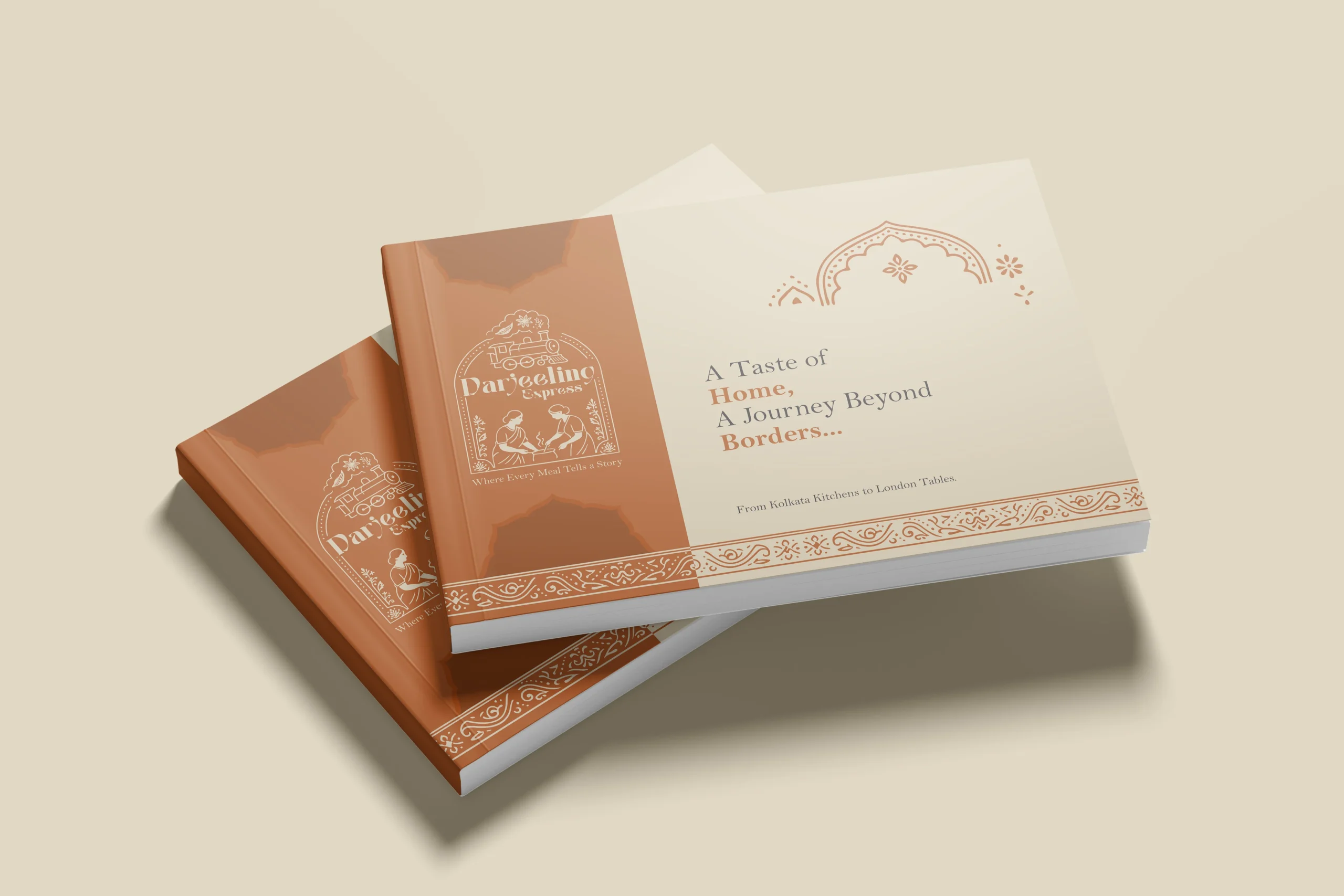
In a dining scene full of typographic marks and minimal identities, illustration was a strategic choice. We needed the restaurant brand to communicate what Darjeeling Express stands for before anyone reads a word. A clean logomark could never carry that weight. Only a fully realised illustrative mark could.
The mark brings together the Darjeeling train and the women who define the restaurant. Two things that are inseparable from the brand’s identity, and instantly recognisable as its own.
We developed two colour directions. Deep teal for quiet authority and cultural depth, a palette that signals credibility without loudness. Warm terracotta for familiarity and belonging, the colour equivalent of walking into somewhere that already feels like home. Both directions solve the same strategic problem differently: how do you make a brand impossible to confuse with anything else in the market.
Brand Visualisation
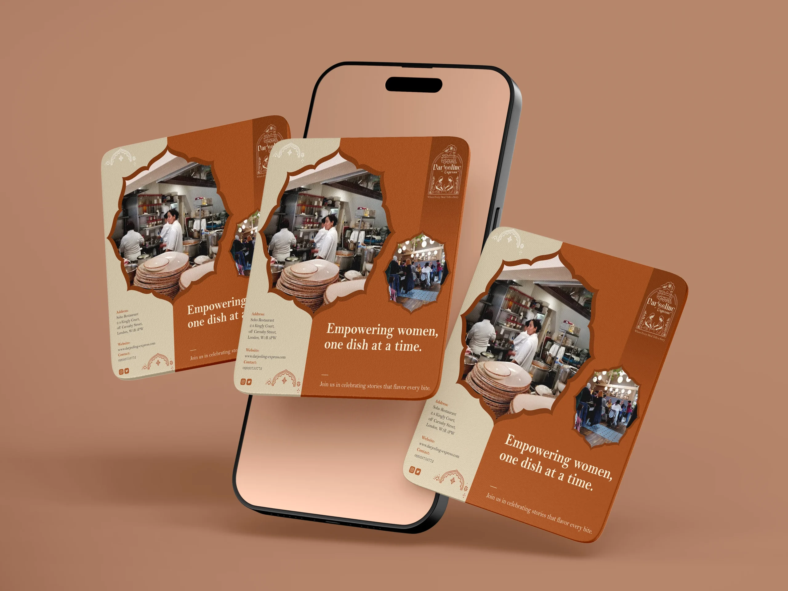
We designed our creatives similar to how we visualised it. And for the final visualisation, this was the part where everything came together. Seeing the identity move from a moodboard into real applications, menus, packaging, digital templates, and watching it hold up across all of them was genuinely satisfying. The palettes translated beautifully across print and screen, and the illustrated mark never lost its character no matter the scale. From a small stamp on a menu to a full printed board, it always looked like it belonged. That kind of consistency does not happen by accident. It comes from getting the foundations right.
Final Execution
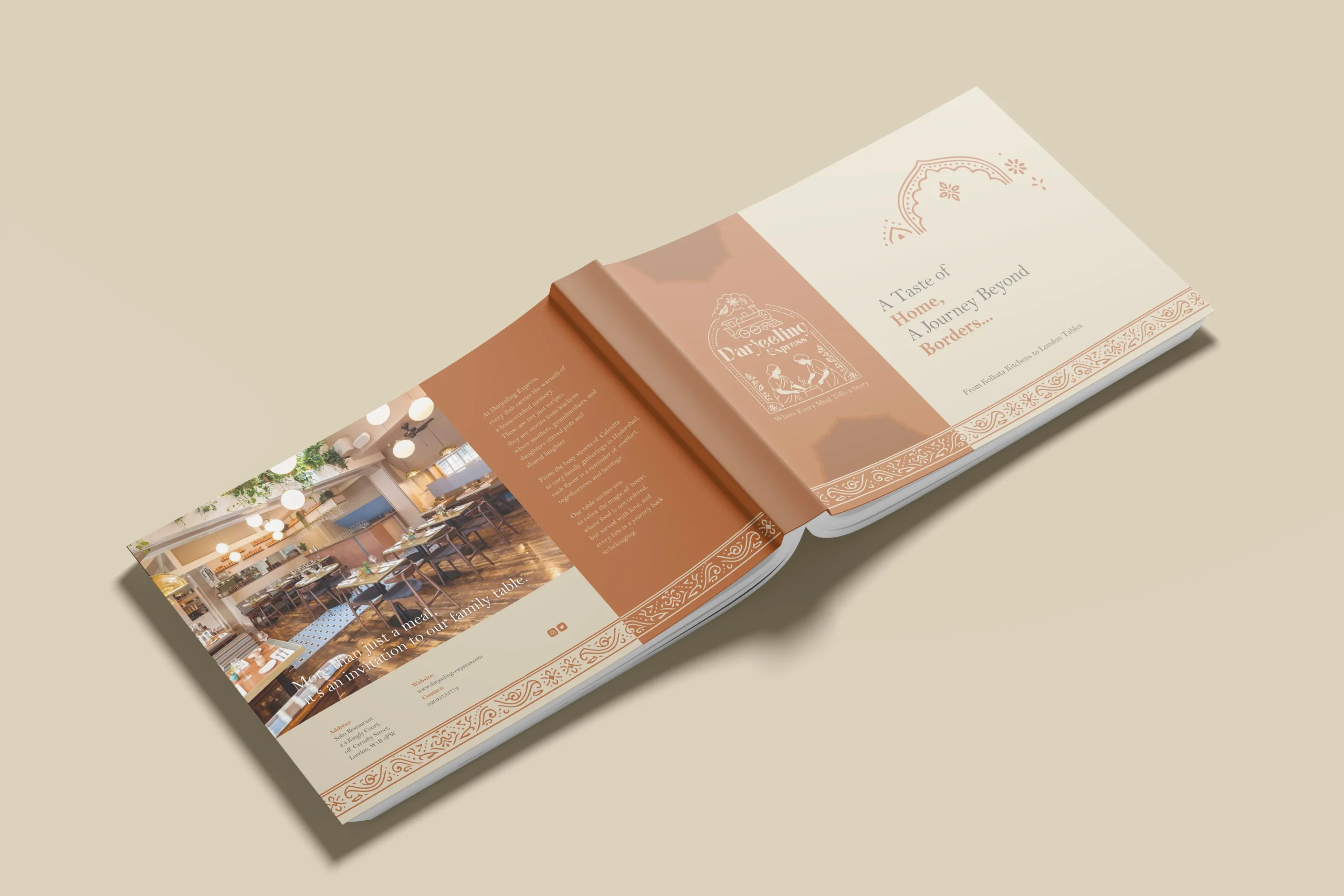
Handing over a project is always a mix of emotions, but mostly pride. With Darjeeling Express, it felt like sending something into the world that was genuinely ready. The full brand system, guidelines, print-ready files, and digital assets, all built to be used confidently without us in the room.
The value chain here is straightforward. We built Darjeeling Express a coherent, confident identity they could own completely. Darjeeling Express used that identity to show up consistently across every touchpoint, digital and physical. And their customers felt the difference, because the experience of the brand now began long before anyone walked through the door. What we create for our clients ultimately shapes what their clients feel. That is the point.
Project highlights
The strategic read
Before anything was designed, we had to understand how this specific audience would experience the space. Defence and government delegates are detail-oriented by profession. A misaligned sign, a poorly lit corridor, a VIP zone that feels off putting, all of these things are registered. The strategy was to design an environment where nothing prompted that kind of doubt.
Psychology built Iinto the layout
Spatial sequencing was used deliberately. Entry points were designed to create a sense of arrival and access. VIP zones were positioned and visually differentiated in ways that communicated hierarchy without signage alone. The media lounge had sightlines and access that made coverage easier. Human behaviour inside large venues follows predictable patterns. We designed with those patterns, not around them.
The outcome
A mega 3-day government defence exhibition executed without incident, at international quality standards, from a site that started as empty ground, drawing 3 lakh visitors.
Packaging design
Being the leading packaging design agency in India, we approached Darjeeling Express packaging through a data driven lens, grounding every decision in consumer behavior. Studies show 68% of consumers associate premium packaging with higher food quality, while 45% are influenced by visual appeal alone, making first impressions critical. We translated this into sturdy, well-structured formats and a consistent visual system of color, typography, and brand elements to strengthen recall. Our analysis also highlighted that packaging ranks among the top drivers of repeat purchase in foodservice, often outperforming ads and reviews. Each design choice was made to signal professionalism, trigger emotional connection, and justify value. The result is packaging that not only delivers food but extends the brand experience, reinforcing identity with every interaction.