

Coffee Table Book Design for a NGO
Vanarai is a Maharashtra-based environmental organisation that has spent four decades reviving land, restoring water, and rebuilding rural livelihoods across India. Being the leading branding agency in India, Angle Advertising was brought in to give this legacy the visual weight it deserves, designing a commemorative coffee table book and social media creatives that could communicate forty years of transformation with honesty, warmth, and authority.
Project details
Client:
Vanarai
Location :
PAN Maharashtra
Industry :
Environmental NGO / Rural Development
Service :
Publication Design, Social Media Design
Project Type :
Brand Communication and Publication Design
Completion :
2025
Verticals :
Coffee table book design, Cover design, Social media carousel design, Visual identity application
The challenge
For forty years, Vanarai NGO worked at an enormous scale. But the organisation’s visual communication had not kept pace with the magnitude of what it had built. The NGO needed a single publication that could sit in front of a donor, a policymaker, or a new volunteer and tell the whole story in a way that compelled belief.
The core authority behind this project was the NGO’s milestone year, four decades of measurable, ground-level impact. That required a coffee table book and social media system that could reach younger, digitally native audiences without losing the credibility that older institutional supporters expected. Angle Advertising was brought in to bridge both and to build a visual language that could hold a legacy without making it feel like an archive.
Moodboard
Brand moodboard and ecosystem
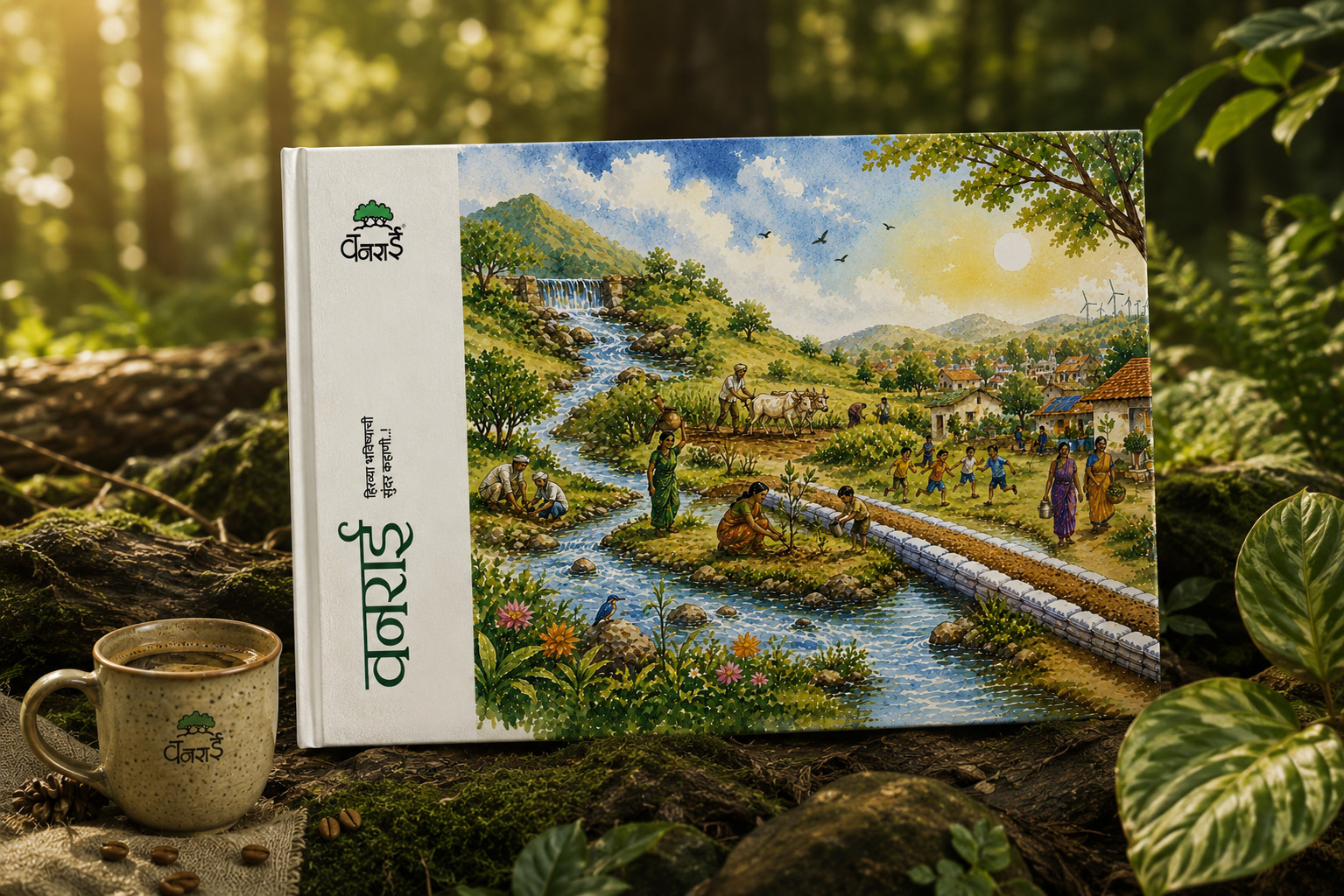
The NGO’s visual world was built from the land itself. Deep forest greens, dappled canopy light, the warm cream of dry soil before the rains – every colour reference came from the ground Vanarai works on. The typography of the NGO coffee table book leaned on Devanagari as a mark of cultural belonging to the villages of Maharashtra. Illustration, watercolour-inflected and hand-rooted, carried the human stories alongside the numbers.
The coffee table book was designed for two distinct audiences of the NGO. For B2B stakeholders including institutional donors, corporate partners, and policymakers, the coffee table book and editorial system needed to signal credibility and permanence. For B2C audiences including individual supporters, volunteers, and social media followers, the carousel content needed immediacy, warmth, and a visual vocabulary accessible enough to stop a scroll.
Identity design
Brand Identity Design
Three cover directions were developed for the NGO coffee table book, each solving the same brief through a different lens. The dark aerial cover used a deep forest photograph overlaid with a rich green wash. Green was chosen because it is the literal proof of the NGO’s work, the colour of land restored. The sunlit forest cover introduced light breaking through the canopy, a deliberate choice to evoke hope and continuity. The clean editorial cover pulled back to a near-white ground, letting the NGO logotype carry the full visual weight, with its Devanagari letterforms filled with forest photography.
The Devanagari script was treated as the primary NGO brand expression. Vanarai [वनराई] is a Marathi word rooted in Maharashtra, and every typographic decision reinforced that belongingness. The India based NGO’s primary visual style is elaborate illustrations. For the social media system, the illustrated visual language was chosen to differentiate the NGO in a feed dominated by photography and data graphics.
Visualisation
Brand visualisations
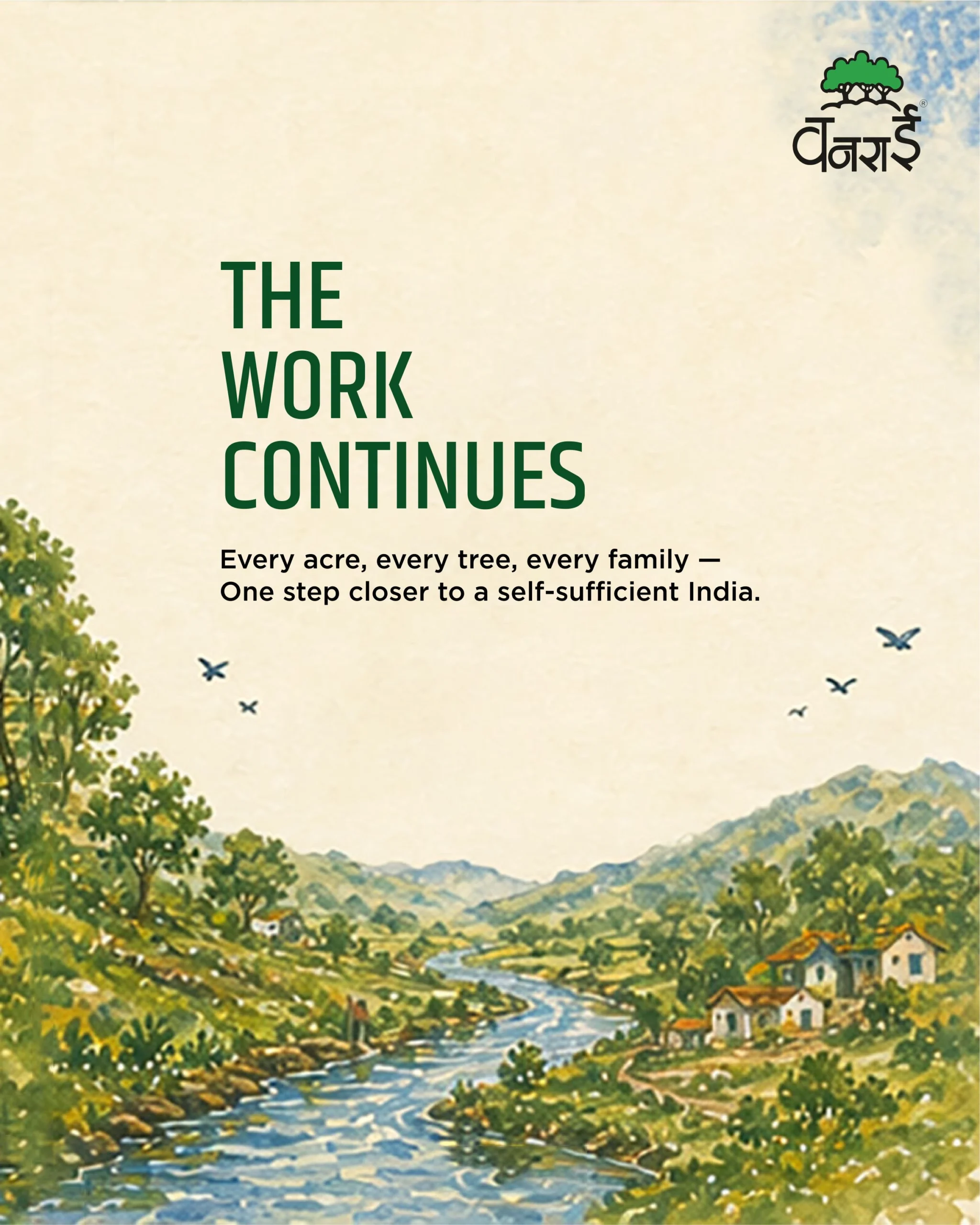
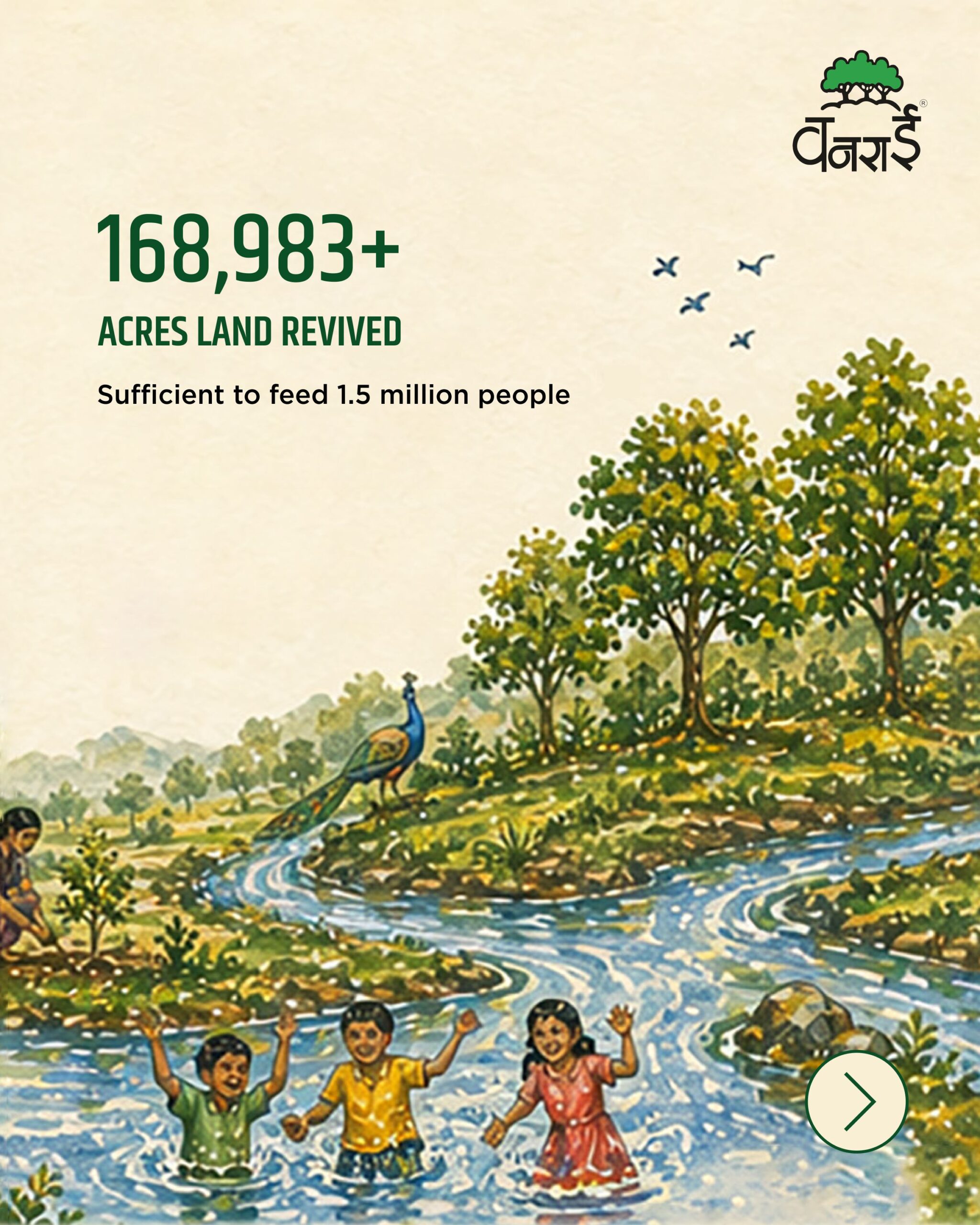
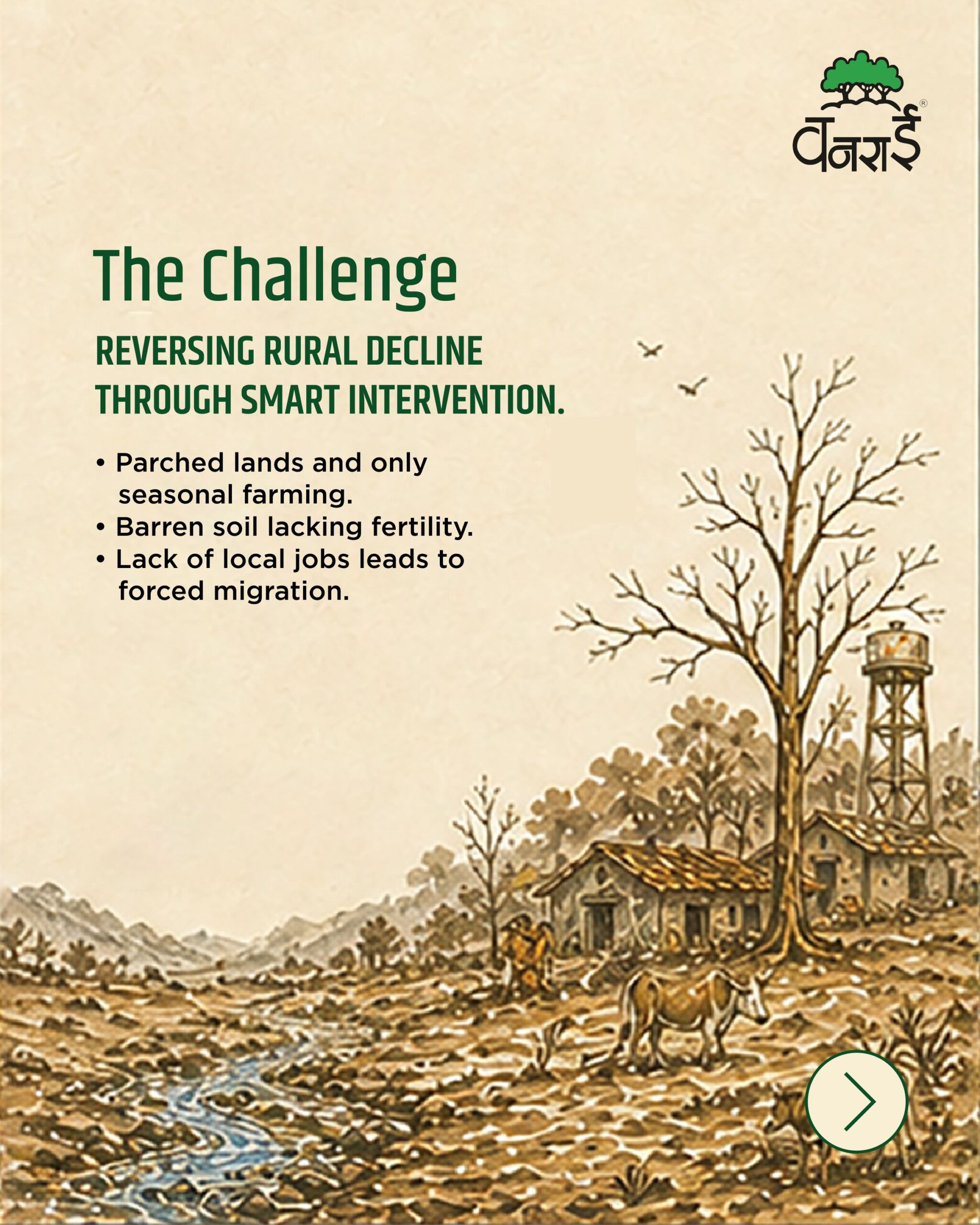
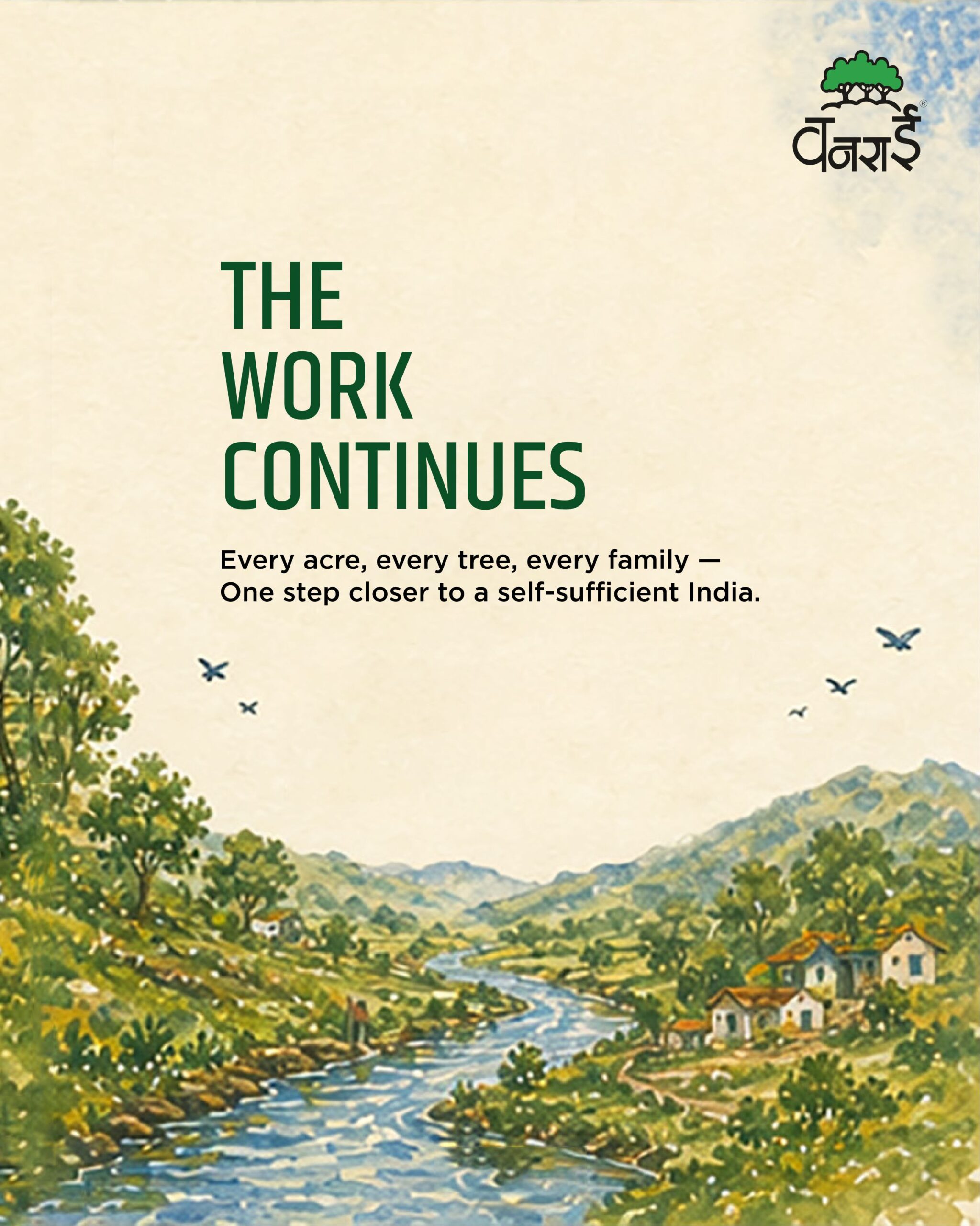
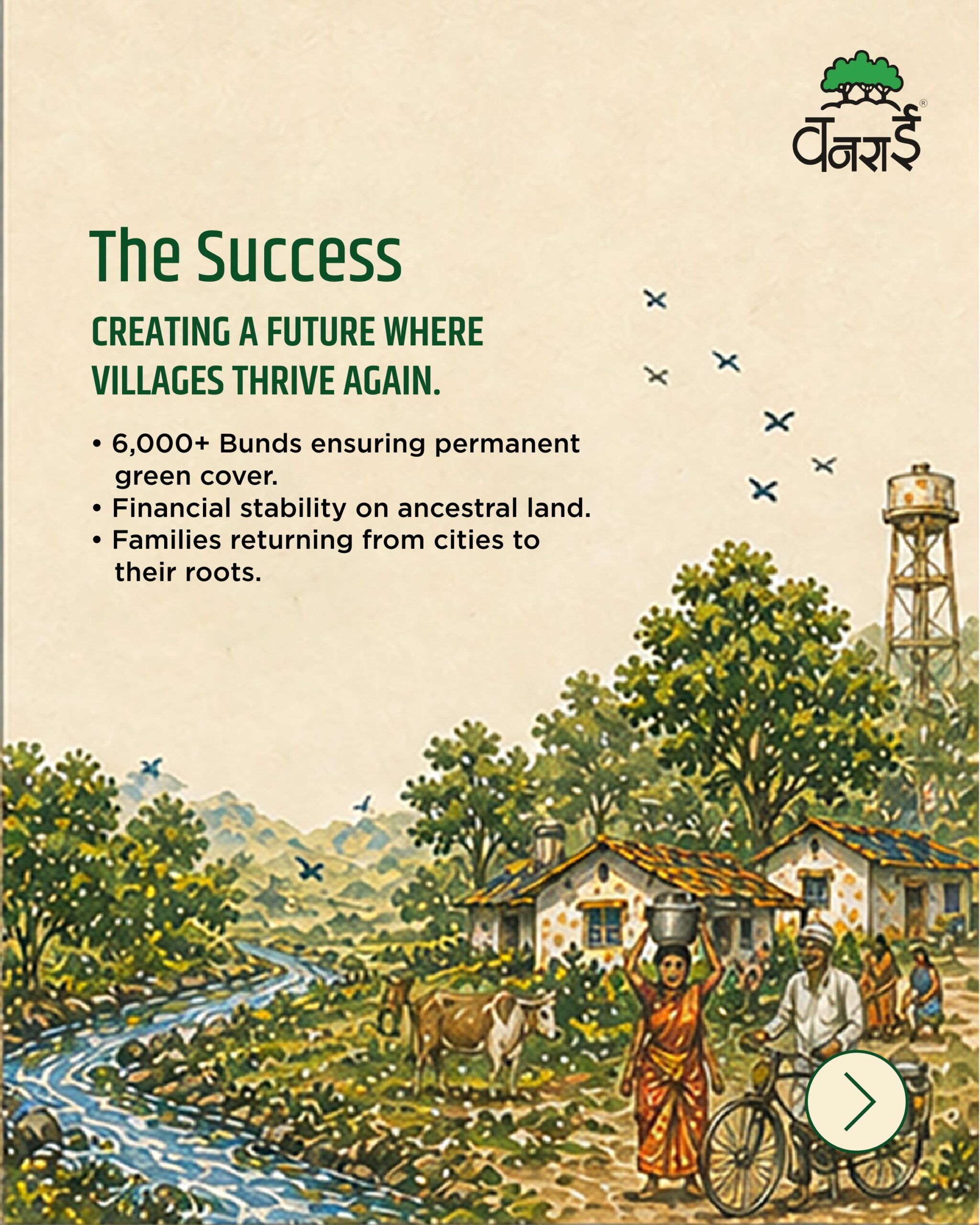
The brand came to life most fully in application. Across the coffee table book, the identity shifted confidently to clean and editorial, demonstrating range without losing coherence. On social media, the eight-panel carousel moved from challenge to transformation, with watercolour illustrations of rivers, farmers, trees, and villages sitting alongside impact numbers. Each panel was held as a standalone post and built as part of a sequence, giving the NGO a content system that worked in fragments and in full. The taglines appeared consistently across every touchpoint, anchoring the visual system in a single line of purpose.
Execution
Final execution
The delivered system included a comprehensive coffee table book with a complete interior layout framework, and a full eight-panel social media carousel in production-ready formats. Every digital piece was built for independent use, with no interpretation needed from Angle’s side to deploy them correctly.
The impact of the coffee table book design execution extends beyond aesthetics. The NGO’s work touches 4.8 million people’s food security annually, has created water potential for over 33 million people, and has revived more than 168,000 acres of land. The coffee table book design system now matches that scale, giving the NGO a communication asset capable of unlocking institutional partnerships, donor confidence, and sustained public engagement at the organisation’s next chapter.
Our Approch
Brand Moodboard
And Ecosystem
Darjeeling Express speaks to three kinds of people. Those who are enthusiasts of Indian food and know exactly what they are looking for. Those who miss the feeling of a home cooked meal and come to the table looking for that comfort. And those with a curiosity for flavour, who seek out dining experiences that are layered, interesting, and genuinely different.
Every element on the moodboard had to work across all three. The terracottas, deep teals, and saffrons carried cultural warmth without alienating anyone. The serif typography felt inherited rather than designed. The imagery of women cooking, shared plates, and quiet rituals was chosen so that everyone who walked in, regardless of where they came from, found something that felt meant for them.
Restaurant Brand
Identity Design
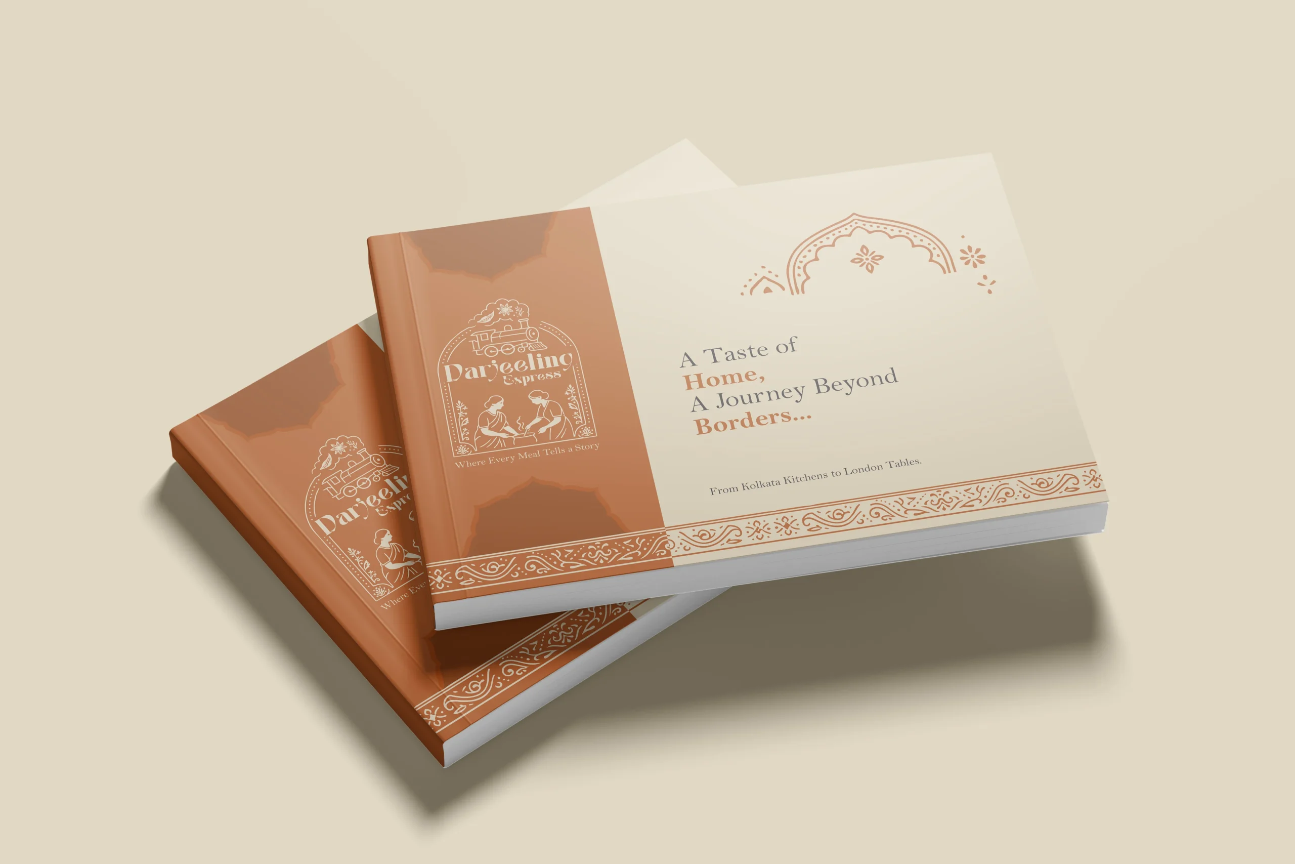
In a dining scene full of typographic marks and minimal identities, illustration was a strategic choice. We needed the restaurant brand to communicate what Darjeeling Express stands for before anyone reads a word. A clean logomark could never carry that weight. Only a fully realised illustrative mark could.
The mark brings together the Darjeeling train and the women who define the restaurant. Two things that are inseparable from the brand’s identity, and instantly recognisable as its own.
We developed two colour directions. Deep teal for quiet authority and cultural depth, a palette that signals credibility without loudness. Warm terracotta for familiarity and belonging, the colour equivalent of walking into somewhere that already feels like home. Both directions solve the same strategic problem differently: how do you make a brand impossible to confuse with anything else in the market.
Brand Visualisation
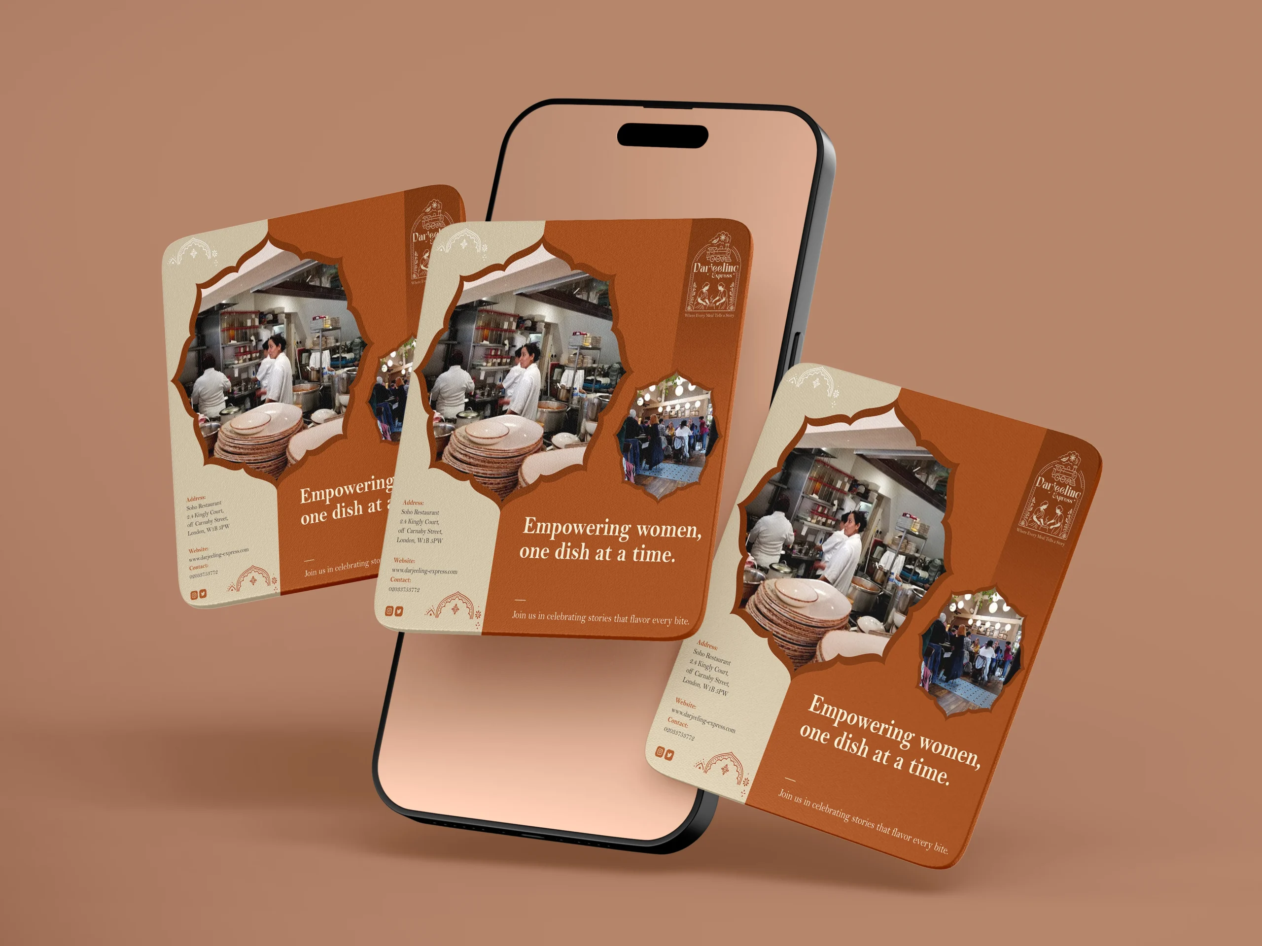
We designed our creatives similar to how we visualised it. And for the final visualisation, this was the part where everything came together. Seeing the identity move from a moodboard into real applications, menus, packaging, digital templates, and watching it hold up across all of them was genuinely satisfying. The palettes translated beautifully across print and screen, and the illustrated mark never lost its character no matter the scale. From a small stamp on a menu to a full printed board, it always looked like it belonged. That kind of consistency does not happen by accident. It comes from getting the foundations right.
Final Execution
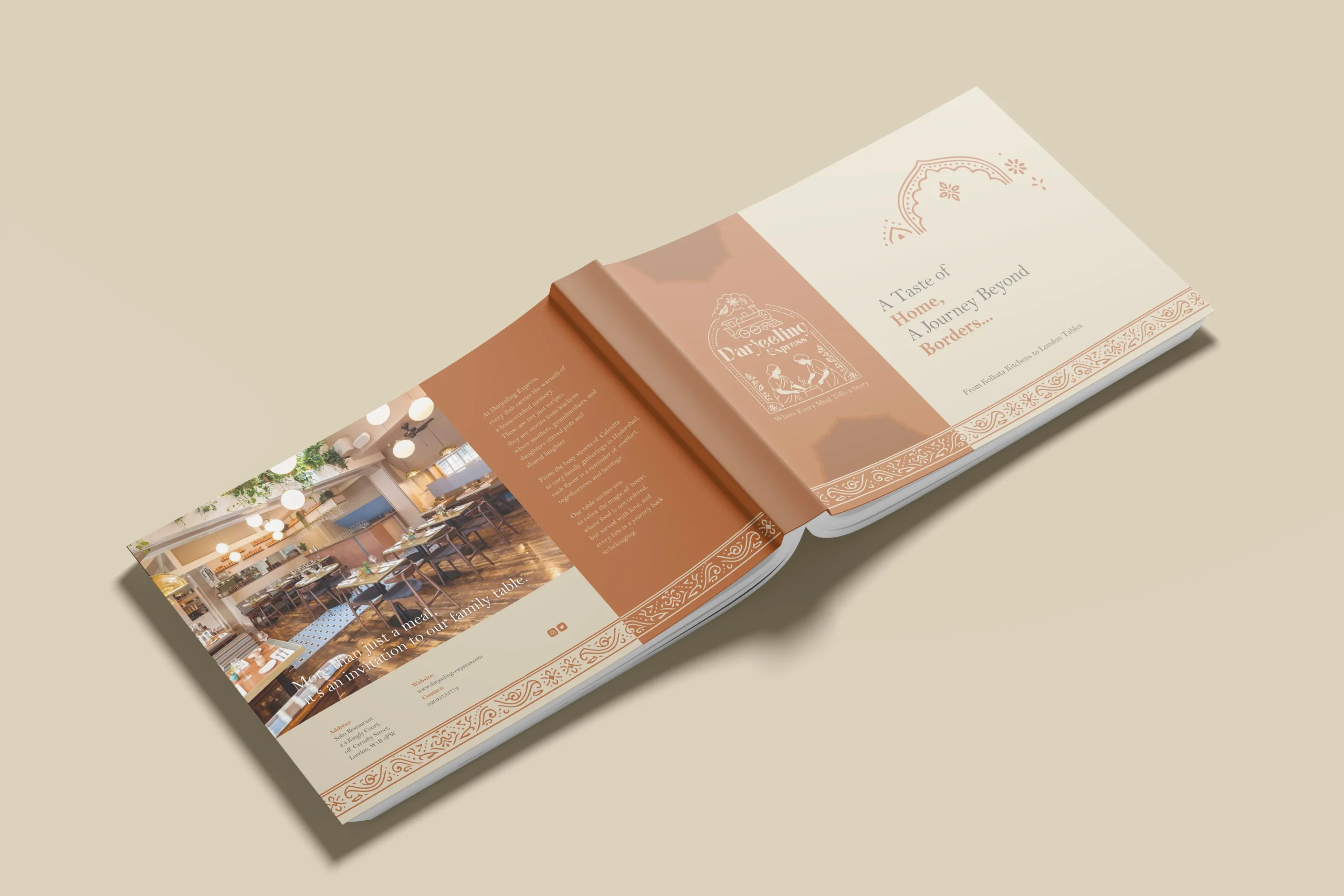
Handing over a project is always a mix of emotions, but mostly pride. With Darjeeling Express, it felt like sending something into the world that was genuinely ready. The full brand system, guidelines, print-ready files, and digital assets, all built to be used confidently without us in the room.
The value chain here is straightforward. We built Darjeeling Express a coherent, confident identity they could own completely. Darjeeling Express used that identity to show up consistently across every touchpoint, digital and physical. And their customers felt the difference, because the experience of the brand now began long before anyone walked through the door. What we create for our clients ultimately shapes what their clients feel. That is the point.
Project highlights
The Devanagari NGO logotype treatment
On the editorial cover of the coffee table book, the name of the NGO is set large in Devanagari with forest photography mapped inside the letterforms. It is the strongest single moment in the project, where identity and environment become literally inseparable.
One United Voice
The coffee table book directions, dark aerial, sunlit canopy, and clean editorial demonstrate how one brand exists beautifully across various verticals.
Illustration in the carousel
The watercolour-style rural illustrations across the social media carousel gave human weight to numbers that could otherwise feel abstract. Farmers, rivers, and children make forty years of work feel present tense.
Packaging design
Being the leading packaging design agency in India, we approached Darjeeling Express packaging through a data driven lens, grounding every decision in consumer behavior. Studies show 68% of consumers associate premium packaging with higher food quality, while 45% are influenced by visual appeal alone, making first impressions critical. We translated this into sturdy, well-structured formats and a consistent visual system of color, typography, and brand elements to strengthen recall. Our analysis also highlighted that packaging ranks among the top drivers of repeat purchase in foodservice, often outperforming ads and reviews. Each design choice was made to signal professionalism, trigger emotional connection, and justify value. The result is packaging that not only delivers food but extends the brand experience, reinforcing identity with every interaction.