

Event Management for Maharashtra Government
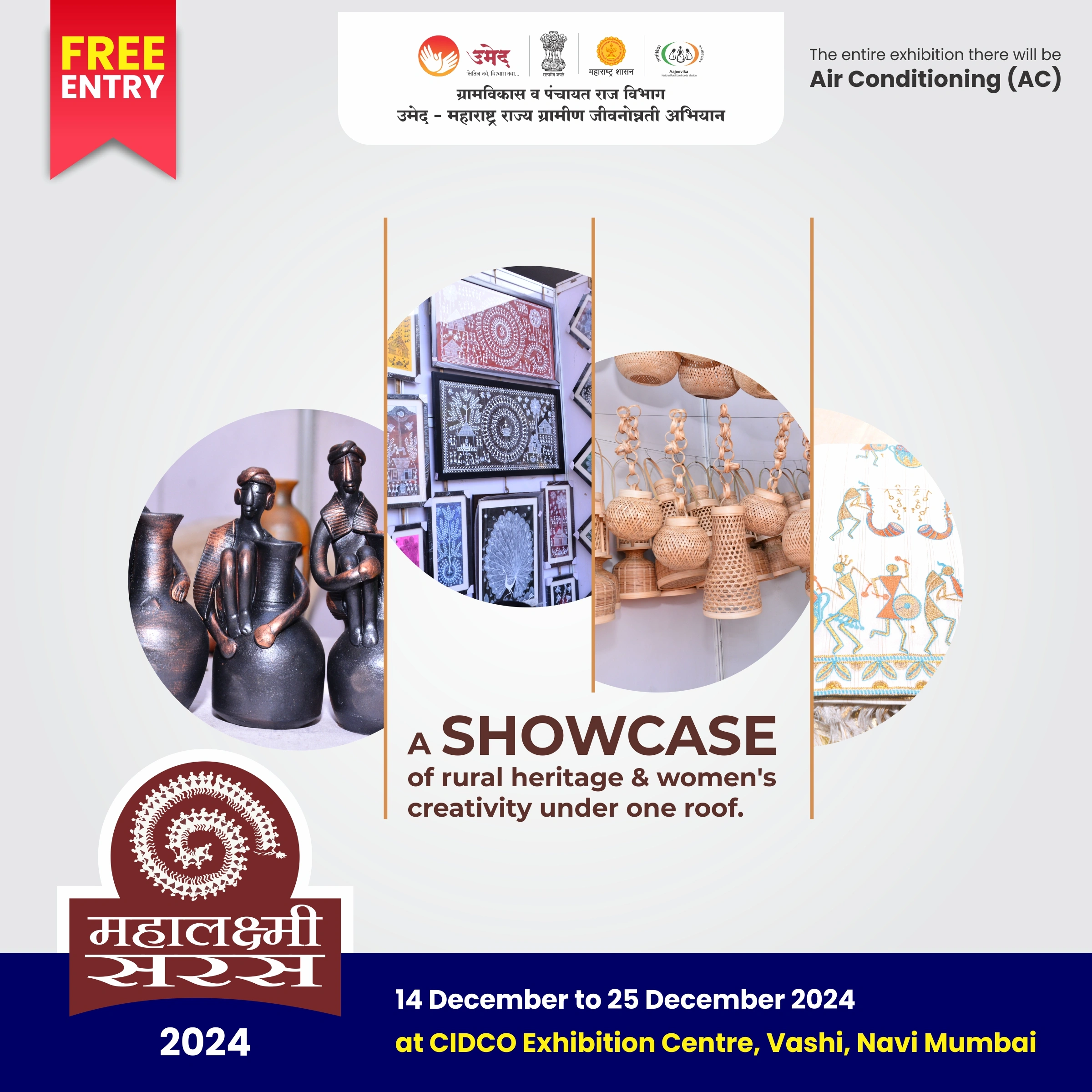
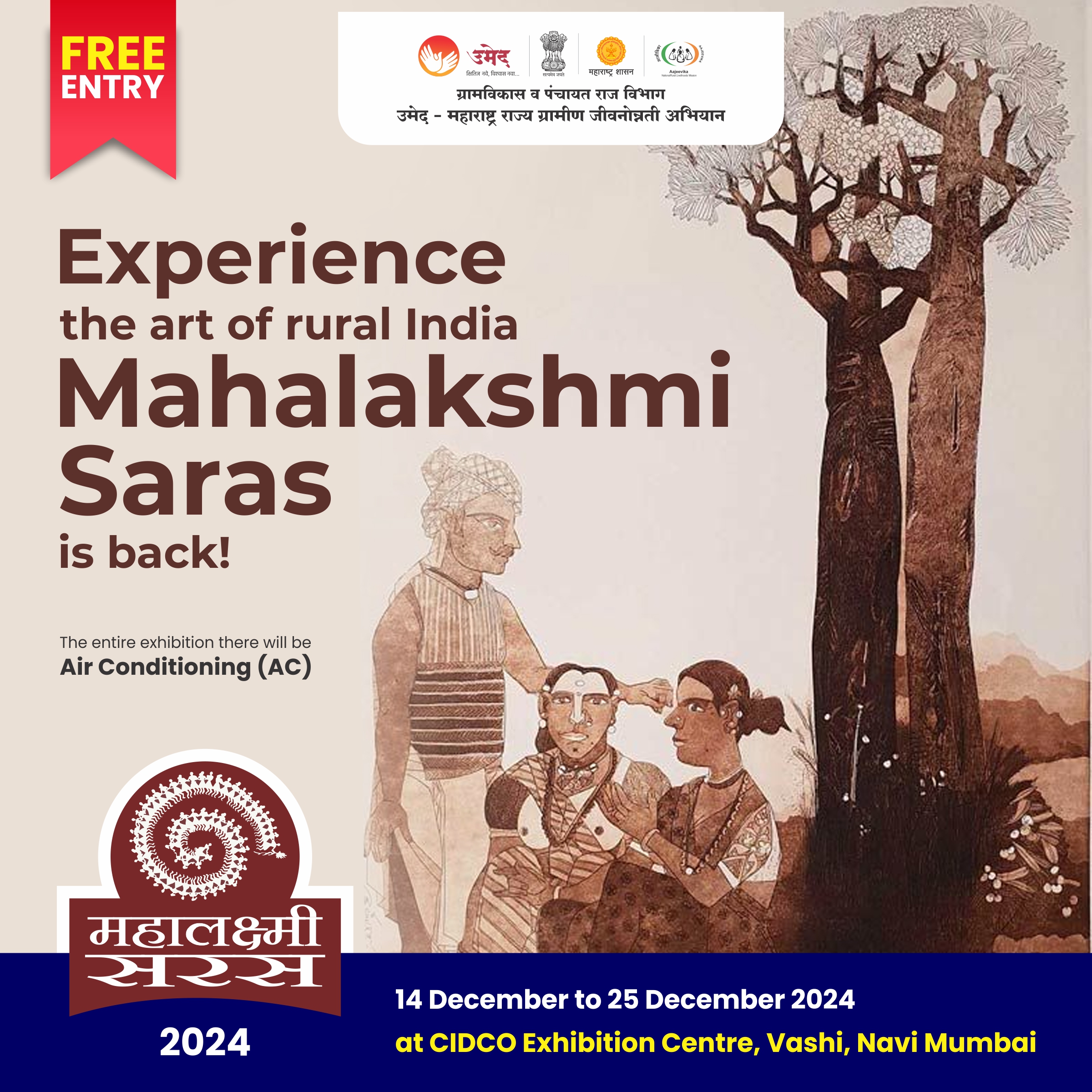
Maharashtra State Rural Livelihoods Mission (MSRLM), is a state-level mission that organises rural women into Self-Help Groups across Maharashtra, giving them a platform to build livelihoods and financial independence. Being the top Events Management company in India, Angle Advt has worked with the rural livelihoods mission for multiple years end-to-end managing their events and their social media presence, and executing their flagship Saras events. Both required understanding a very specific audience and building communication that actually reached them.
Project details
Client:
MSRLM, Government of Maharashtra
Location :
PAN Maharashtra
Industry :
Women, Government, and Rural Development
Service :
Social Media Management, Event Management
Project Type :
Exhibition Event Social Media Management
Completion :
Ongoing 2010 (16 years)
Verticals :
Paid Campaigns, Original Series Production, Event Design and Management, Celebrity Management, Influencer Outreach, On-Ground Promotions Social Media Content Creation
The challenge
The rural livelihoods mission of the Maharashtra Government had a real impact on the ground. Thousands of women across Maharashtra had built products, businesses, and income through their Self-Help Groups. The problem was that the scale and intensity of these women entrepreneurs was not entirely visible. The organisation’s social media reflected that gap, sitting at roughly 3,000 followers with no consistent strategy.
The authority behind this project came from the mission itself. With thousands of SHG women depending on the annual rural trade exhibition for their yearly sales, and the state government needing to demonstrate the programme’s reach, the stakes were really high.
The job was to build a communication presence that matched the scale of what was already happening on the ground, and to drive real footfall and sales at each rural livelihood fair.
Moodboard
Brand moodboard and ecosystem
The event audience split clearly into two groups, and each needed a different approach.
The B2C audience, general visitors and potential customers at rural craft events/exhibitions, responds to warmth, familiarity, and social proof. Seeing a real woman from a village in Vidarbha explain her product on video is more persuasive than any designed graphic. And the content was built around that.
The B2G and broader public audience, government stakeholders, press, and urban followers, needed to see scale, credibility, and impact. Data, reach numbers, and coverage carried that weight.
Both groups were addressed simultaneously, through different content formats running on the same channels.
Identity design
Branding design & execution
The visual language for the government campaign across social media was kept accessible and warm. We decided to opt for clean layouts that could easily be modified according to the regional language and photography that centred the women themselves rather than the organisation. Our vision was clearer than ever. When your subject is 200 empowered women selling handmade products out of 150 stalls, the most compelling creative asset you have is them, not a fancy designed poster.
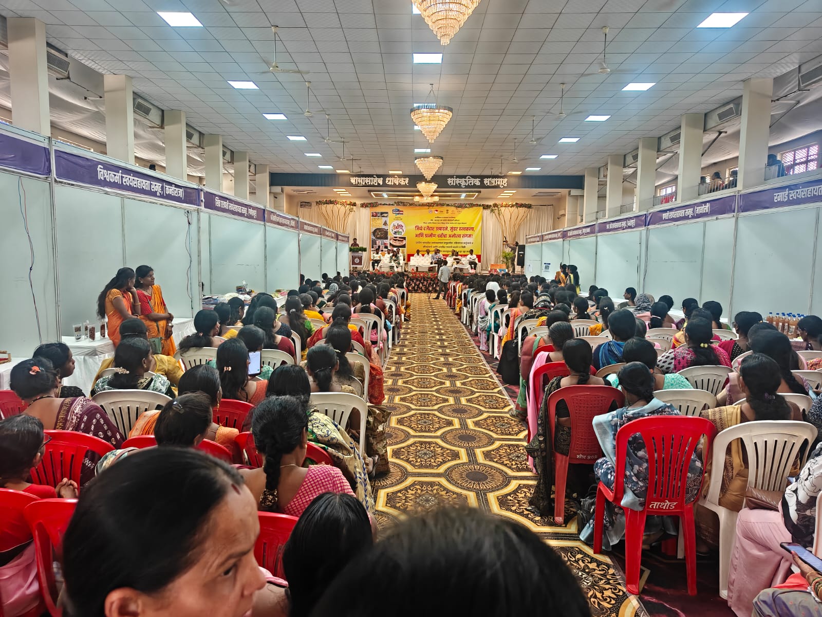
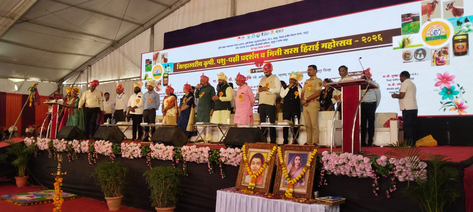
For rural exhibition collateral, stall signage, and community stage design, the visual direction shifted toward colour and energy, reflecting the artisan bazaar atmosphere while maintaining enough structure for wayfinding across vast square feet.
‘Yashogatha’, the original content series, used a documentary tone: handheld filming, natural light, and unscripted conversation. That format builds trust in a way that produced content does not.
Visualisation
Brand visualisations
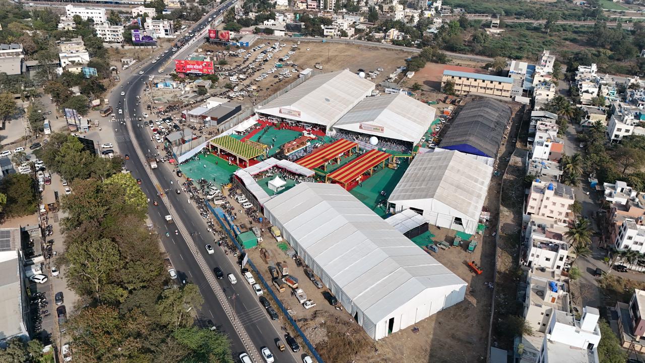
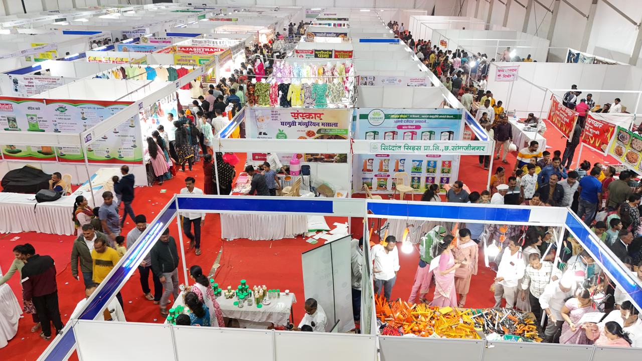
Rural trade fair layouts were planned to manage visitor flow across 150 stalls over 40,000 square feet. Stall placement, entry points, community stage positioning, and high-traffic zones were all mapped before setup began, because how a visitor moves through a self-help group exhibition determines how long they stay and how much they engage.
On the digital side, content calendars, post formats, and the Yashogatha series were structured before production began. Each piece of content was designed to serve a specific function, either driving awareness, building trust, or converting attention into footfall at the next women’s livelihood exhibition.
Execution
Final execution
Social media following grew from 3,000 to 60,000 plus over five years, a 20x increase, through a combination of consistent content, monthly performance audits, and paid campaigns. Multiple videos crossed 1 million views. YouTube livestreams featuring celebrities including Aamir Khan brought significant reach to the rural livelihoods mission’s work.
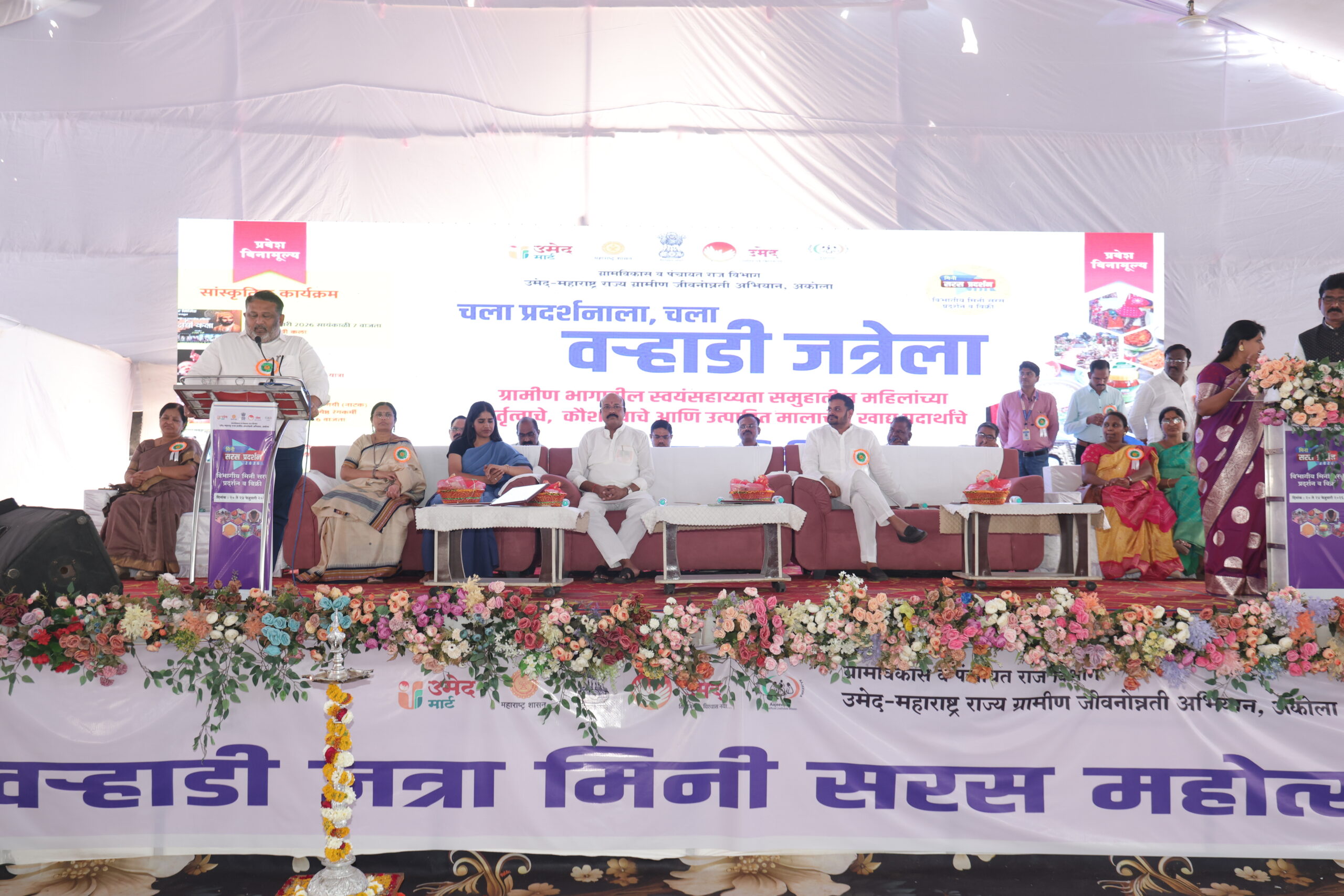
Each women’s livelihood fair ran across five days, averaging 10,000 to 15,000 visitors, with locations like Palghar drawing 75,000. Across 200 SHG women and 150 artisan stalls, total sales per edition ranged from Rs. 70 lakh to Rs. 2 crore. Three to four celebrities and five influencers attended each edition.
Our Approch
Brand Moodboard
And Ecosystem
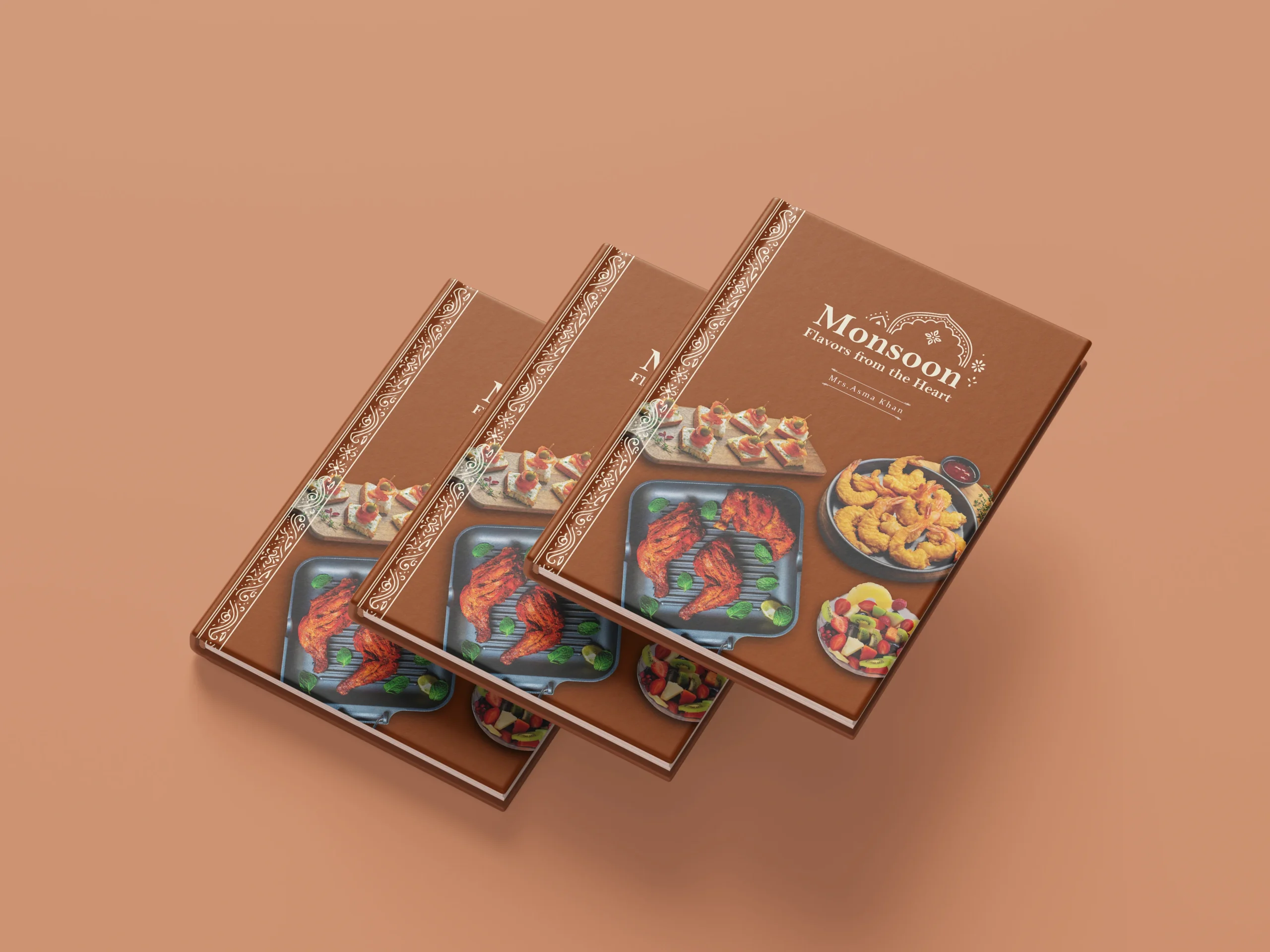
Darjeeling Express speaks to three kinds of people. Those who are enthusiasts of Indian food and know exactly what they are looking for. Those who miss the feeling of a home cooked meal and come to the table looking for that comfort. And those with a curiosity for flavour, who seek out dining experiences that are layered, interesting, and genuinely different.
Every element on the moodboard had to work across all three. The terracottas, deep teals, and saffrons carried cultural warmth without alienating anyone. The serif typography felt inherited rather than designed. The imagery of women cooking, shared plates, and quiet rituals was chosen so that everyone who walked in, regardless of where they came from, found something that felt meant for them.
Restaurant Brand
Identity Design
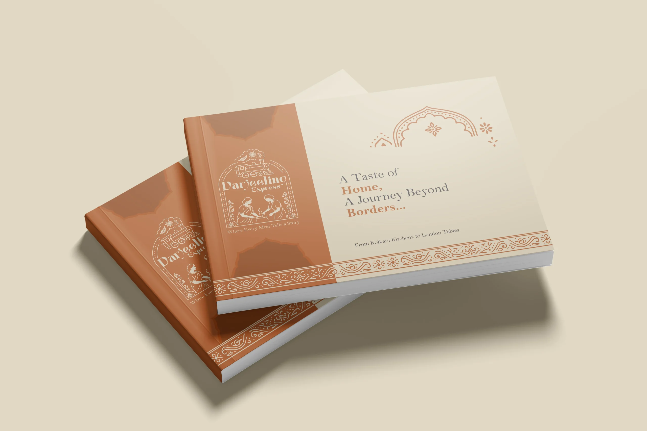
In a dining scene full of typographic marks and minimal identities, illustration was a strategic choice. We needed the restaurant brand to communicate what Darjeeling Express stands for before anyone reads a word. A clean logomark could never carry that weight. Only a fully realised illustrative mark could.
The mark brings together the Darjeeling train and the women who define the restaurant. Two things that are inseparable from the brand’s identity, and instantly recognisable as its own.
We developed two colour directions. Deep teal for quiet authority and cultural depth, a palette that signals credibility without loudness. Warm terracotta for familiarity and belonging, the colour equivalent of walking into somewhere that already feels like home. Both directions solve the same strategic problem differently: how do you make a brand impossible to confuse with anything else in the market.
Brand Visualisation
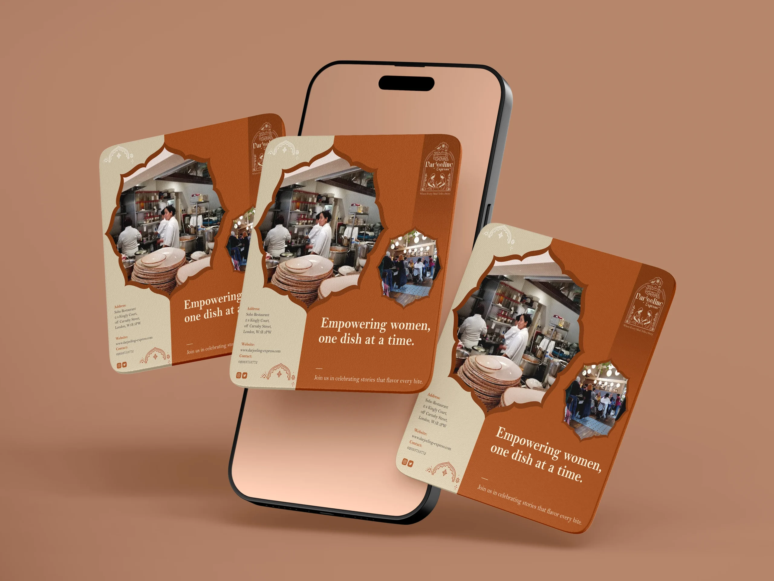
We designed our creatives similar to how we visualised it. And for the final visualisation, this was the part where everything came together. Seeing the identity move from a moodboard into real applications, menus, packaging, digital templates, and watching it hold up across all of them was genuinely satisfying. The palettes translated beautifully across print and screen, and the illustrated mark never lost its character no matter the scale. From a small stamp on a menu to a full printed board, it always looked like it belonged. That kind of consistency does not happen by accident. It comes from getting the foundations right.
Final Execution
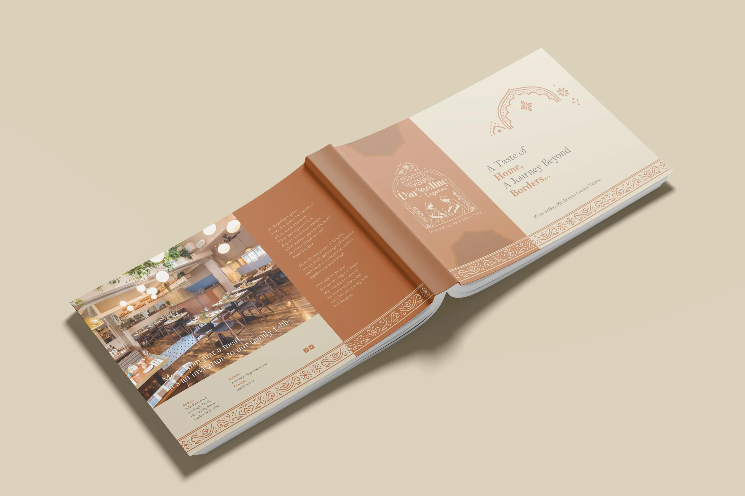
Handing over a project is always a mix of emotions, but mostly pride. With Darjeeling Express, it felt like sending something into the world that was genuinely ready. The full brand system, guidelines, print-ready files, and digital assets, all built to be used confidently without us in the room.
The value chain here is straightforward. We built Darjeeling Express a coherent, confident identity they could own completely. Darjeeling Express used that identity to show up consistently across every touchpoint, digital and physical. And their customers felt the difference, because the experience of the brand now began long before anyone walked through the door. What we create for our clients ultimately shapes what their clients feel. That is the point.
Project highlights
Yashogatha
The most effective content the rural livelihoods mission published was not designed. It was filmed. Yashogatha was built on a simple insight: people trust other people more than they trust organisations. A woman from a rural SHG talking about her business, in her own words, in her own language, reaches the target audience in a way no graphic ever will. The series drove both emotional connection and measurable reach.
Building Footfall Through Social Proof
Celebrity appearances and influencer visits at rural craft exhibitions were the footfall drivers. When someone with an audience shows up at a women's artisan fair and posts about it, it gives undecided visitors a reason to come. That psychology was built into the exhibition strategy from the start.
Five Years, Compounding Results
A 20x follower growth. Rs. 2 crore in sales at a single SHG trade fair. 75,000 visitors in one city. This is the impact of one of many districts in a single year. And this was consistent throughout the years we have been working for them.
Packaging design
Being the leading packaging design agency in India, we approached Darjeeling Express packaging through a data driven lens, grounding every decision in consumer behavior. Studies show 68% of consumers associate premium packaging with higher food quality, while 45% are influenced by visual appeal alone, making first impressions critical. We translated this into sturdy, well-structured formats and a consistent visual system of color, typography, and brand elements to strengthen recall. Our analysis also highlighted that packaging ranks among the top drivers of repeat purchase in foodservice, often outperforming ads and reviews. Each design choice was made to signal professionalism, trigger emotional connection, and justify value. The result is packaging that not only delivers food but extends the brand experience, reinforcing identity with every interaction.