

Packaging Design for a Pune-based Bakery
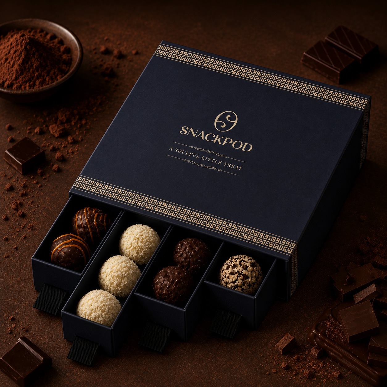
Angle partnered with Snackpod, a Pune based bakery brand, to design a new packaging system. The client is a premium Indian bakery brand known for cakes, cookies, and chocolates. Being the leading branding agency in India, they needed a packaging design that works for massive B2B corporate gifting orders and direct online B2C sales. We started with the chocolate bar as our primary design canvas. Our strategy focused heavily on human behavior. We changed simple product boxes into a layered unboxing experience that builds real emotional value.
We looked closely at how people interact with premium gifts in modern urban environments. By designing the box to open slowly and reveal layers of art, we built a sensory journey. This strategy bridges the gap between high-volume commercial production and the intimate feeling of a custom, artisanal creation.
Project details
Client:
Snackpod
Location :
Pan-India Distribution
Industry :
Gourmet Bakery and Premium Confectionery Gifting
Service :
Packaging Strategy, Structural Design, Print Coordination
Project Type :
B2B and B2C Unified Packaging Identity
Completion :
March 2026
Verticals :
Gift Boxes Custom Wrappers Botanical Layouts
The challenge
The premium bakery market is completely crowded. Brands constantly shout about basic origin stories, ethics, or imported luxury. The real problem was a total lack of deep visual meaning. Most packaging options feel generic and fail to work across different festive occasions. They look flashy but lack soul, leaving consumers feeling disconnected after the initial glance.
In mass corporate giving, the obstacle is psychological. Institutional buyers are not just buying gourmet food. They are buying what the gift says about their own taste and standards. When a company sends out hundreds of gifts, the presentation carries the entire weight of their corporate identity and relationship value.
We had to solve a difficult balance. The boxes had to scale for high-volume commercial printing while feeling completely personal, handcrafted, and specific. Our mission was to bring genuine human warmth back into the transactional world of corporate exchange.
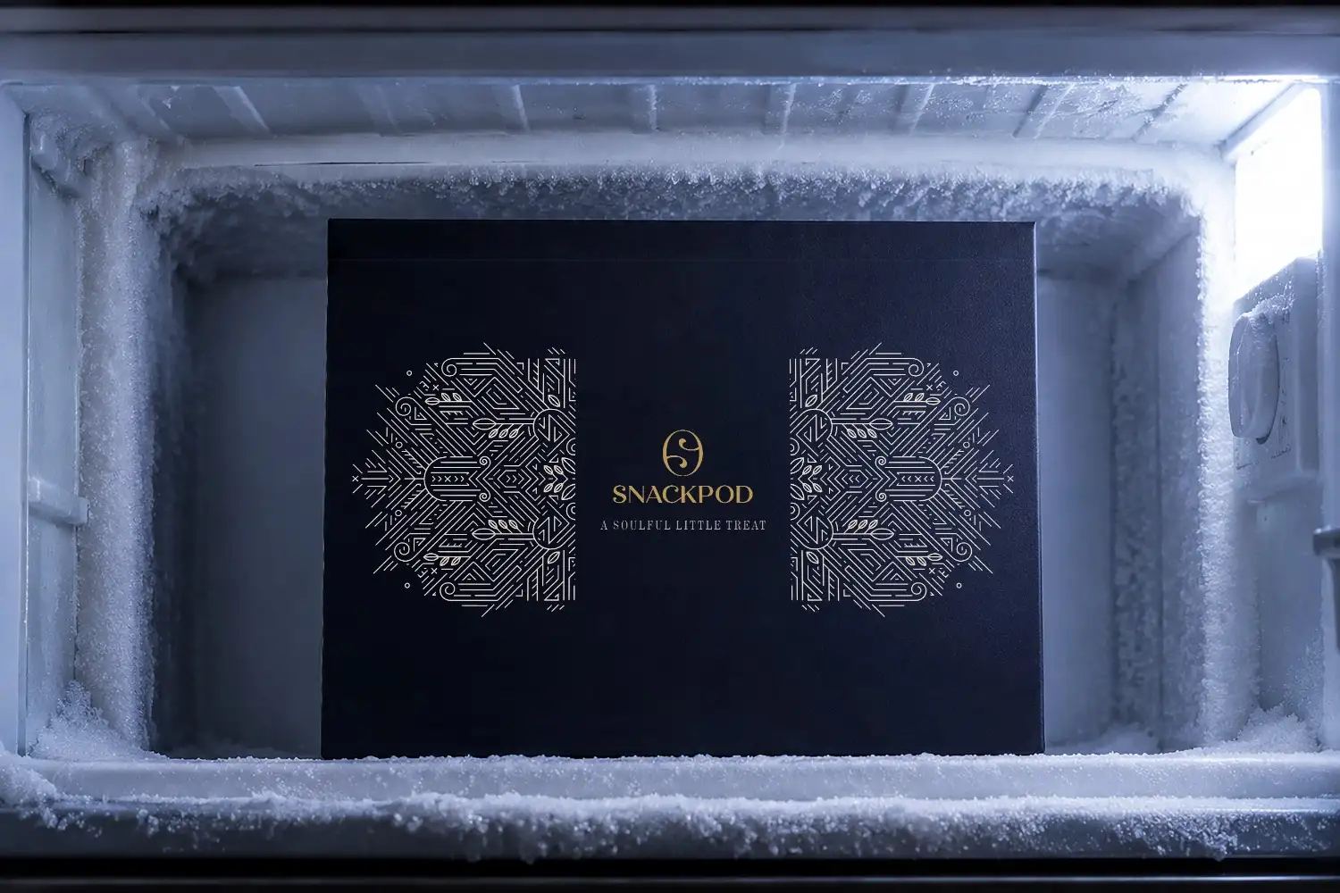
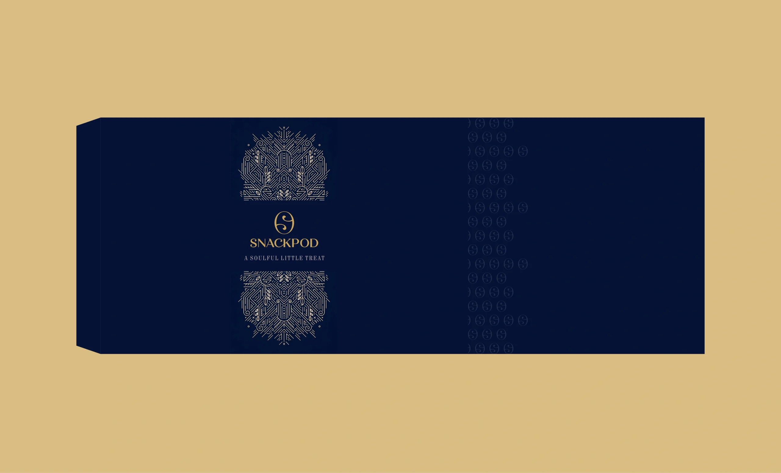
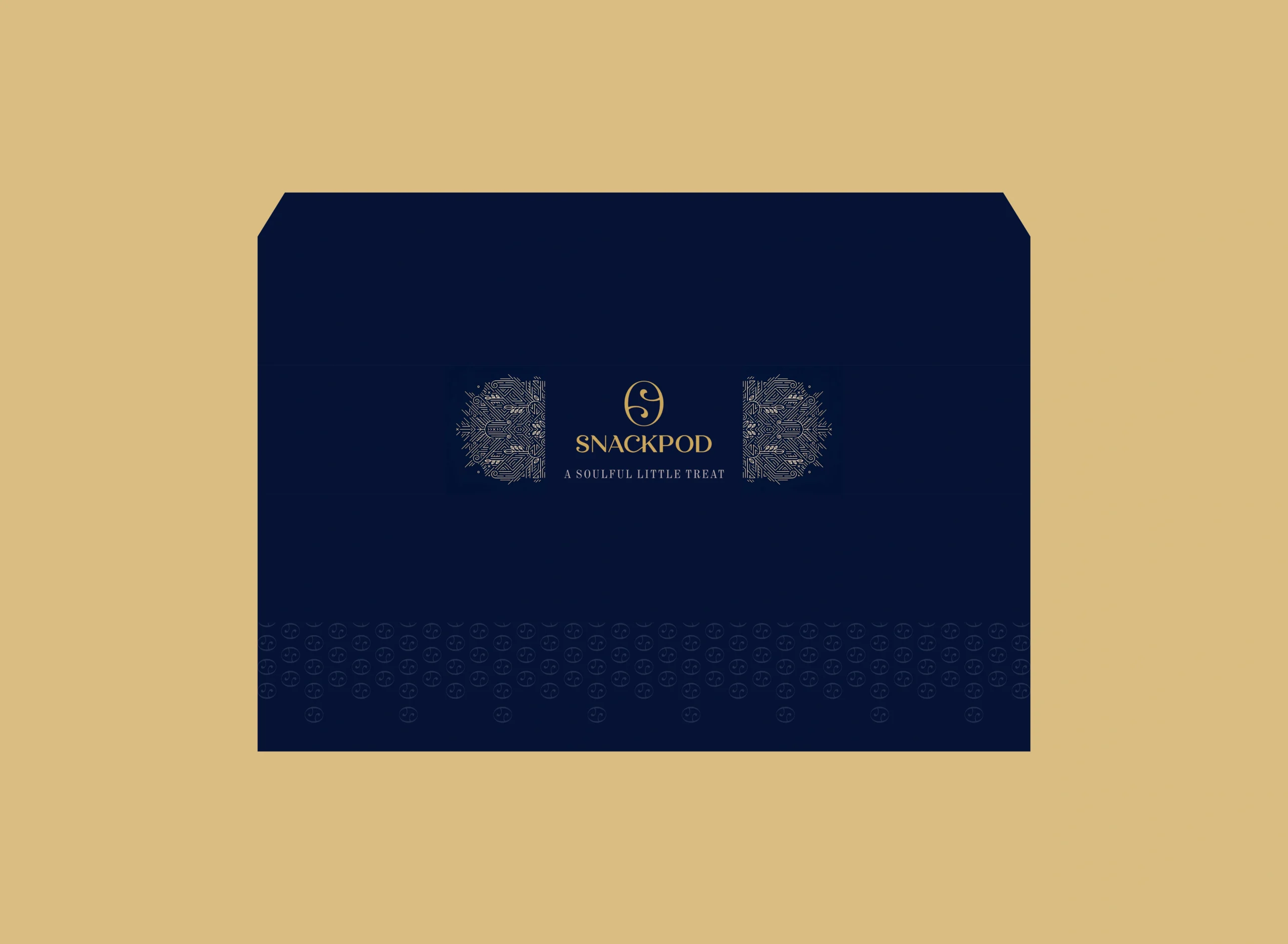
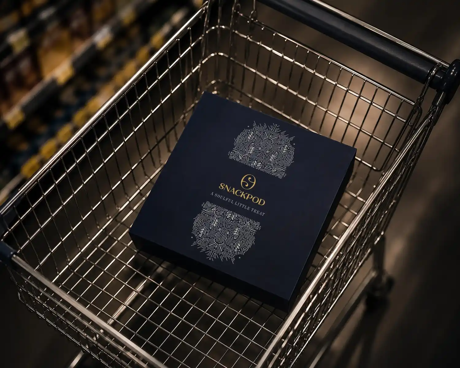
Moodboard
Brand moodboard and ecosystem
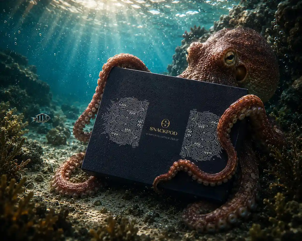
We built a rich visual packaging ecosystem that honors the traditional as well as the modern aspects. This direction avoids loud patterns and cheap foil stamping, relying instead on structural grace and artistic depth.
The visual system uses a high-contrast palette with deep tones and premium paper textures. It creates a heavy, valuable physical presence before a single word is read. We designed this specifically for urban, design-conscious buyers who notice fine details. The layout creates a connection between the giver and the recipient. By matching deep cultural roots with clean layouts, the brand bridges the gap between tradition and modern style.
Identity design
Brand identity design
The visual grid of the packaging balances corporate structure with a warm, artisanal touch. We used an authored typographic layout instead of generic, rigid computer templates. This keeps the identity feeling independent and unique. Every word and block of text was placed to guide the eye naturally, creating a sense of calm balance across the physical surface.
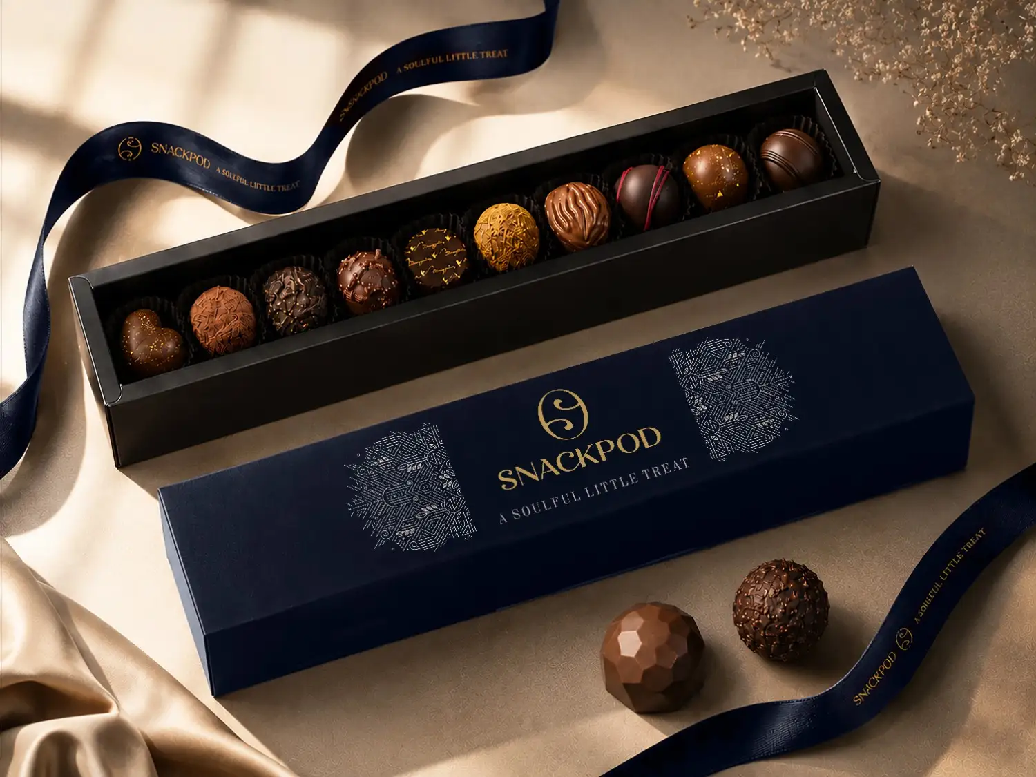
To visually prove that the gourmet bakery company uses hand-picked ingredients, the packaging design centers on custom line art. We drew dense, layered botanical patterns of the actual source ingredients. These illustrations add real visual depth and historical texture to the face of the packaging box. The lines are fine, deliberate, and deeply detailed, showing the human care behind the craft. By framing these dense patterns with clean margins, the final box looks like a premium lifestyle object meant to be displayed rather than discarded.
Visualisation
Brand visualisations
Our communication strategy maps out a clear digital and retail roadmap. For the immediate launch, the focus stays entirely on owned channels, showcasing the packaging across social media and the official website.
To support future growth, we designed the packaging layout to adapt as distribution expands. The bold, artistic styling ensures the products will stand out on cluttered screen interfaces when scaling to quick-commerce apps like Blinkit and Instamart down the line. Additionally, the wrapping botanical art easily transitions to physical retail shelves, keeping its premium positioning alongside imported goods in gourmet stores like Dorabjees and Nature’s Basket in the far future.
Execution
Final execution
The final packaging rollout gave the gourmet confectionery company a highly flexible design matrix. It scales smoothly across completely different box depths and product sizes without losing its handcrafted feel. The system remains completely unified whether it is applied to a single dark chocolate bar or a massive festive hamper box.
For large B2B commercial orders, the physical weight of the box immediately elevates the prestige of corporate givers. It earns a proud space on executive desks during major festivals like Diwali. In the online B2C space, the dramatic layouts and rich colours create instant attraction on digital feeds. We used human behavior to shift perceptions from a default, automated gift to a deeply considered experience that honors the art of hospitality.
Our Approch
Brand Moodboard
And Ecosystem
Darjeeling Express speaks to three kinds of people. Those who are enthusiasts of Indian food and know exactly what they are looking for. Those who miss the feeling of a home cooked meal and come to the table looking for that comfort. And those with a curiosity for flavour, who seek out dining experiences that are layered, interesting, and genuinely different.
Every element on the moodboard had to work across all three. The terracottas, deep teals, and saffrons carried cultural warmth without alienating anyone. The serif typography felt inherited rather than designed. The imagery of women cooking, shared plates, and quiet rituals was chosen so that everyone who walked in, regardless of where they came from, found something that felt meant for them.
Restaurant Brand
Identity Design
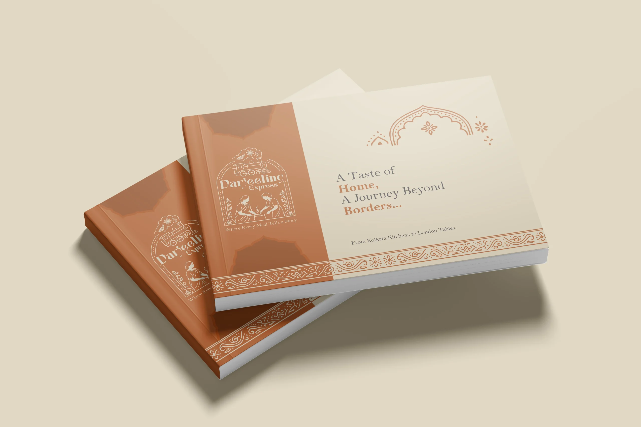
In a dining scene full of typographic marks and minimal identities, illustration was a strategic choice. We needed the restaurant brand to communicate what Darjeeling Express stands for before anyone reads a word. A clean logomark could never carry that weight. Only a fully realised illustrative mark could.
The mark brings together the Darjeeling train and the women who define the restaurant. Two things that are inseparable from the brand’s identity, and instantly recognisable as its own.
We developed two colour directions. Deep teal for quiet authority and cultural depth, a palette that signals credibility without loudness. Warm terracotta for familiarity and belonging, the colour equivalent of walking into somewhere that already feels like home. Both directions solve the same strategic problem differently: how do you make a brand impossible to confuse with anything else in the market.
Brand Visualisation
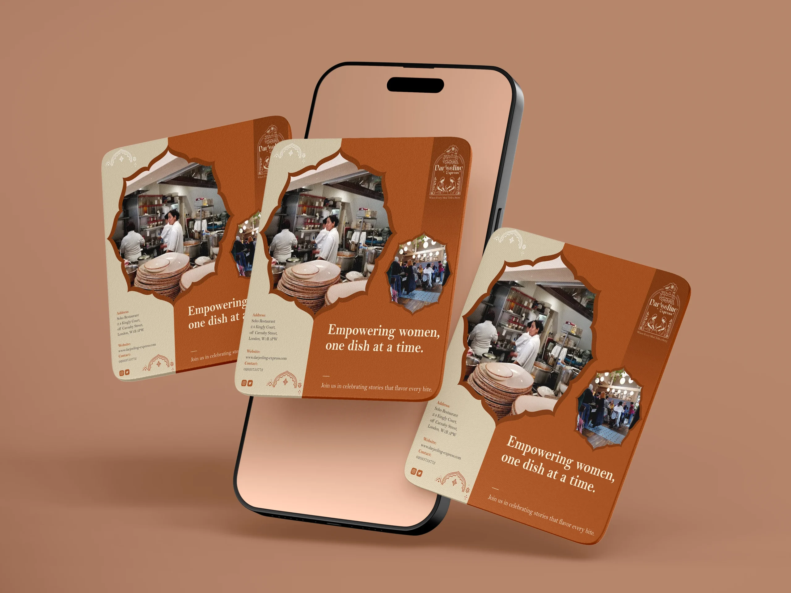
We designed our creatives similar to how we visualised it. And for the final visualisation, this was the part where everything came together. Seeing the identity move from a moodboard into real applications, menus, packaging, digital templates, and watching it hold up across all of them was genuinely satisfying. The palettes translated beautifully across print and screen, and the illustrated mark never lost its character no matter the scale. From a small stamp on a menu to a full printed board, it always looked like it belonged. That kind of consistency does not happen by accident. It comes from getting the foundations right.
Final Execution
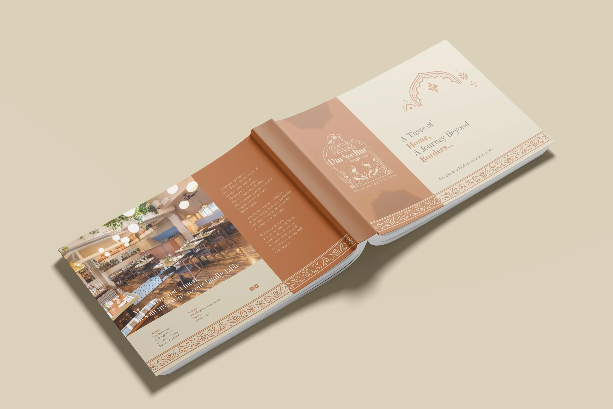
Handing over a project is always a mix of emotions, but mostly pride. With Darjeeling Express, it felt like sending something into the world that was genuinely ready. The full brand system, guidelines, print-ready files, and digital assets, all built to be used confidently without us in the room.
The value chain here is straightforward. We built Darjeeling Express a coherent, confident identity they could own completely. Darjeeling Express used that identity to show up consistently across every touchpoint, digital and physical. And their customers felt the difference, because the experience of the brand now began long before anyone walked through the door. What we create for our clients ultimately shapes what their clients feel. That is the point.
Project highlights
Extended brand shelf-Life
We turned temporary commercial wrapping into an art-driven rigid box system, keeping the brand active as a lifestyle object in consumer homes for weeks.
Flexible multi-channel scaling
Our design shifted from a single chocolate bar template into a large box architecture, commanding premium space in both corporate boardrooms and online retail.
Visual ingredient storytelling
We traded dry technical text for dense, hand-drawn botanical line art, visually proving the premium quality of the ingredients at a single glance.
Packaging design
Being the leading packaging design agency in India, we approached Darjeeling Express packaging through a data driven lens, grounding every decision in consumer behavior. Studies show 68% of consumers associate premium packaging with higher food quality, while 45% are influenced by visual appeal alone, making first impressions critical. We translated this into sturdy, well-structured formats and a consistent visual system of color, typography, and brand elements to strengthen recall. Our analysis also highlighted that packaging ranks among the top drivers of repeat purchase in foodservice, often outperforming ads and reviews. Each design choice was made to signal professionalism, trigger emotional connection, and justify value. The result is packaging that not only delivers food but extends the brand experience, reinforcing identity with every interaction.