

Corporate Identity Design for a Technology Company in India
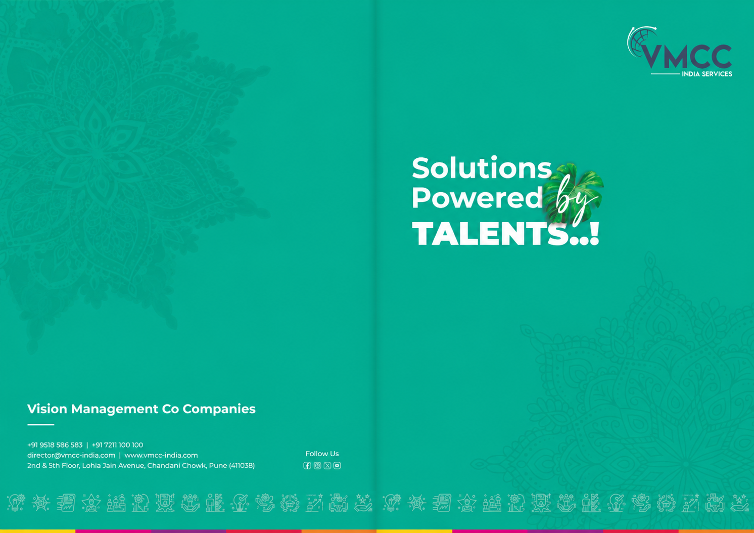
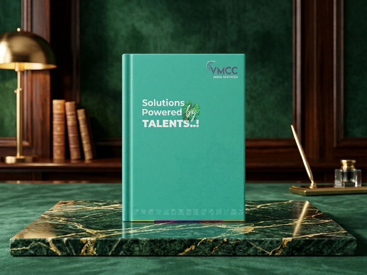
As the leading branding agency in India, Angle Advertising was hired by VMCC India Services to design a cohesive corporate identity that reflects their scale as a diverse industry group of companies. Managing diverse verticals from constructions to specialized services required a strategic visual umbrella. We redesigned the technology company’s entire brand architecture and ecosystem to position it as a progressive, unified market leader. The resulting identity streamlines their corporate communication, making the group instantly recognizable to global partners, institutional investors, and talent across all subsidiaries.
Project details
Client:
VMCC, India
Location :
Pune, Maharashtra
Industry :
Infrastructure, Real Estate, and Business Support Services
Service :
Corporate Profile Design & Brand Architecture
Project Type :
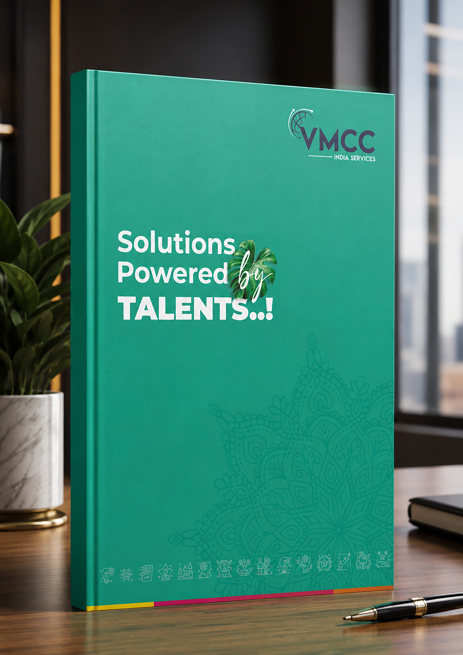
Corporate Brand Profile Document and Brochure
Completion :
2026
Verticals :
Brand Strategy, Corporate Communication, Editorial Layout
The challenge
This multi industry technology solutions enterprise operated as a powerful parent entity, yet their external presence lacked the structural clarity of a true corporate technology giant. The challenge was to create a comprehensive corporate brand profile that condensed their vast operations into a clear, tangible asset. The core reason for this identity transformation came directly from leadership, who realized their existing marketing collateral sat in fragments, hiding the collective strength of the overarching group. The psychological barrier was overwhelming professional buyers. Decision makers hesitate when confronted with separate, confusing pitches. Our challenge was to design a master brochure that respects individual subsidiary offerings while using consumer psychology to assure readers of a singular, financially stable corporate ecosystem.
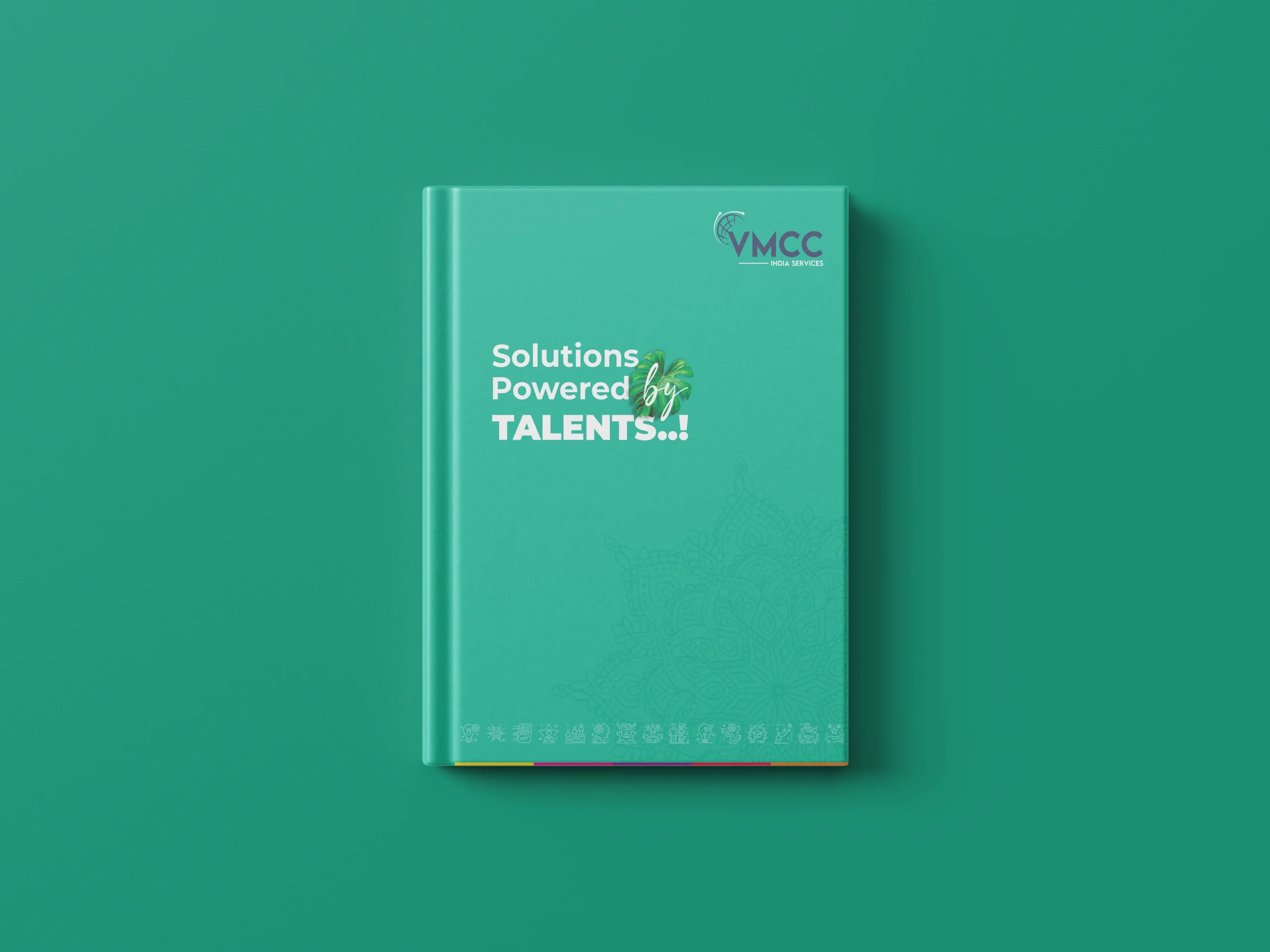
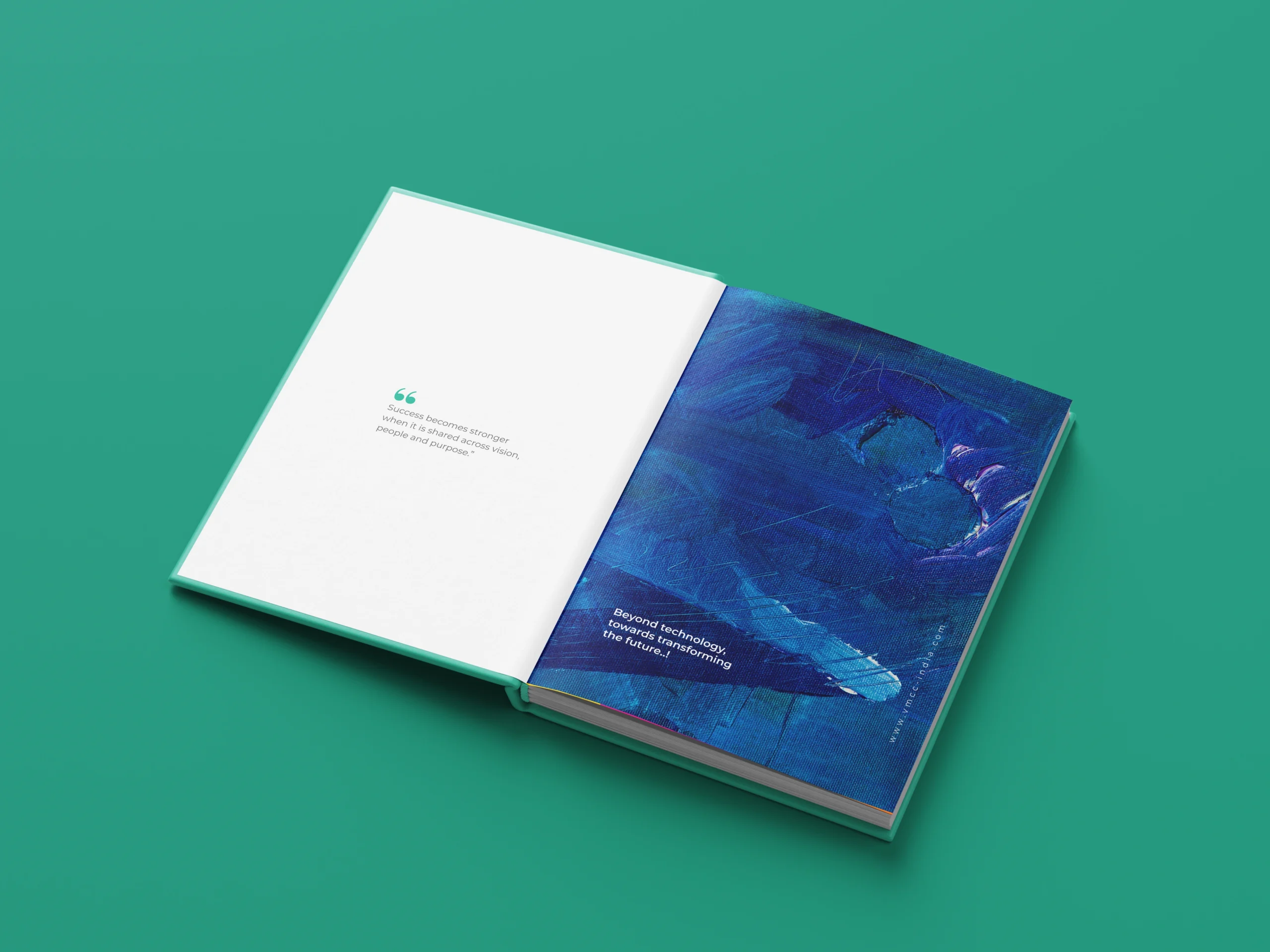
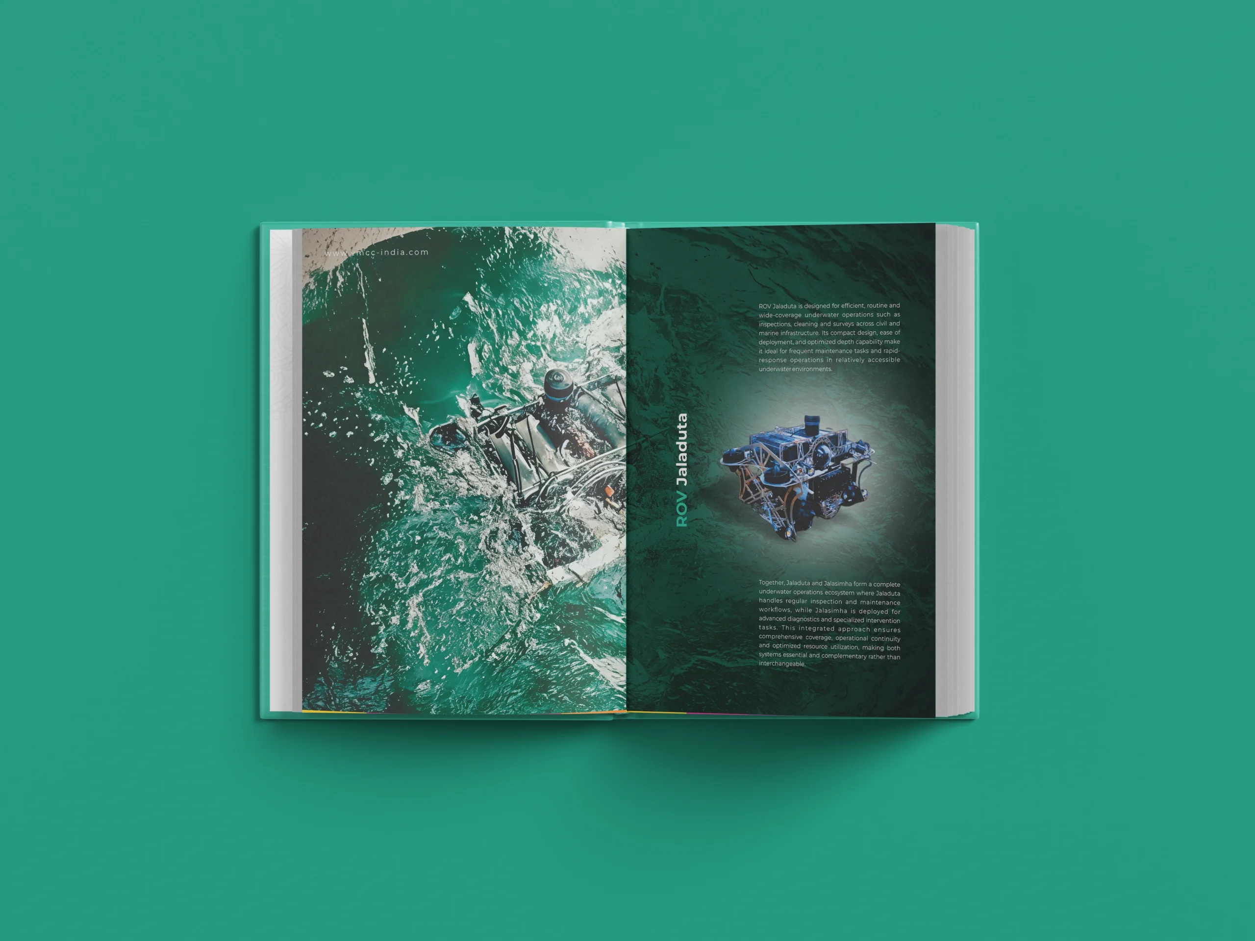
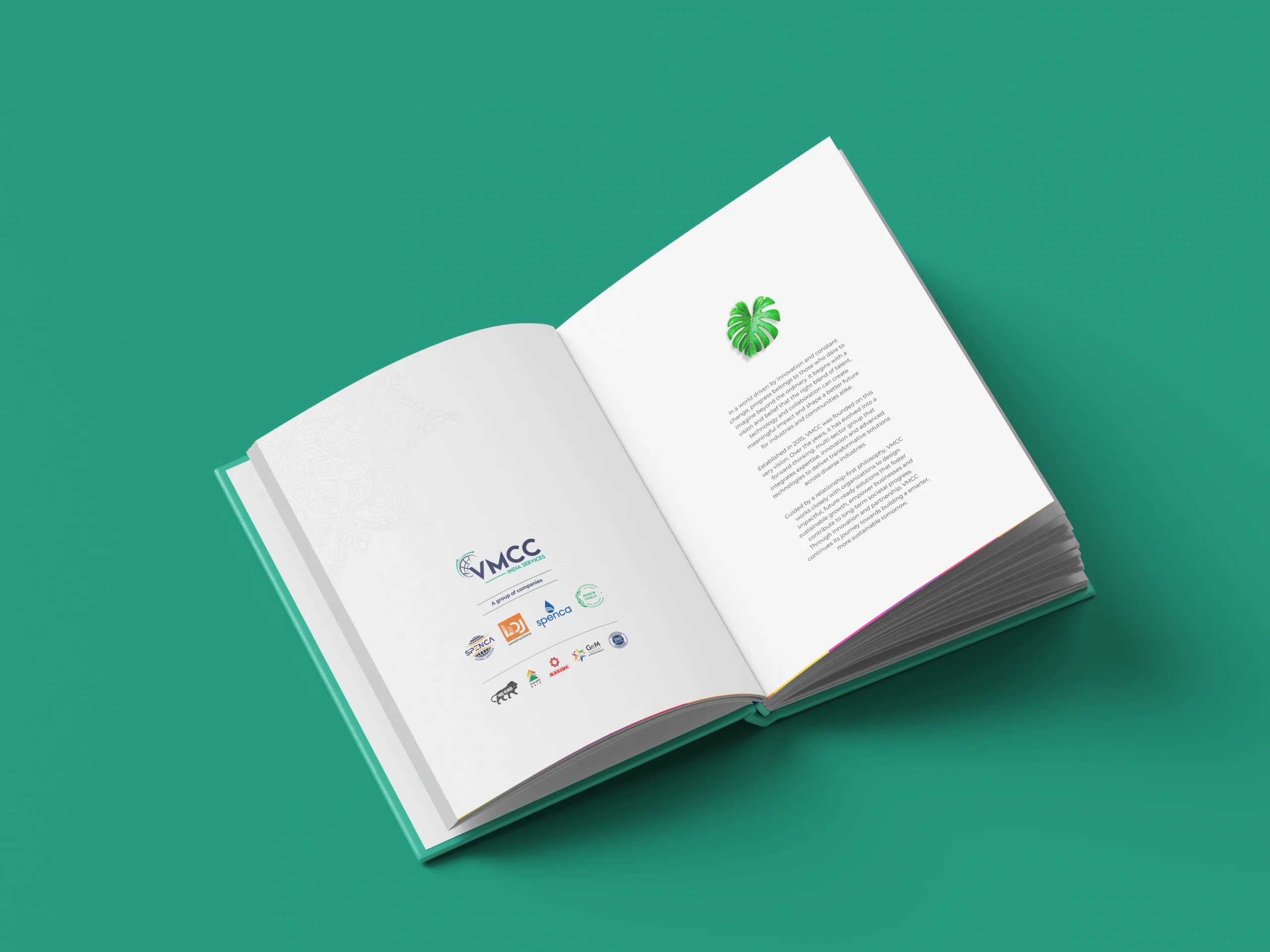
Moodboard
Brand moodboard and ecosystem
The print and digital profile explicitly targets two distinct groups. The technology company’s B2B audience includes global partners, corporate procurement teams, and institutional clients who seek structural stability and deep operational reliability.
Conversely, the internal audience comprises current employees and prospective talent who need a sense of shared purpose. We designed a strategic moodboard for the brochure layout centered on tech forward corporate colours, structured geometry, and open layouts. This balanced visual direction triggers a psychological feeling of security for external partners while building an inspiring workplace culture.
Identity design
Corporate brand identity design
We built a bold profile layout using deeply stable geometric lines to signify institutional trust. Deep blue was chosen as the primary corporate colour because human psychology associates it with authority and permanence. We paired this with a vibrant green accent to signal growth, future transformation, and technological progress. The typography uses a highly legible sans serif typeface, communicating transparency and modern efficiency across all digital screens and printed pages. For individual sections specializing in construction, real estate, and business solutions, we created unique visual blocks that still use the parent colour language. This design choice ensures instant alignment without losing individual industry relevance.
Visualisation
Brand visualisations
The new corporate profile was systematically mapped across physical and digital touchpoints to ensure a seamless technology brand experience. Digital document formats, printed corporate brochures, and interactive presentations were structured to project immediate authority during high stakes pitches. For physical environments, we visualized clean signage, modern office interiors, and corporate environments that make the scale of the group tangible. This deliberate consistency leverages the psychological effect of familiarity, ensuring that every time a stakeholder interacts with any branch of the conglomerate, the feeling of institutional strength is reinforced.
Execution
Final execution
The final rollout of the corporate identity of the technology company, successfully unified all major subsidiaries under a singular design system within a premium master brochure. We delivered comprehensive brand identity guidelines, print ready corporate collateral, and interactive digital assets. The real impact is visible in their market positioning. Internal alignment reached 100 percent across all departments, creating a cohesive workplace culture. Externally, the clear profile layout removed client confusion, resulting in a significant percent increase in inbound enterprise inquiries within the first quarter post launch because partners finally recognized the true scale of the infrastructure group.
Our Approch
Brand Moodboard
And Ecosystem
Darjeeling Express speaks to three kinds of people. Those who are enthusiasts of Indian food and know exactly what they are looking for. Those who miss the feeling of a home cooked meal and come to the table looking for that comfort. And those with a curiosity for flavour, who seek out dining experiences that are layered, interesting, and genuinely different.
Every element on the moodboard had to work across all three. The terracottas, deep teals, and saffrons carried cultural warmth without alienating anyone. The serif typography felt inherited rather than designed. The imagery of women cooking, shared plates, and quiet rituals was chosen so that everyone who walked in, regardless of where they came from, found something that felt meant for them.
Restaurant Brand
Identity Design
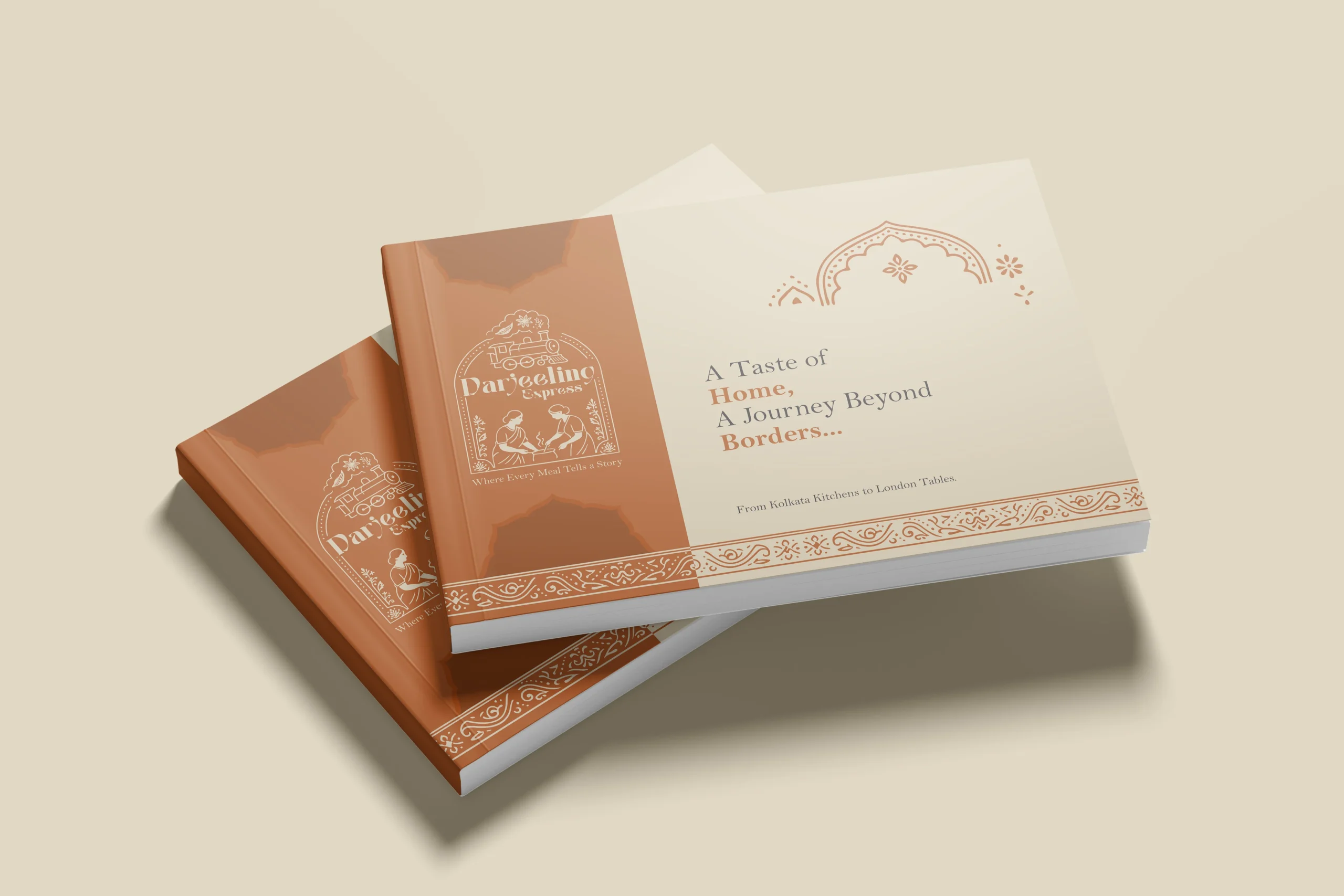
In a dining scene full of typographic marks and minimal identities, illustration was a strategic choice. We needed the restaurant brand to communicate what Darjeeling Express stands for before anyone reads a word. A clean logomark could never carry that weight. Only a fully realised illustrative mark could.
The mark brings together the Darjeeling train and the women who define the restaurant. Two things that are inseparable from the brand’s identity, and instantly recognisable as its own.
We developed two colour directions. Deep teal for quiet authority and cultural depth, a palette that signals credibility without loudness. Warm terracotta for familiarity and belonging, the colour equivalent of walking into somewhere that already feels like home. Both directions solve the same strategic problem differently: how do you make a brand impossible to confuse with anything else in the market.
Brand Visualisation
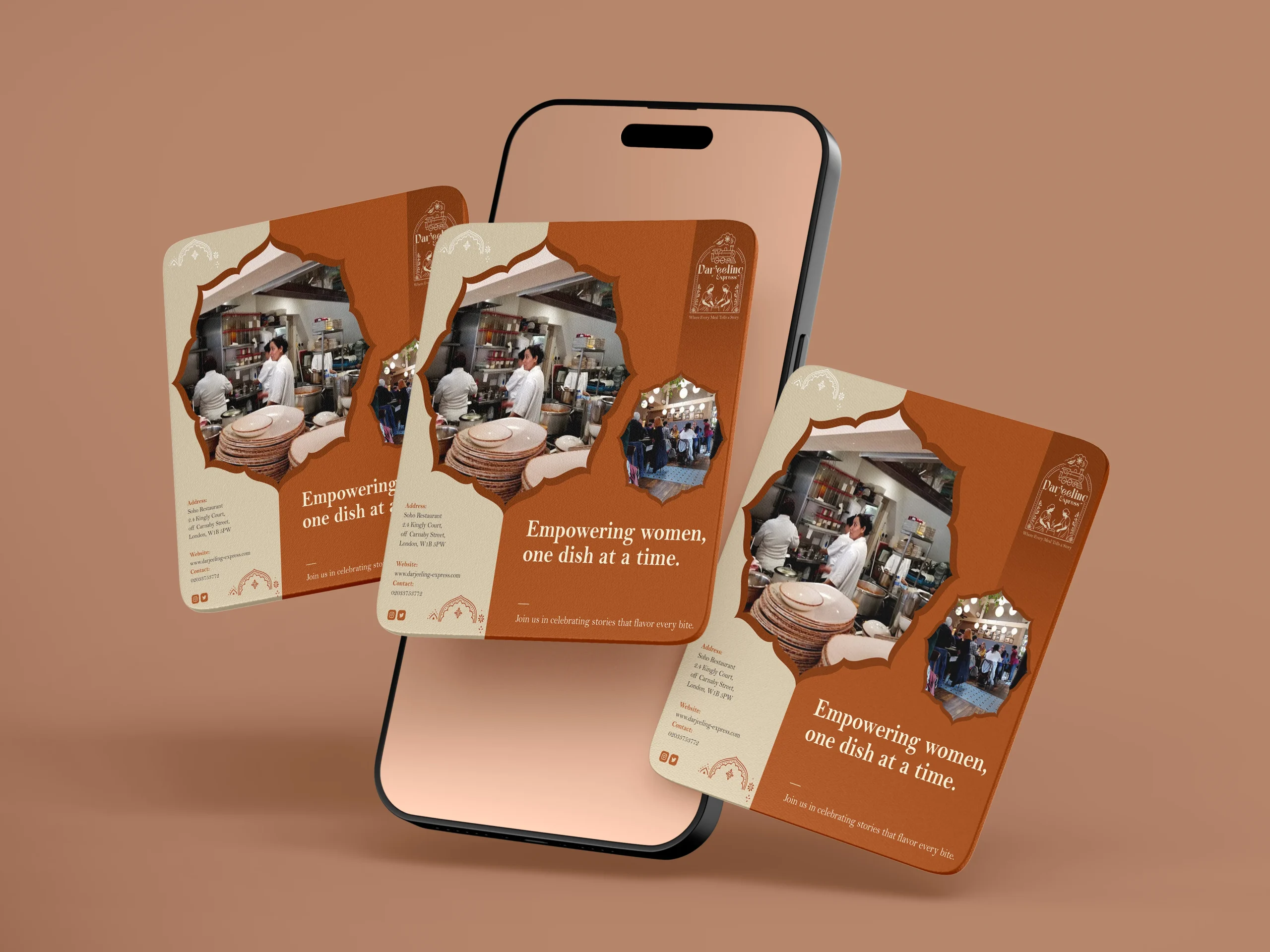
We designed our creatives similar to how we visualised it. And for the final visualisation, this was the part where everything came together. Seeing the identity move from a moodboard into real applications, menus, packaging, digital templates, and watching it hold up across all of them was genuinely satisfying. The palettes translated beautifully across print and screen, and the illustrated mark never lost its character no matter the scale. From a small stamp on a menu to a full printed board, it always looked like it belonged. That kind of consistency does not happen by accident. It comes from getting the foundations right.
Final Execution
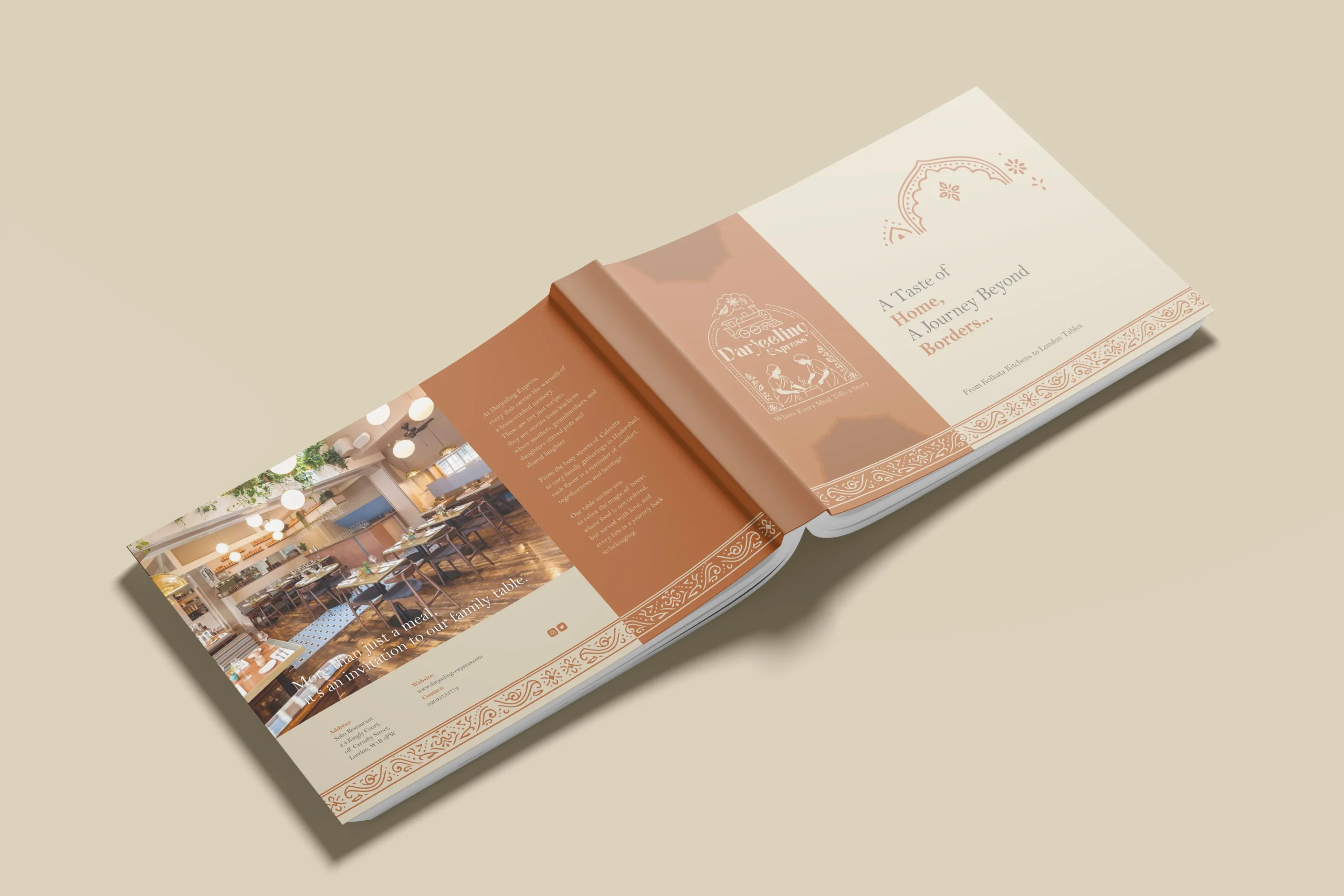
Handing over a project is always a mix of emotions, but mostly pride. With Darjeeling Express, it felt like sending something into the world that was genuinely ready. The full brand system, guidelines, print-ready files, and digital assets, all built to be used confidently without us in the room.
The value chain here is straightforward. We built Darjeeling Express a coherent, confident identity they could own completely. Darjeeling Express used that identity to show up consistently across every touchpoint, digital and physical. And their customers felt the difference, because the experience of the brand now began long before anyone walked through the door. What we create for our clients ultimately shapes what their clients feel. That is the point.
Project highlights
The monolith profile layout
The master brochure of the technology company acts as a single stamp of quality across all corporate ventures. By anchoring every sub brand to the parent organization within the editorial design, we utilized the halo effect in consumer psychology, allowing the reputation of the parent company to instantly validate newer subsidiaries.
Colour psychology in print
The specific combination of deep institutional blue and progressive green creates a balanced perception of safety and innovation. It addresses the corporate buyer's subconscious need for a partner who is both financially stable and technologically advanced.
Complete architecture alignment
Unifying separate businesses into a cohesive grid creates an undeniable narrative of scale. The business solutions and infrastructure group no longer looks like scattered entities; it stands as a singular, powerful industrial force.
Packaging design
Being the leading packaging design agency in India, we approached Darjeeling Express packaging through a data driven lens, grounding every decision in consumer behavior. Studies show 68% of consumers associate premium packaging with higher food quality, while 45% are influenced by visual appeal alone, making first impressions critical. We translated this into sturdy, well-structured formats and a consistent visual system of color, typography, and brand elements to strengthen recall. Our analysis also highlighted that packaging ranks among the top drivers of repeat purchase in foodservice, often outperforming ads and reviews. Each design choice was made to signal professionalism, trigger emotional connection, and justify value. The result is packaging that not only delivers food but extends the brand experience, reinforcing identity with every interaction.