

Marketing collateral design for an agricultural machinery manufacturer
As a leading branding agency in India, we collaborated with the largest heavy engine machinery manufacturer in India, Yanmar to develop a comprehensive marketing collateral ecosystem, establishing a powerful visual narrative for their smart agricultural machinery rollout in India.
Project overview
Our graphics team took charge of designing high-impact marketing collaterals such as leaflets, specialized technical brochures, and large-format expo posters tailored for fast-paced commercial touchpoints. Distributed across national agricultural exhibitions, trade expos, rural dealership stores, and direct corporate stakeholder presentations, these marketing materials bridged the gap between complex Japanese engineering and grounded, field-level utility. We turned technical product specifications into highly persuasive sales & marketing assets that resonated with individual farmers and large agricultural enterprise buyers alike.
Yanmar india — project details
Client
Yanmar India Pvt. Ltd.
Location
Pan-India, Global
Industry
Agricultural Machinery & Heavy Equipment
Services
Visual Strategy, Print Infrastructure, Technical Copywriting
Year
October 2025
Project Type
B2B and B2C Commercial Print Collateral Campaign
Tags
Large Format Posters, Die-Cut Leaflets, Dealer Toolkits
The challenge
The agricultural equipment manufacturing company faced a critical communication hurdle when introducing high-technology machinery to traditional farming sectors. Industrial harvesters and remote tracking hardware carry steep financial investments, making buyers highly risk-averse. The psychological barrier centered on a deep-seated skepticism toward abstract technological promises. Farmers and corporate field managers often find multi-layered corporate jargon alienating, preferring instead to evaluate machinery based on real-world reliability, parts durability, and clear operational cost reductions.
The marketing collateral design challenge required moving away from typical industrial data sheets that feel dry and detached. Instead, the team needed to create a localized print media and collaterals ecosystem that balanced corporate authority with immediate, on-the-ground clarity. These marketing collaterals had to perform under diverse environments, capturing immediate interest on busy exhibition floors, remaining highly scannable within crowded dealership offices, and serving as an authoritative leave-behind asset for sophisticated corporate partners and agritech stakeholders.
Brand moodboard
Brand moodboard and ecosystem
Our design strategy discarded superficial design trends to focus heavily on the psychology behind the purchase of agricultural purchasing. The brand ecosystem was divided to engage two distinct user mindsets simultaneously. The B2C segment required simple, visual proofs of operational efficiency, structural durability, and fuel economy. The B2B corporate segment demanded precision, clear technological differentiation, and long-term asset security data.
To address both needs, the visual theme utilized high-contrast, premium layouts dominated by a commanding industrial red, crisp whites, and deep technical grays. This clean colour palette was intentionally selected to evoke a sense of high manufacturing precision and operational safety. By matching expansive, real-world farm photography with clear, grid-based typography, the equipment manufacturer’s print and marketing ecosystem moved away from complex corporate imagery, establishing a highly accessible and deeply authentic visual presence.
identity
Brand identity design
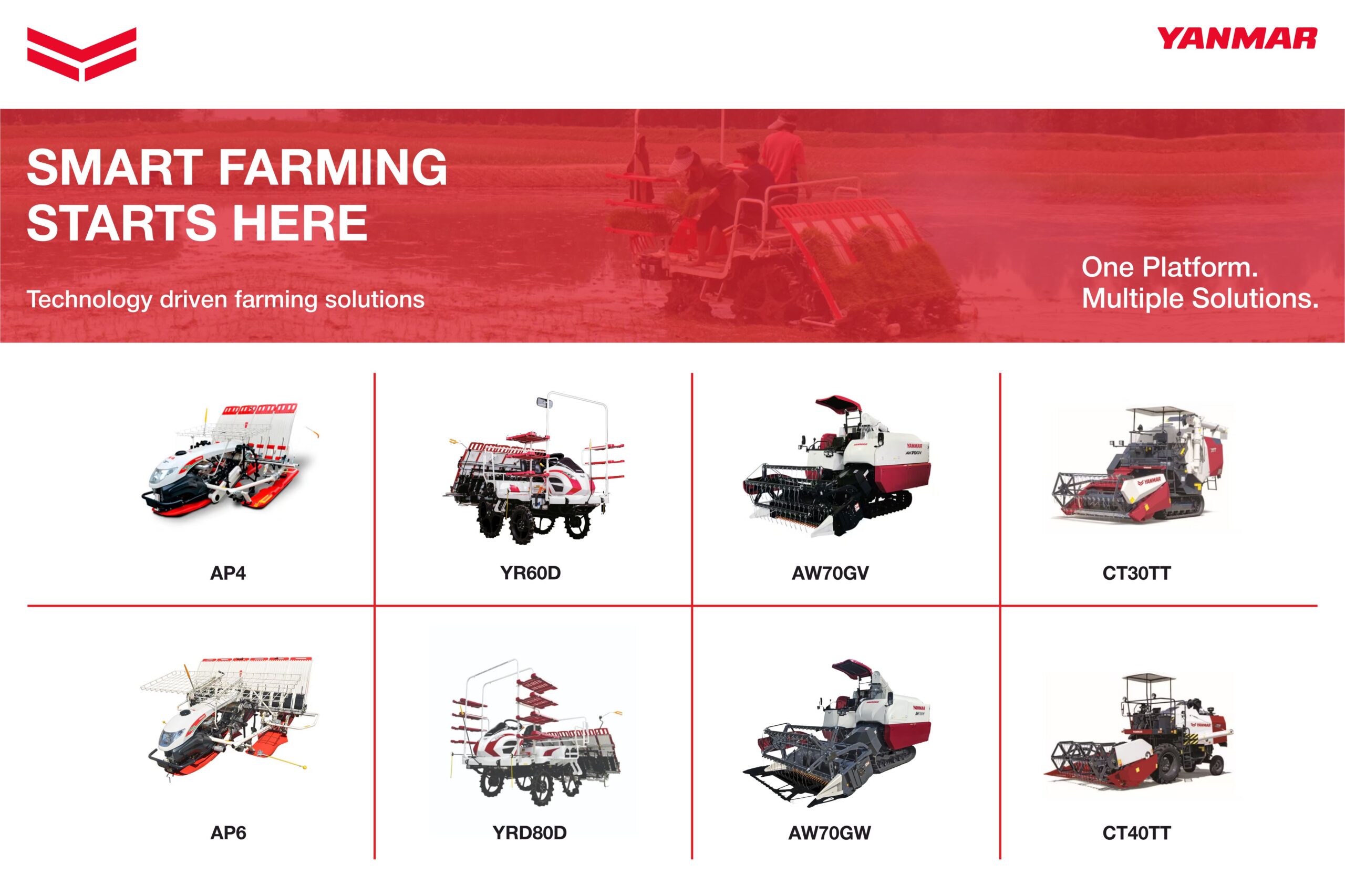
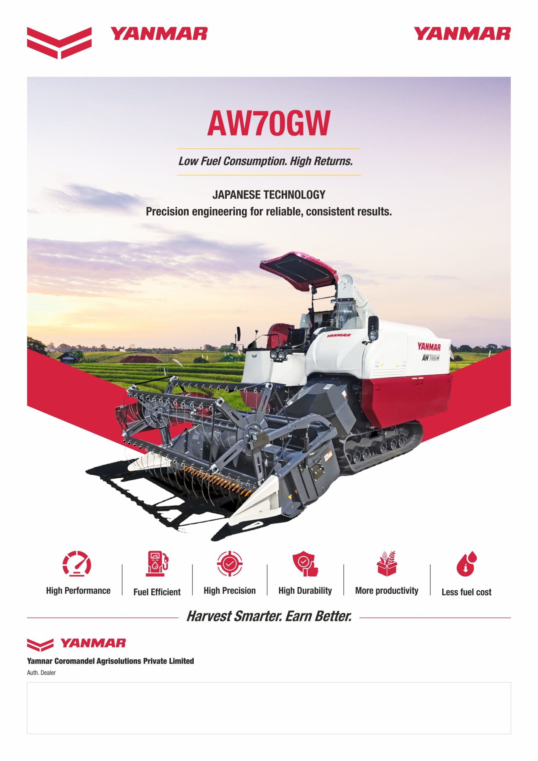
The identity system for the machinery manufacturer was carefully structured to ensure absolute visual consistency across distinct physical marketing/sales print formats. For large-scale display environments, we created three distinct variations of regional display materials. These compositions utilized varying horizontal grid lines and clean blocks to organize an extensive multi-vehicle portfolio, keeping product profiles visually distinct even when viewed from across a crowded expo hall. For targeted machinery portfolios, the design structure shifted toward deep-dive performance metrics. In the harvester sales leaflets, the layout abandoned cluttered text blocks in favor of clear, isolated icon grids that highlighted low fuel consumption and grain loss metrics, making advanced performance advantages instantly legible to non-technical buyers.
visualisation
Brand visualisation
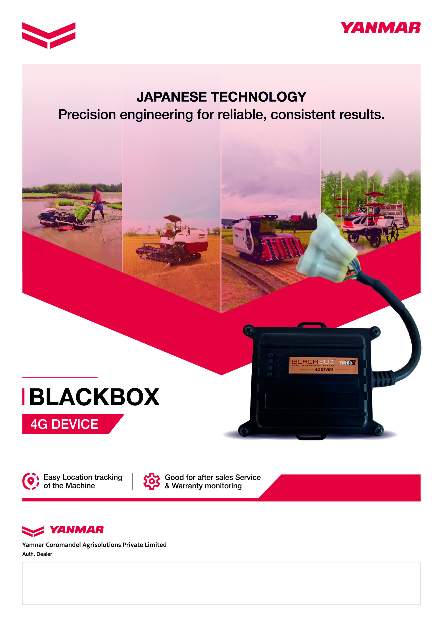
The communication journey was mapped out to systematically dismantle buying hesitation at every phase of interaction. For specialized telemetry and machine-tracking products, the creative strategy focused on making invisible digital protection feel physically tangible. This approach was central to the layouts developed for the smart tracking hardware brochures. Instead of explaining complex 4G data routing through heavy blocks of text, the brochures utilized clean cutaways of physical hardware connected to a bold graphic shield overlaid on field photography. This design choice instantly conveyed a sense of constant engine monitoring and total security. Key features like geo-fencing, battery health metrics, and working-hour tracking were separated into standalone informational zones, allowing dealership visitors and corporate buyers to process advanced hardware capabilities in a single glance.
Deployment
Final execution
The complete marketing collateral deployment provided the heavy equipment manufacturing company with an integrated, highly effective offline marketing toolkit. By standardizing design formats, the final print assets gave sales representatives and regional dealers the exact materials needed to lead structured, high-conversion conversations.
The focus on clean layout structure and human behavior eliminated the friction often caused by confusing technical brochures. Whether displayed on large expo walls or used as an executive corporate leave-behind, the print ecosystem maintained premium brand positioning while speaking directly to the real-world needs of modern agribusinesses.
Project highlights
100 Percent uniform retail visibility matrix
Our team developed and distributed a unified print kit across a vast national network of agricultural dealership centers, replacing inconsistent regional flyers with a singular visual style that elevated store professional standards.
High-scannability icon framework
By converting dry technical specifications into an intuitive, custom iconography system for the harvester product line, we reduced the time required for customers to understand key machine benefits.
Zero-Friction B2B corporate engagement
The clean, grid-based layout used for the telemetry tracking hardware successfully streamlined corporate stakeholder pitches, providing regional sales teams with an authoritative, high-clarity tool that effectively communicated machine reliability and security.


