


Cold-pressed oil bottle packaging & label design
Based in Pune, Maharashtra, India, Snehapoornam oils operates with a process that prioritises purity over convenience. They have built their reputation on one thing done consistently well: pressing oils the right way, with minimal processing, and without making any compromise on quality. As a leading brand design company in India, Angle Advertising was brought in to design packaging and labels for the cold-pressed oil bottle that matched this standard visually and gave the oil brand the shelf presence it had earned through years of doing things right.
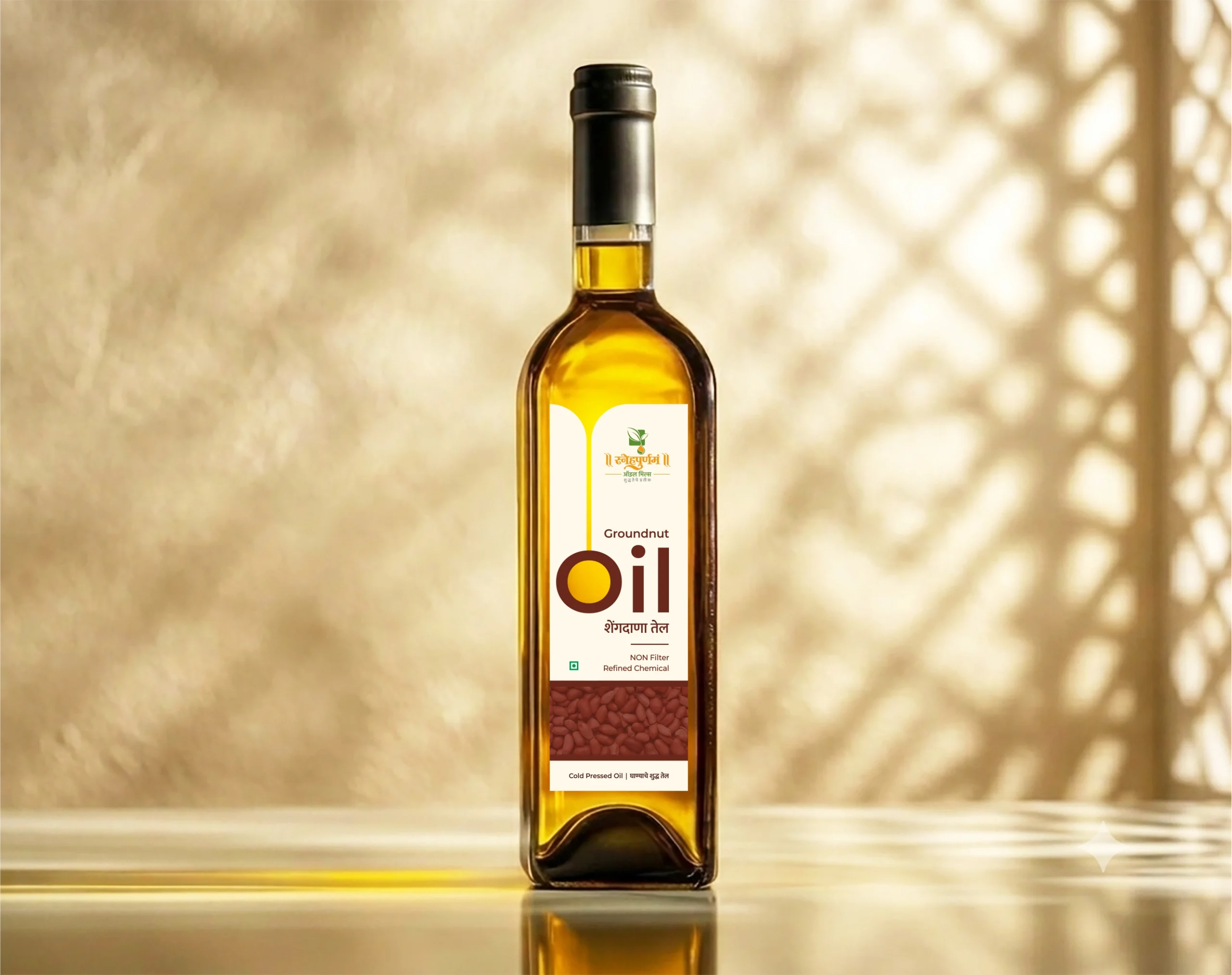
The credibility gap
India’s edible oil market is on track to reach $31.2 billion by 2028, with health-conscious purchasing behaviour driving consistent growth across traditionally processed oil segments. The category, particularly the cold-pressed oil category is expanding, and with it, so is the volume of brands making similar-sounding claims about purity, process, and origin.
The credibility of Snehapoornam’s cold-pressed oil was never the concern. The concern was the appropriate packaging design that would make justice to the quality and value offered by the oil mill. Research consistently shows that:
For a cold-pressed oil brand with real substance behind it, the above stats are both an opportunity and a responsibility. The packaging needed to do justice to the oil product range it was representing.
Oil bottle packaging design project details
Brand :
Snehapoornam oil mills
Location :
Pune, maharashtra, india
Industry :
Food and beverage
Solution :
Brand research, label and packaging design
Completion :
2025
Project type :
Brand Re-design
Services :
Label design, packaging design, brand research
The challenge
- 72% of purchase decisions in food retail are made at the point of shelf.
- About 81% of consumers have tried a new product because the packaging caught their attention.
- 94% of first impressions of a product are based on visual design.
- Up to 85% of consumers cite colour as the primary reason for choosing a product.
- About 70% of consumers say packaging design influences their perception of product quality.
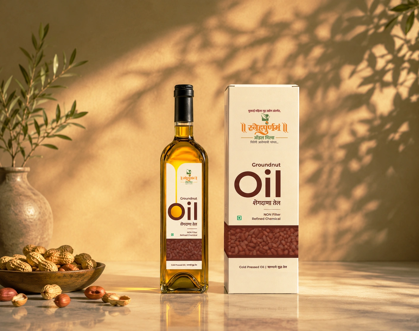
Moodboard
Brand moodboard and ecosystem
The Snehapoornam consumer is not someone who is not browsing. They have already decided to seek something more considered, and they are looking for a brand that reflects that decision back at them accurately.
The moodboard was built around that expectation. Warm ochres, harvest golds, and deep earthy tones were drawn directly from the agricultural source of the cold-pressed oil itself, not from what was trending in packaging design at the time. Colour psychology research consistently shows that earth tones in food packaging build associations of naturalness, reliability, and safety, precisely the values Snehapoornam needed to own at first glance.
Philosophy
Packaging design philosophy
The colours in Snehapoornam’s cold-pressed oil packaging each mean something.
- Groundnut Oil uses terracotta and deep orange, shades that feel warm and familiar, much like the oil itself.
- Mustard Oil goes into a rich harvest gold, reflecting the strength and heritage that mustard has always carried in the Indian kitchen.
- Sesame Oil sits in a quiet natural beige, fitting for an oil that is gentle and refined.
- The cold-pressed oil brand’s orange runs across all three, keeping the range feeling like one cohesive family.
The choice to write in both English and Marathi was not accidental. For an oil brand from Pune, writing in Marathi tells consumers that this is a brand that genuinely belongs here. English sits alongside it to make the product accessible to a wider audience without losing that local identity.
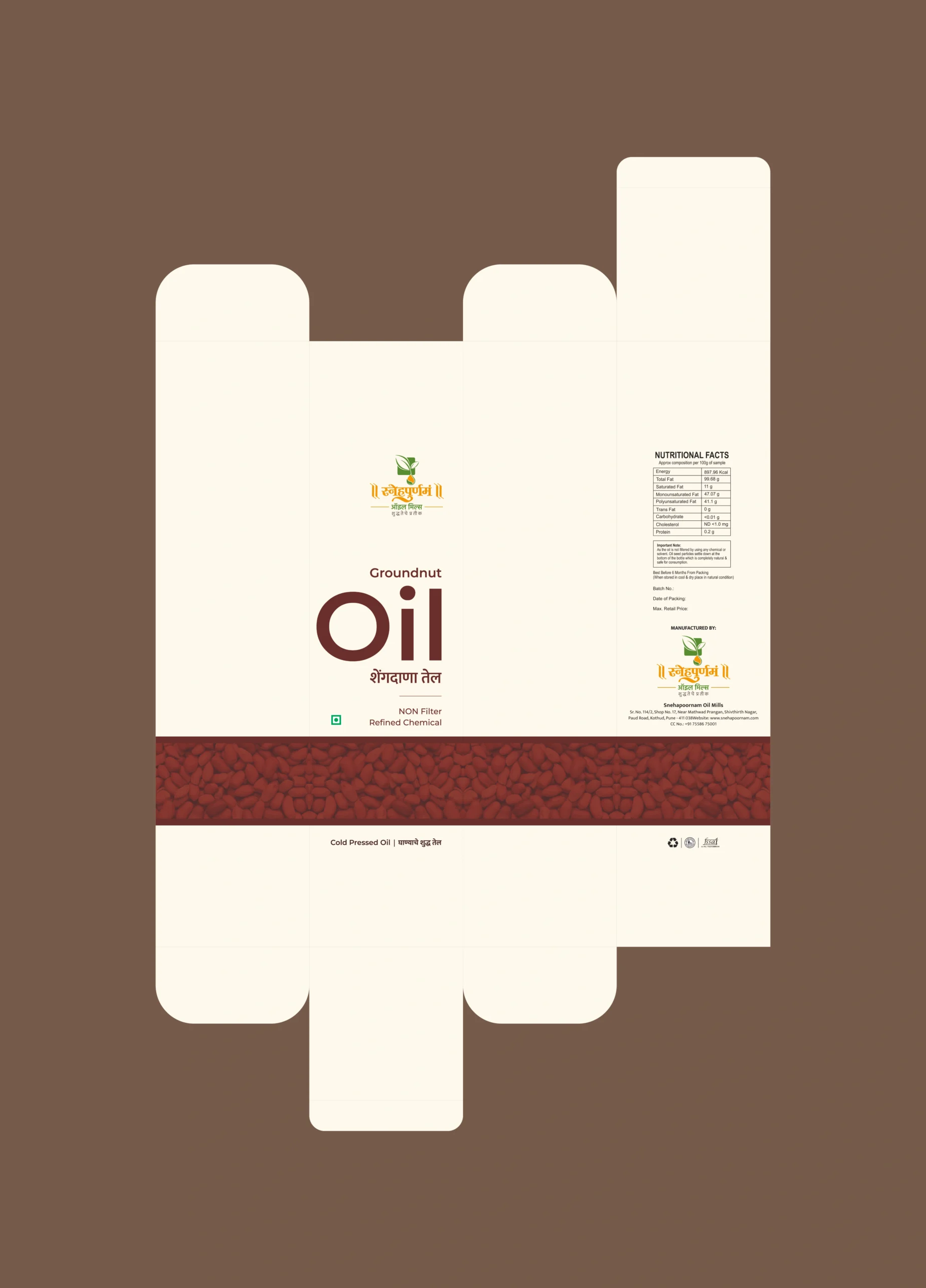
The oil bottle label is organised into three clear sections, nutritional information, product identity, and the brand’s background, so that everything a consumer needs is easy to find.
Consistency
Brand visualisations
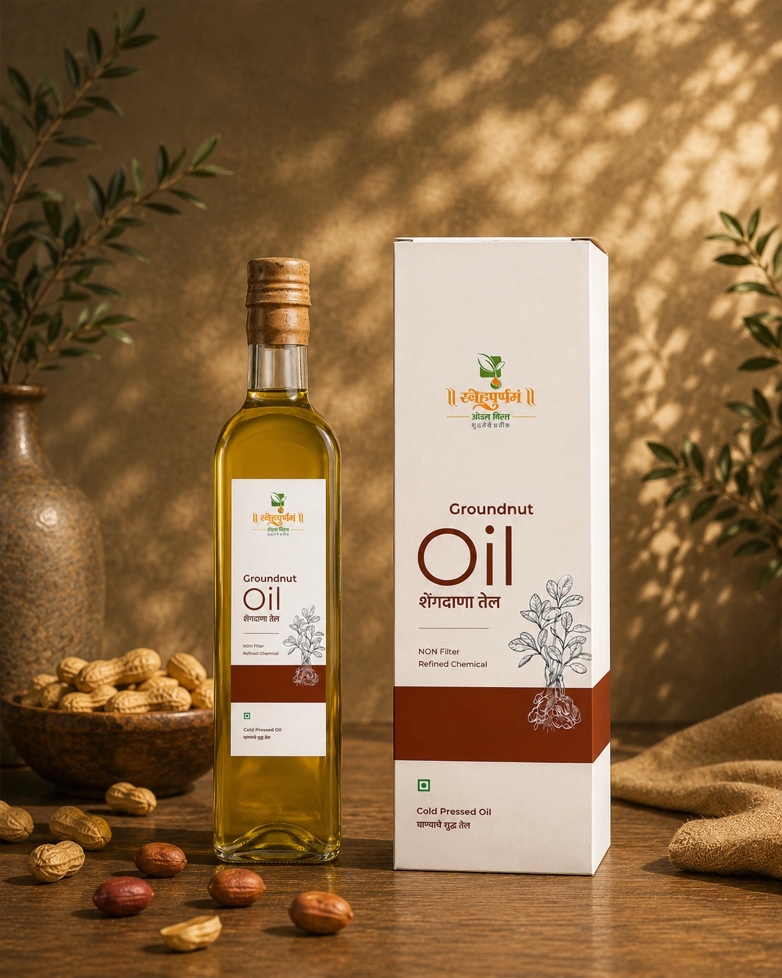
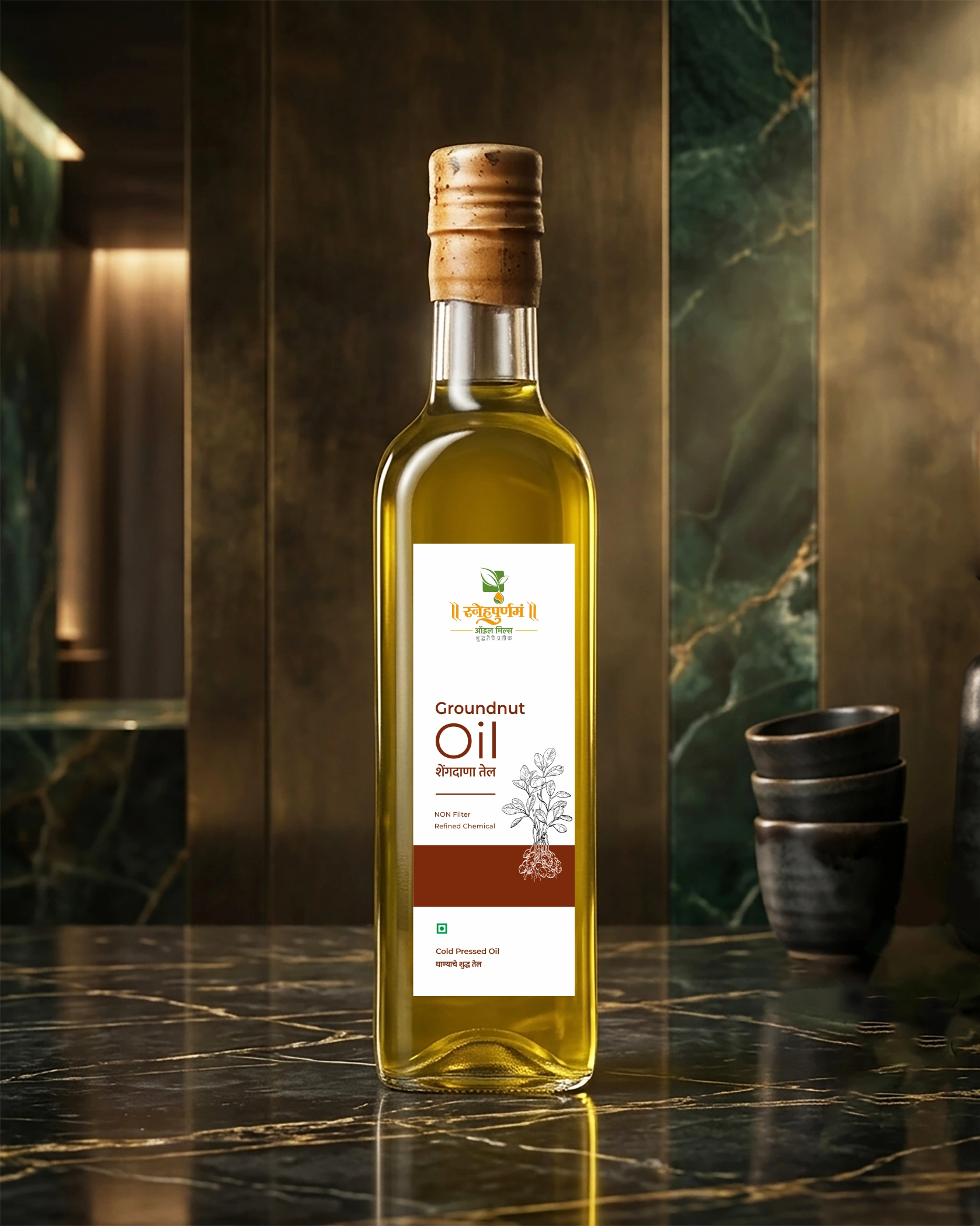
When the complete range of the oil packages came together, the design held up across every variant without losing coherence. Each cold-pressed oil carried a distinct visual identity through its photography and tonal palette, while the shared illustration and typographic system kept the oil range immediately recognisable as a unified family.
The system scaled without compromise from label to outer packaging. Typography remained legible and well-proportioned across every application.
Consistency at this level across a multi-product cold-pressed oil range does not happen by default. It is the outcome of building a system that accounts for that range from the very beginning of the design process.
Delivery
Final execution
Handing over a completed project means handing over a system the cold-pressed oil brand can work with independently, at scale, and with full confidence. Every print-ready file and design guideline across this project was built with that in mind.
The commercial logic is simple. Packaging that earns attention at the shelf drives the first purchase. A product that genuinely delivers on what its packaging communicates builds the loyalty that sustains a brand over time. Snehapoornam has always delivered on the product side. The cold-pressed oil packaging now ensures that the first impression is equally worth making.
The Solution
Brand Moodboard
and Ecosystem
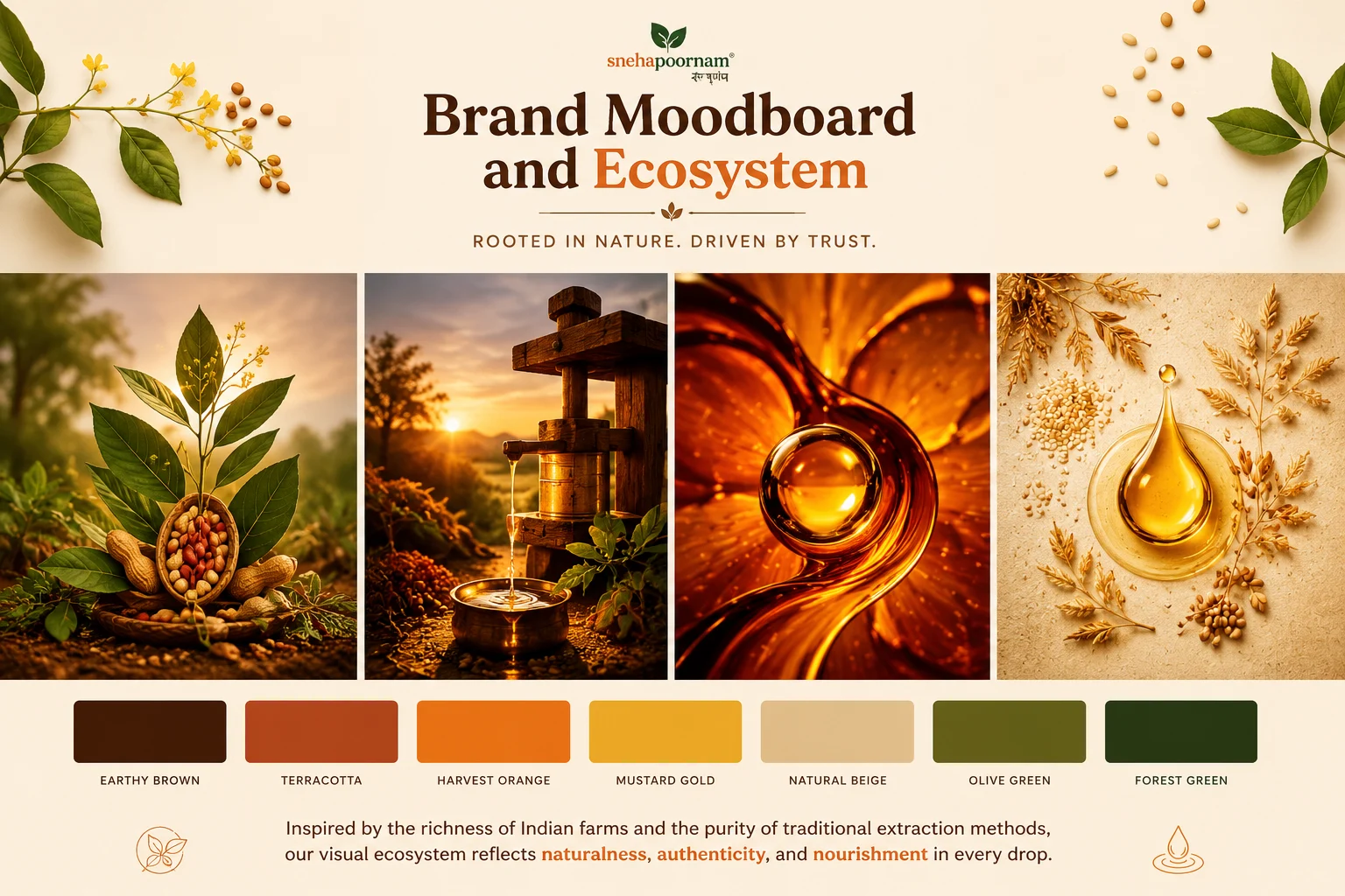
The Snehapoornam consumer is not someone who is not browsing. They have already decided to seek something more considered, and they are looking for a brand that reflects that decision back at them accurately.
The moodboard was built around that expectation. Warm ochres, harvest golds, and deep earthy tones were drawn directly from the agricultural source of the cold-pressed oil itself, not from what was trending in packaging design at the time. Colour psychology research consistently shows that earth tones in food packaging build associations of naturalness, reliability, and safety, precisely the values Snehapoornam needed to own at first glance.
Packaging Design
Philosophy
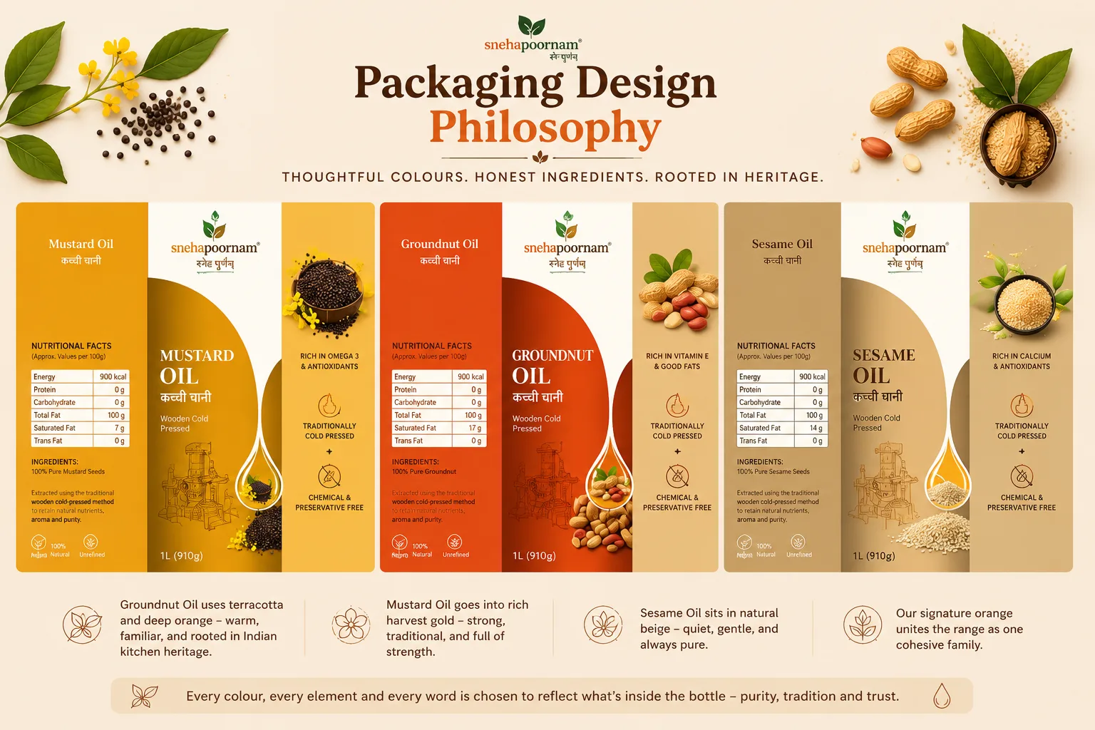
The colours in Snehapoornam’s cold-pressed oil packaging each mean something.
- Groundnut Oil uses terracotta and deep orange, shades that feel warm and familiar, much like the oil itself.
- Mustard Oil goes into a rich harvest gold, reflecting the strength and heritage that mustard has always carried in the Indian kitchen.
- Sesame Oil sits in a quiet natural beige, fitting for an oil that is gentle and refined.
- The cold-pressed oil brand's orange runs across all three, keeping the range feeling like one cohesive family.
The choice to write in both English and Marathi was not accidental. For an oil brand from Pune, writing in Marathi tells consumers that this is a brand that genuinely belongs here. English sits alongside it to make the product accessible to a wider audience without losing that local identity.
The oil bottle label is organised into three clear sections, nutritional information, product identity, and the brand’s background, so that everything a consumer needs is easy to find.
Brand Visualisations
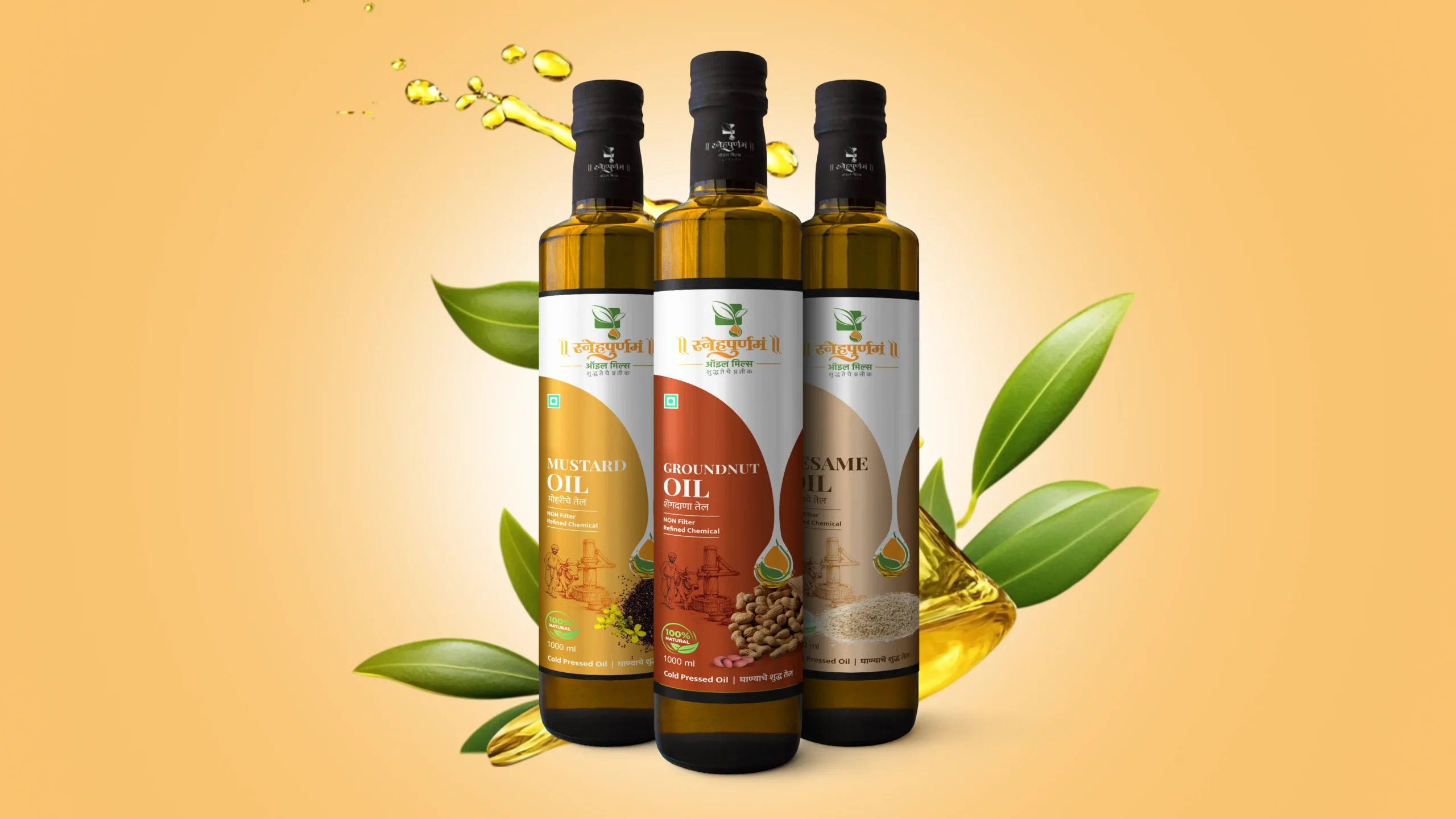
When the complete range of the oil packages came together, the design held up across every variant without losing coherence. Each cold-pressed oil carried a distinct visual identity through its photography and tonal palette, while the shared illustration and typographic system kept the oil range immediately recognisable as a unified family.
The system scaled without compromise from label to outer packaging. Typography remained legible and well-proportioned across every application.
Consistency at this level across a multi-product cold-pressed oil range does not happen by default. It is the outcome of building a system that accounts for that range from the very beginning of the design process.
Final Execution
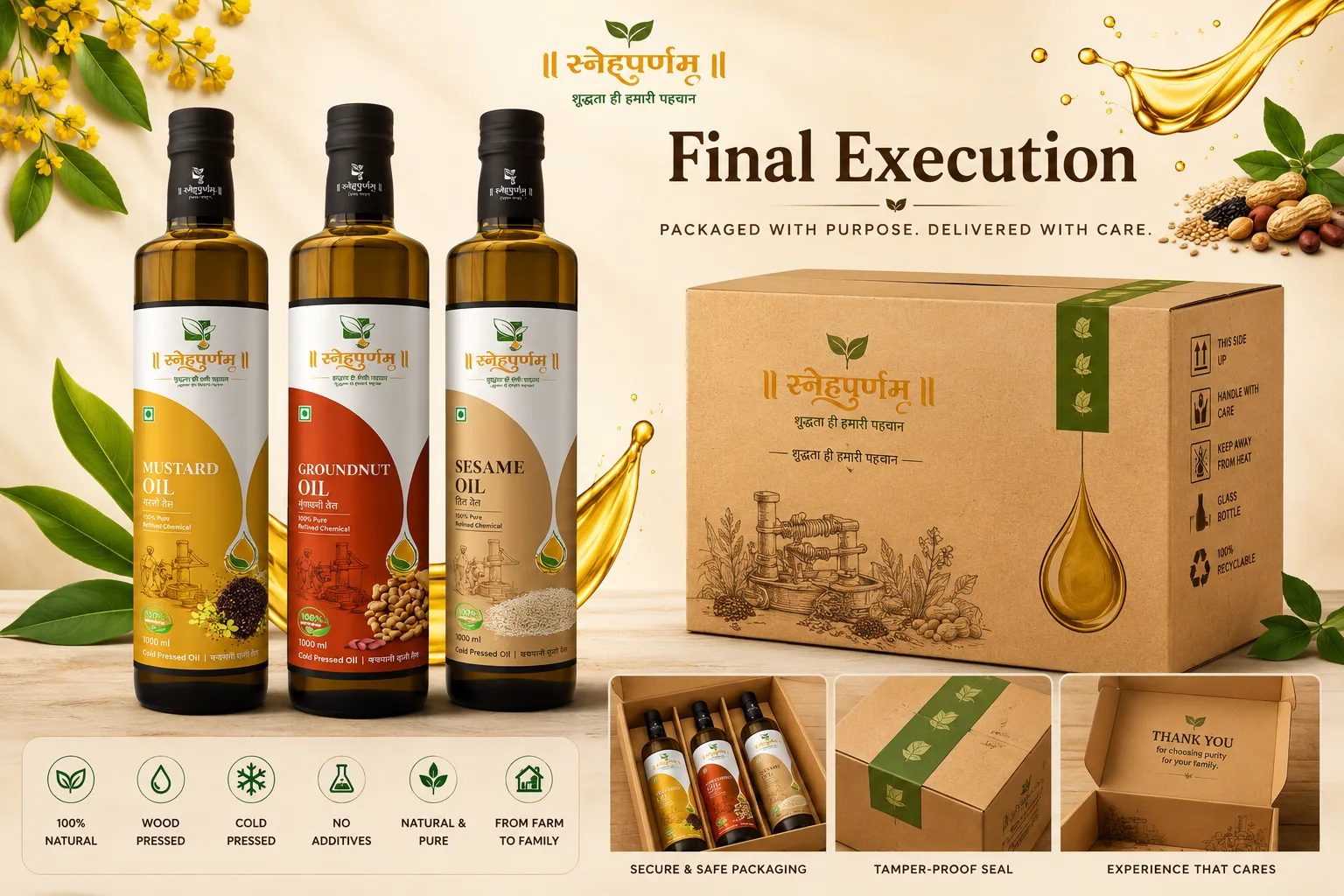
Handing over a completed project means handing over a system the cold-pressed oil brand can work with independently, at scale, and with full confidence. Every print-ready file and design guideline across this project was built with that in mind.
The commercial logic is simple. Packaging that earns attention at the shelf drives the first purchase. A product that genuinely delivers on what its packaging communicates builds the loyalty that sustains a brand over time. Snehapoornam has always delivered on the product side. The cold-pressed oil packaging now ensures that the first impression is equally worth making.
Project highlights
Capturing the insights
Before any visual decisions were made, the focus was on understanding the cold-pressed oil brand deeply. The Marathi tagline ;शुद्धतेचे प्रतीक’, meaning “Symbol of Purity”, were not just background details. They were the foundation everything else was built on. With 81% of consumers having tried a new product based on packaging alone, that foundation of packaging and message it sent out needed to be taken seriously.
Crafting the label
The three-panel label is where strategy and craft meet. The colour chosen for each variant reflects the psychology of the product itself, so the palette does more than look right. It reinforces what consumers already associate with each oil.
Building the packaging system
Packaging influences over 70% of first-time purchase decisions in food retail. The bilingual approach strengthens trust further by creating immediate cultural familiarity. Every decision here was a brand-level call, resulting in a system built to perform consistently.


