

Dr. Vithalrao Vikhe Patil Foundation.
Vikhe Patil is a name that commands deep respect in the educational landscape — not just across Maharashtra, but well beyond its borders. With a legacy built over generations, the institution carries a rich heritage rooted in the vision of its forefathers, and a proven track record of shaping some of India’s brightest minds.
We, being the leading creative design company in India, were tasked to create a coffee table book worthy of that legacy — one that could speak to a remarkably diverse audience. Given the institution’s stature, the coffee table book would find itself in the hands of prospective students, senior bureaucrats, and international dignitaries alike. It had to work for all of them.
The challenge, therefore, was design-deep: how do you translate decades of history, cultural identity, and academic excellence into a single, visually compelling artifact? The coffee table book needed to honor the institution’s roots, celebrate its heritage, and at the same time, tell the story of its impact — through the generations of students who have gone on to shape the nation. Every page had to feel considered, every visual had to carry weight.
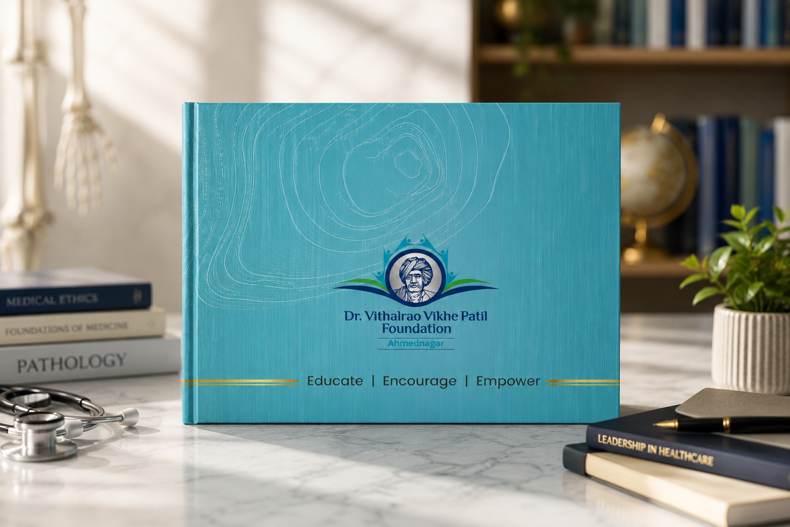
Coffee table book design project details
A heritage-led coffee table book conceptualized, designed, and executed by ANGLE Advertising. The project combined storytelling, editorial design, and visual branding to present the Foundation’s journey, achievements, and future vision in a premium, collectible format.
Client :
Vikhe patil foundation
Project type :
Coffee table book
Industry :
Education / philanthropy
Services :
Conceptualization, editorial design, visual branding
Deliverables :
Coffee table book
Objective :
To document the legacy, journey, and impact of the Foundation through a premium coffee table book.
Solution
Concept: within the rings of time - A legacy built layer by layer | where time becomes the foundation.
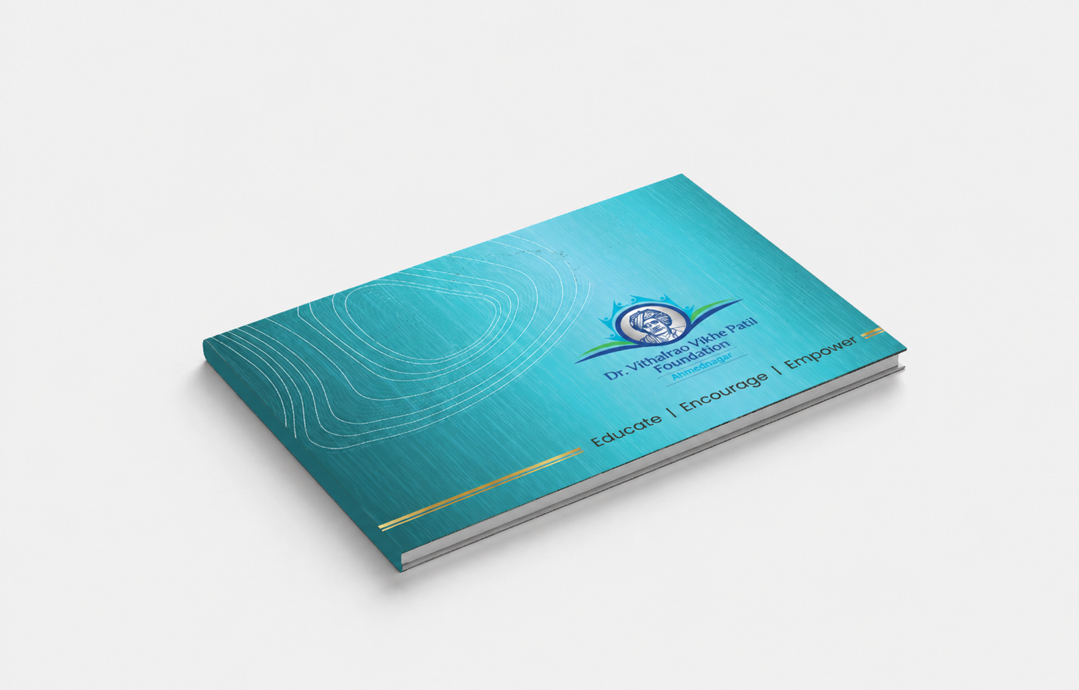
This coffee table book design draws inspiration from the internal layers of a banyan tree’s wood—the silent record of time, growth, and resilience.
The flowing concentric lines echo tree rings, each layer representing a chapter in the Foundation’s journey. Like wood grains that form slowly and steadily, the Foundation’s impact has been built year by year, generation by generation, without haste and without compromise.
Every layer signifies:
- Years of learning and institution-building
- Decisions that shaped communities
- Values preserved under pressure
- Growth that remained true to its core
Strength is communicated not through bold symbols, but through depth and continuity. The central emblem aligns with the tree’s heartwood—the strongest, most enduring part—representing Dr. Vithalrao Vikhe Patil’s vision that continues to hold the structure together.
The challenge
The core challenge was to translate a multi-generational legacy into a single cohesive coffee table book design language. The Foundation represents decades of educational excellence, cultural values, and societal impact—requiring a narrative that resonates across varied audiences. The coffee table book needed to balance depth with accessibility, ensuring it appealed equally to young aspirants, policymakers, and international dignitaries.
Another complexity lay in structuring vast archival content into a format that felt curated rather than dense. Visually, the task was to avoid conventional institutional design clichés and instead create something timeless, symbolic, and emotionally resonant.
Every element of the coffee table book—from typography to imagery—had to reflect authority without appearing rigid, and heritage without feeling outdated.
Moodboard
Brand moodboard and ecosystem
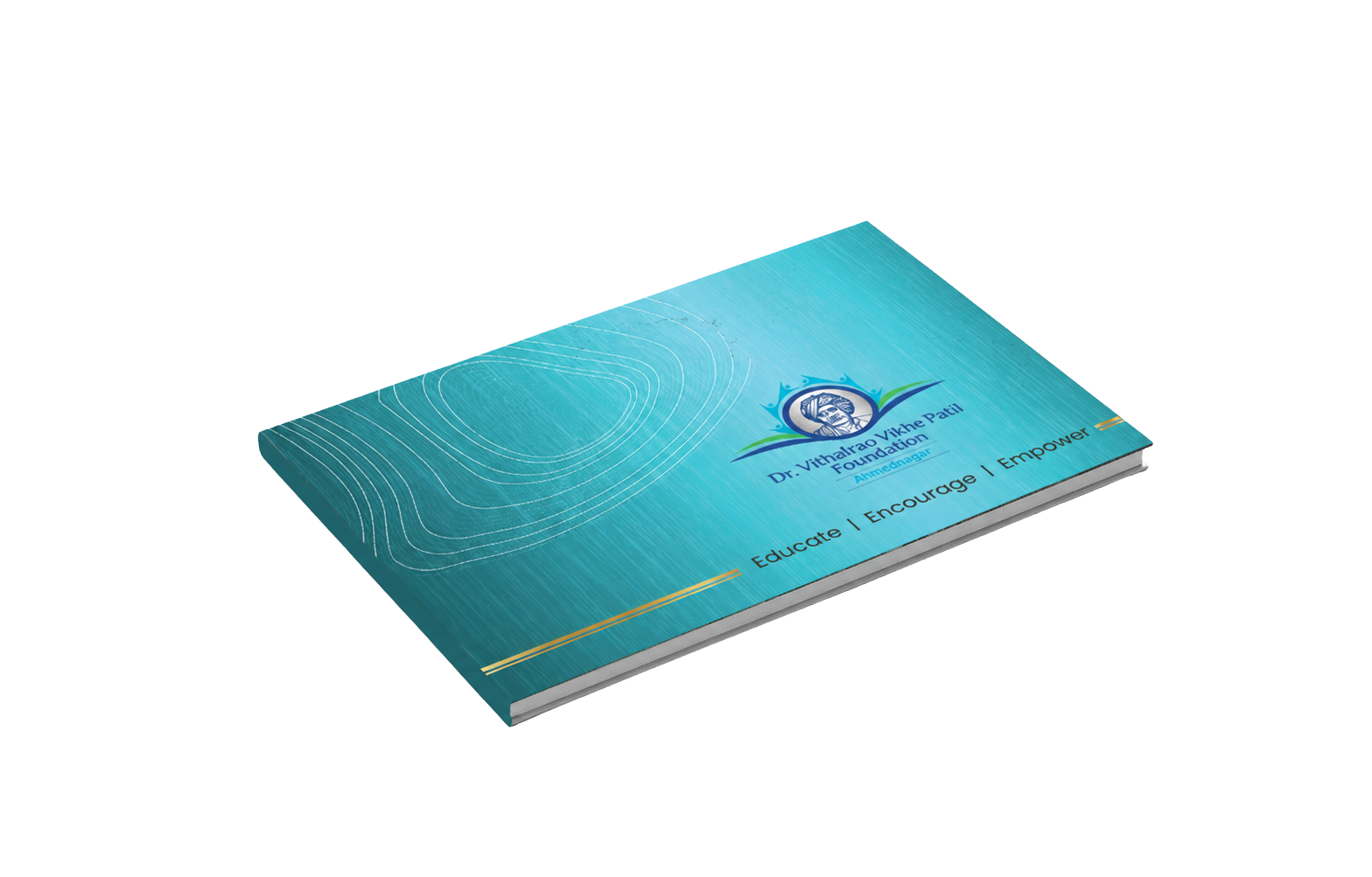
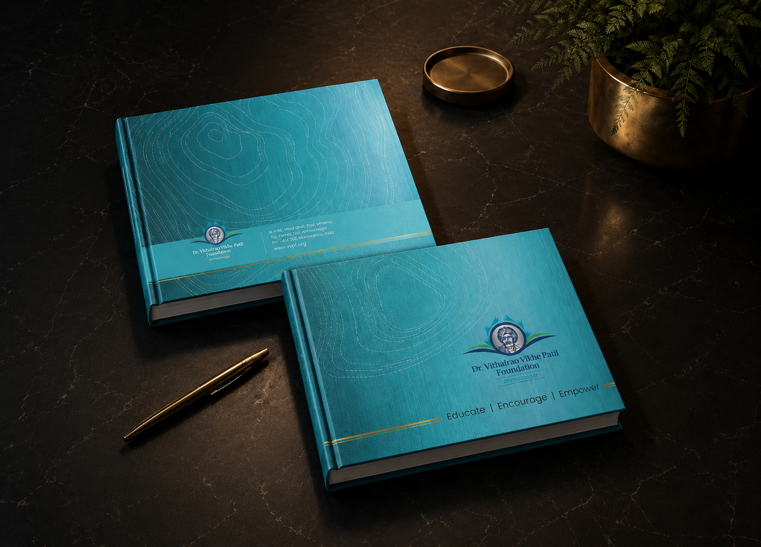
The moodboard drew inspiration from the organic strength and timelessness of a banyan tree. Earthy textures, natural gradients, and concentric patterns formed the core visual language. The ecosystem extended beyond print—ensuring adaptability across presentations, digital platforms, and institutional communication. The design language emphasized warmth, depth, and authenticity, avoiding artificial gloss. Materials, finishes, and visual tones were curated to evoke heritage and permanence. This cohesive ecosystem ensured that the coffee table book was not just a standalone artifact, but a central piece of the Foundation’s broader brand narrative.
Identity
Brand identy design
The central concept, “Within the Rings of Time,” shaped the identity—drawing from the layered rings of a banyan tree to symbolize growth, resilience, and continuity. Each concentric line represents a phase in the institution’s journey, reflecting years of learning, decision-making, and societal contribution. The visual identity of the coffee table book avoids overt symbolism, instead communicating strength through subtlety and depth. The central emblem aligns with the metaphorical heartwood, representing the enduring vision of the founder. The design language integrates structured layouts with fluid organic patterns, reinforcing the idea of disciplined growth rooted in strong values. This identity system ensured consistency while allowing flexibility across chapters and themes.
Visualisation
Brand visualisations
Visual storytelling of the coffee table book was executed through a balance of high-impact imagery, refined infographics, and minimal yet purposeful text. Archival photographs were enhanced to maintain authenticity while achieving visual consistency. The coffee table book features custom illustrations and data visualizations that simplify complex milestones into engaging formats. The layouts were designed to guide the reader intuitively, using whitespace and hierarchy to create rhythm. Corporate visuals of the coffee table book were elevated through thoughtful photo editing and tonal grading aligned with the earthy palette. Each spread was treated as a standalone visual experience while contributing to the larger narrative flow of the coffee table book.
Legacy
Final execution
The final output was a premium coffee table book with meticulous attention to materiality, print quality, and finishing. From paper selection to binding, every detail reinforced the sense of legacy and permanence. The colour palette—featuring parchment tones, wood-grain browns, and subtle gold accents—was consistently applied to enhance depth and sophistication. The coffee table book successfully balances visual richness with editorial clarity, ensuring readability across audiences. As a result, it functions not only as a storytelling medium but also as a strategic brand asset with long-term institutional value and cross-platform adaptability

The insight
Legacy is not built in moments, but in layers over time. The idea was to represent growth as a continuous, organic process rather than isolated achievements—shifting the narrative from showcasing success to embodying it.

The identity
“Within the Rings of Time” transformed the institution’s journey into a living visual metaphor—where every layer, line, and texture reflects resilience, continuity, and enduring vision.